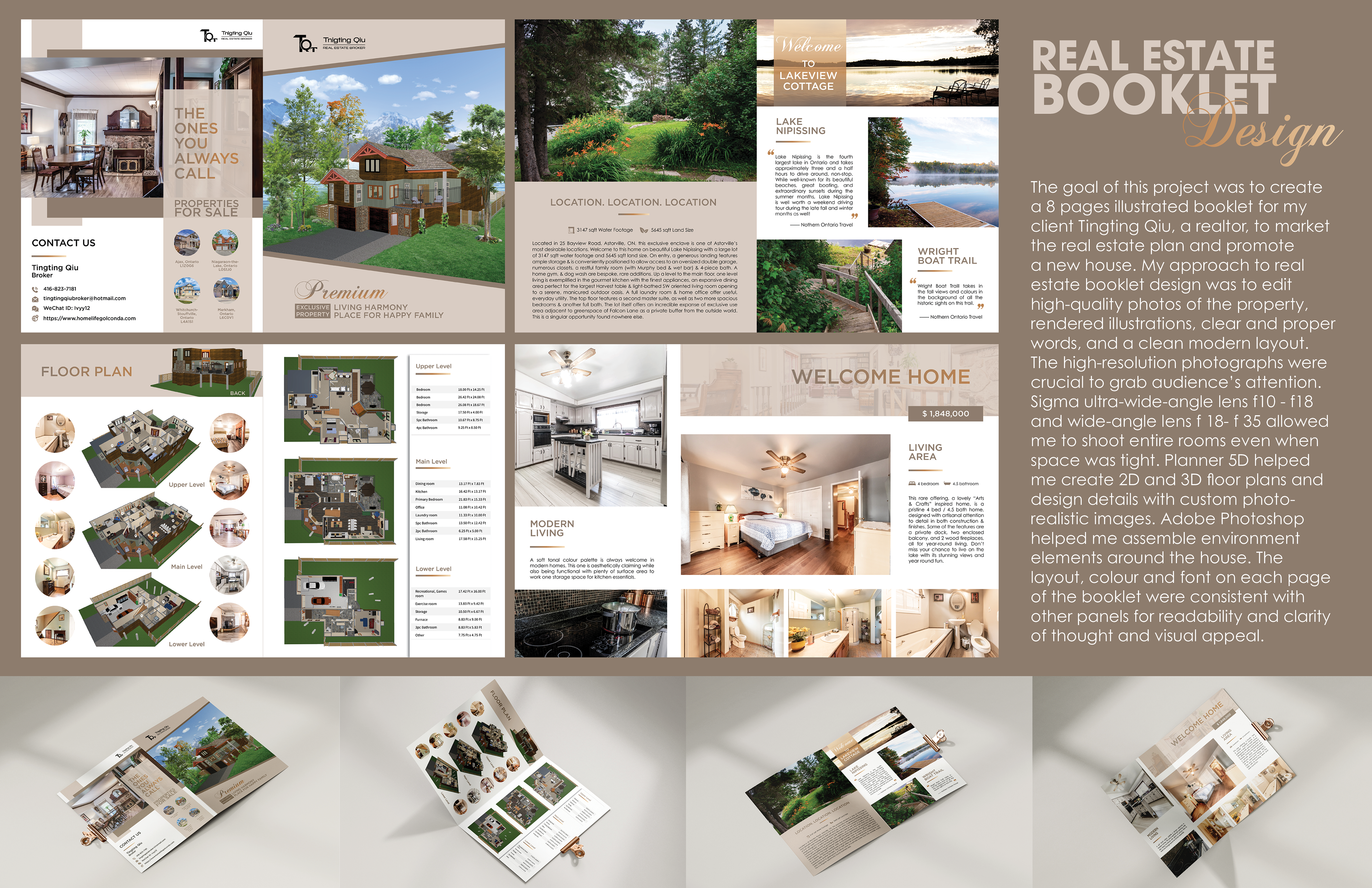

Challenge:
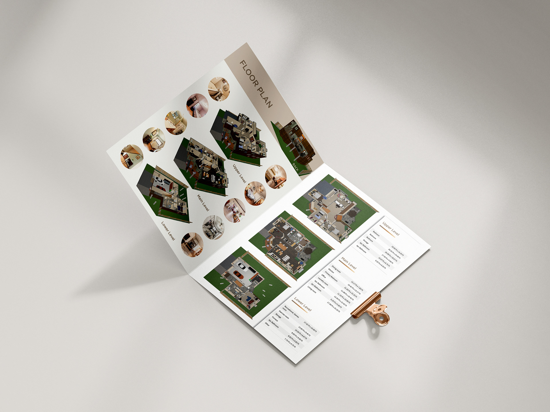
One of the challenges faced was to create a 3D floor plan based on a 2D floor plan. The objective was to represent the vertical, front, and side views of each floor's structure, as well as the interior layout. Another challenge was to render the house, including the exterior environment and landscape, by identifying and assembling the appropriate elements.
Target Audience:
High-income group people who have a big family like the lake view cottage
Background:
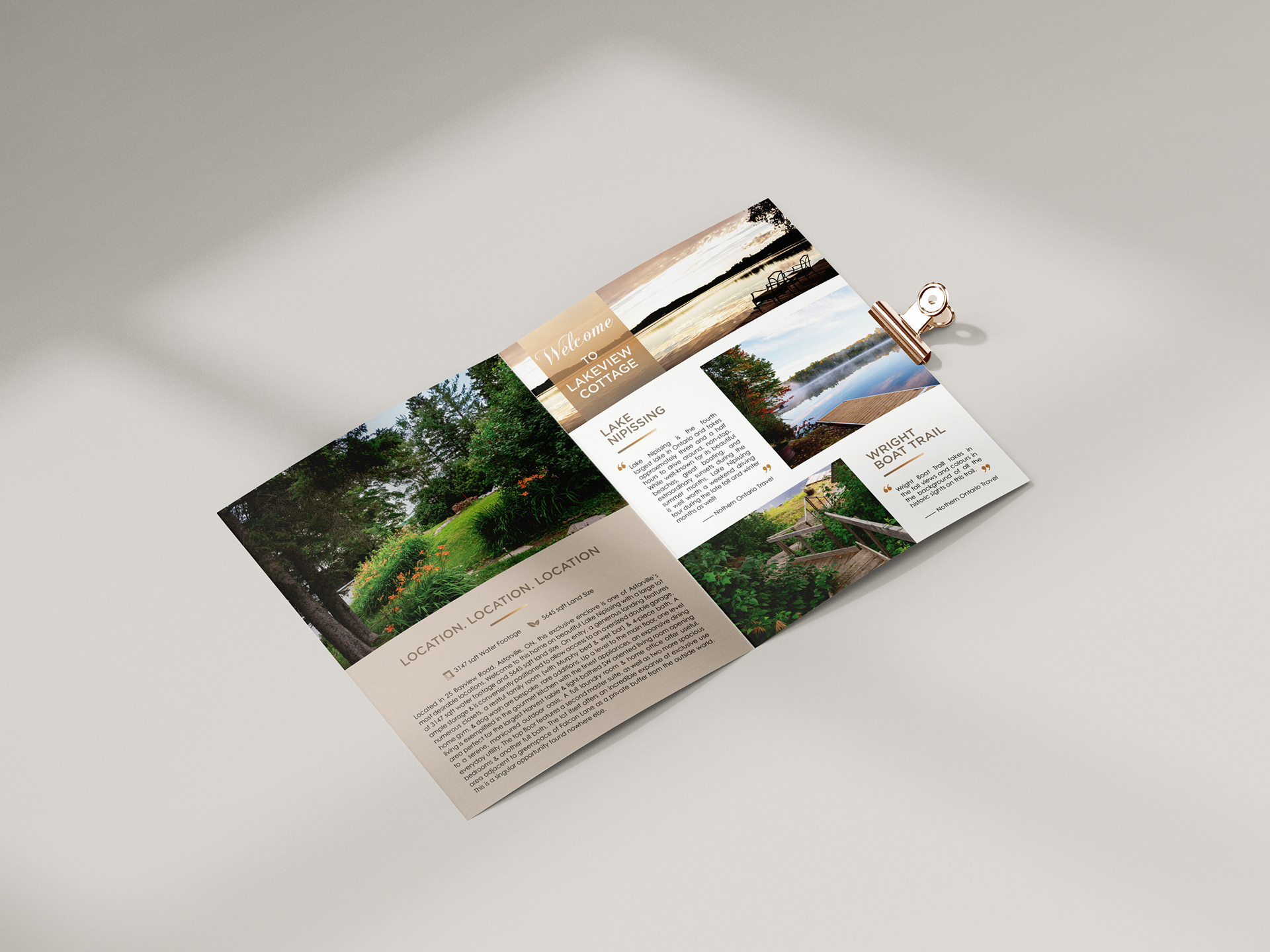
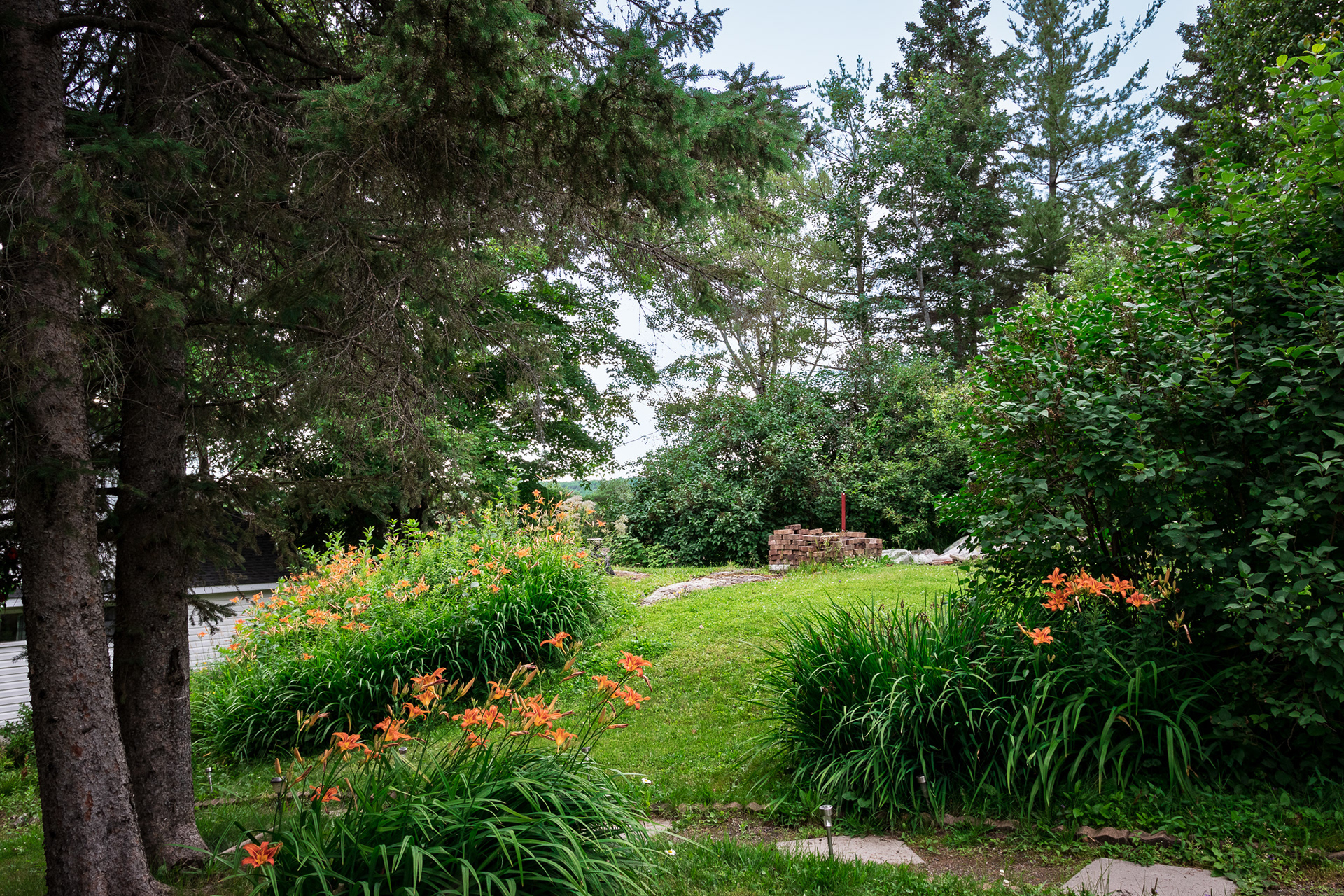
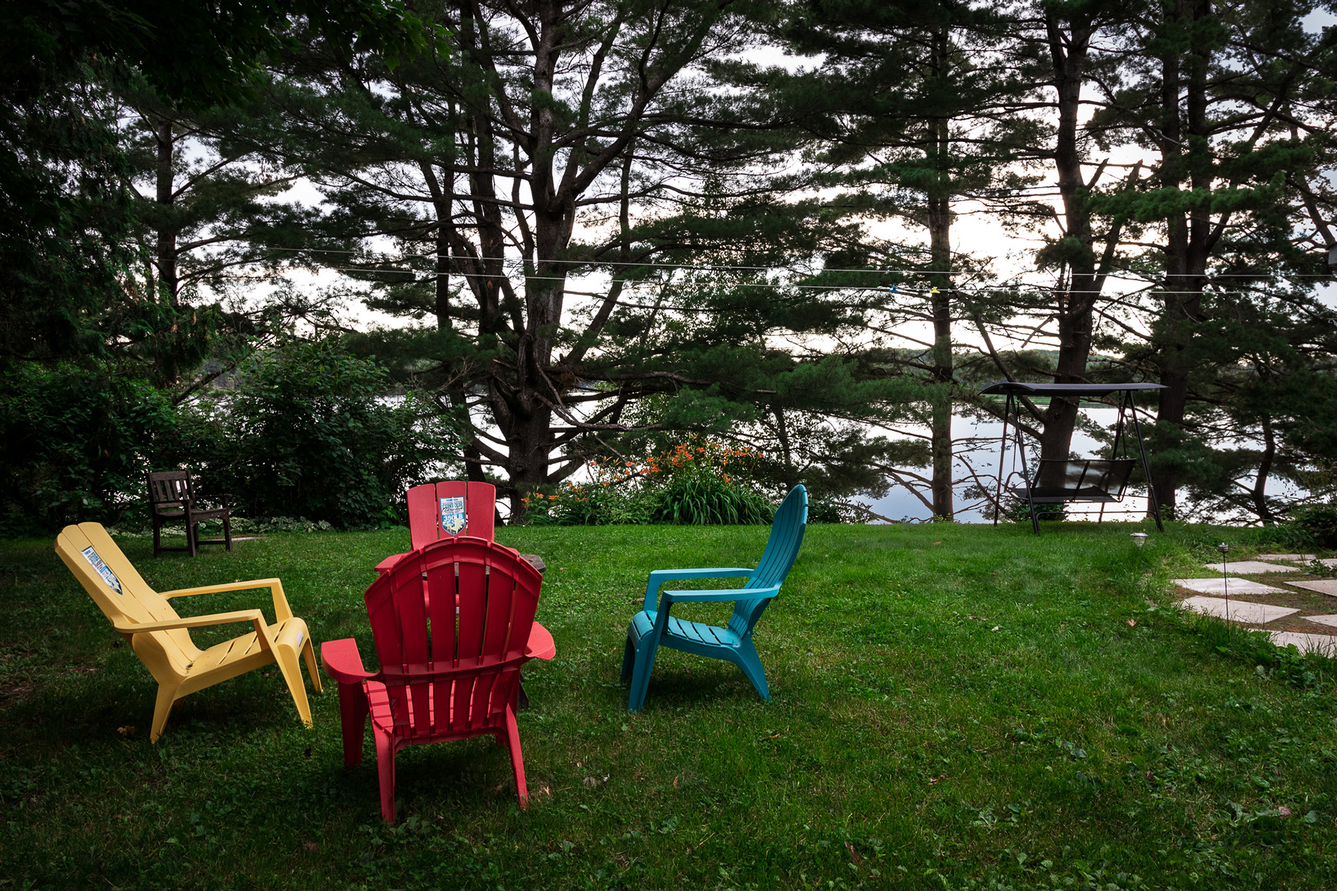
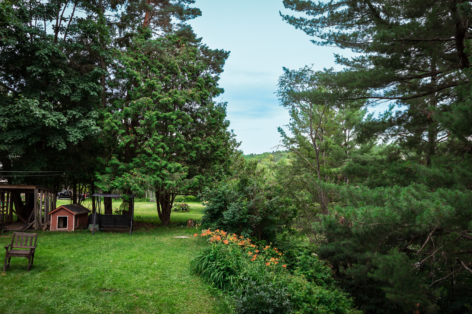
The new house's outlook cannot be photographed due to the lack of mature gardens and the unfinished yard and path. There are three possible solutions to this problem. The first option is to create new 2D and 3D floor plans based on the previous ones. The second option is to design a 3D rendering of the house that showcases the outlook and environment. The third option is to take photographs of the interiors and landscapes surrounding the area. Additionally, the client has requested a personal logo to build brand awareness.
Inspiration / Research:
I did some research on 3D floor plans and house rendering applications and eventually decided to use Planner 5D and Adobe Photoshop to create the illustration. The brochure's colour palette inspired me and gave me a feeling of warm sunshine, fresh air, and a comfortable lifestyle.
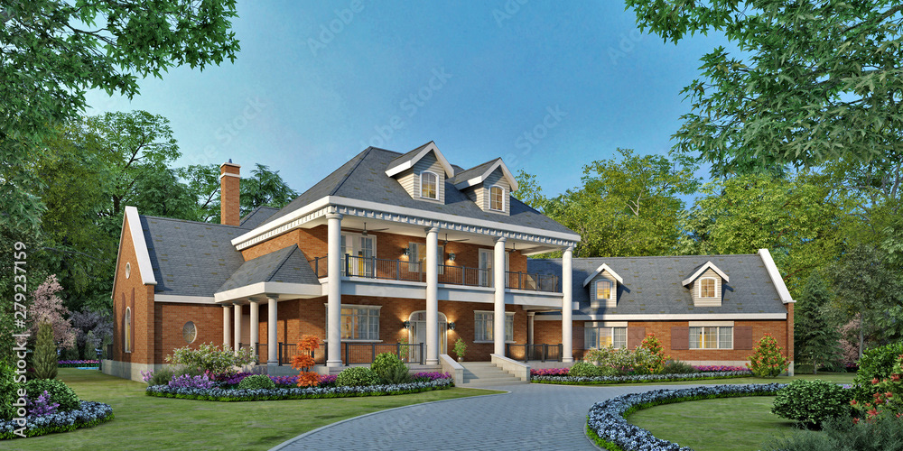
3D Rendering House
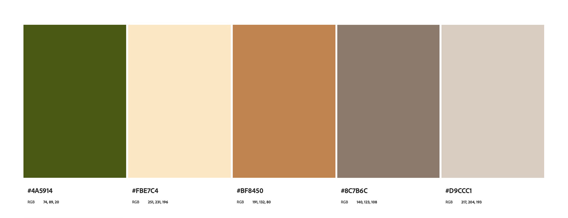
Colour Reference
Process:
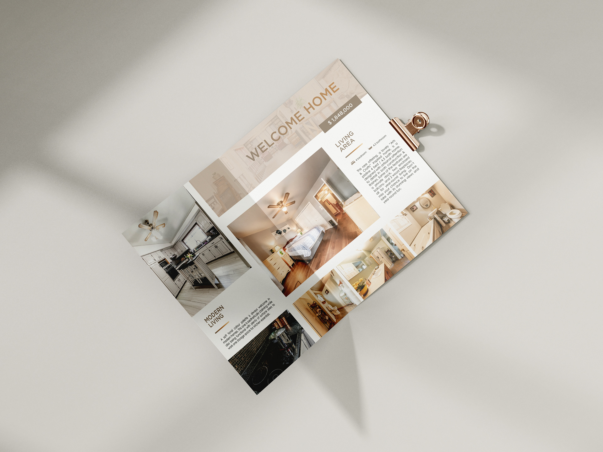
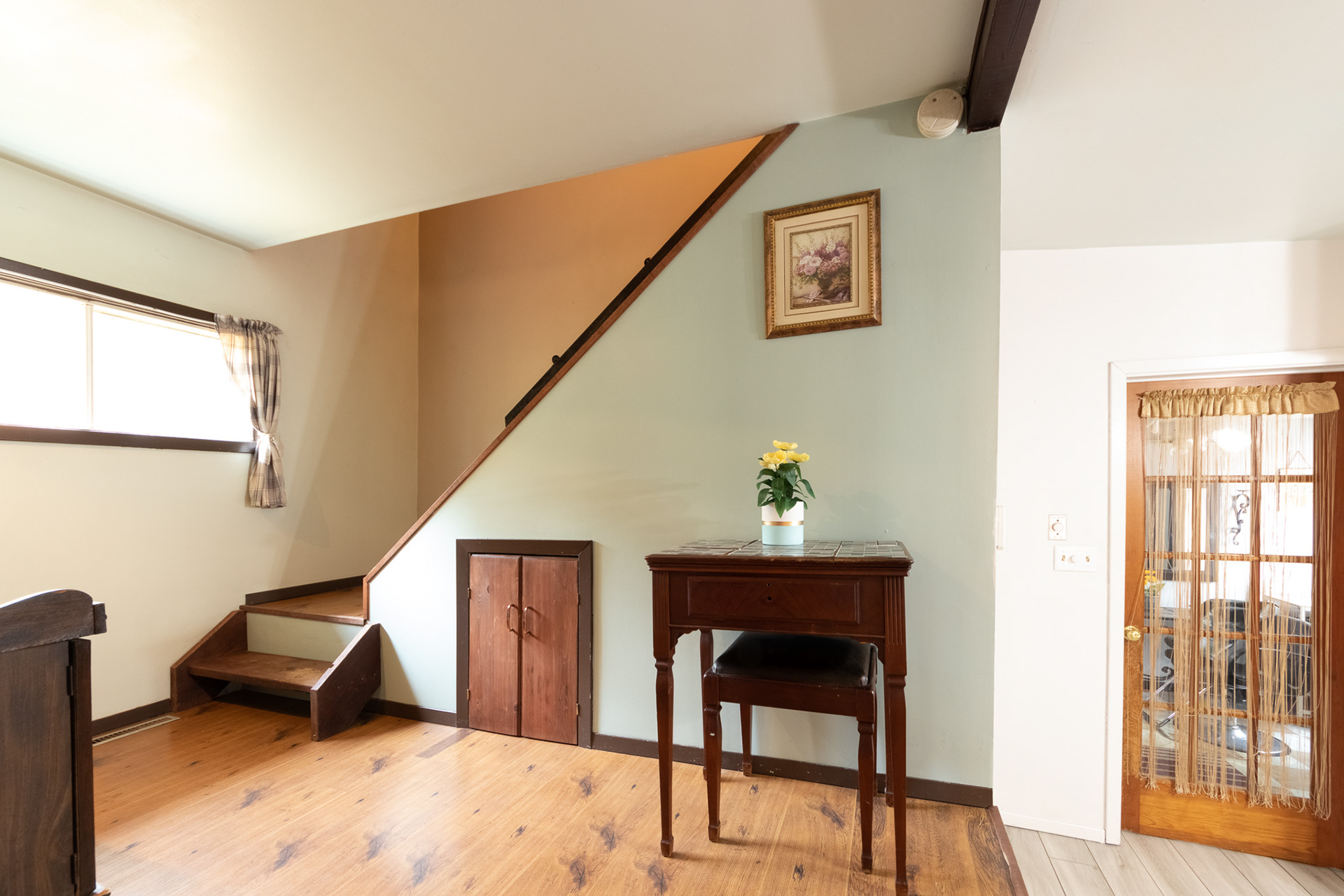
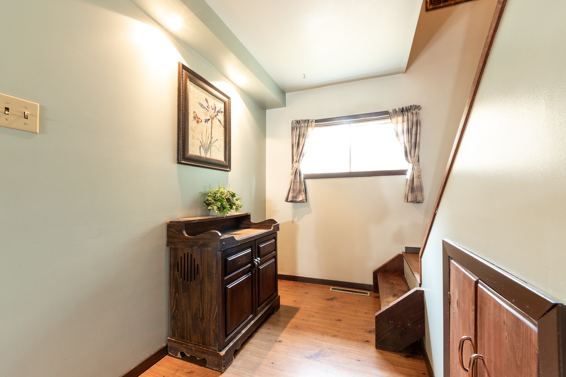
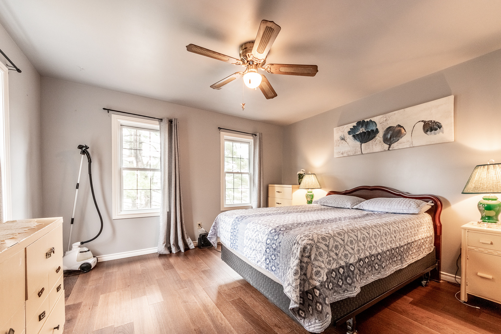
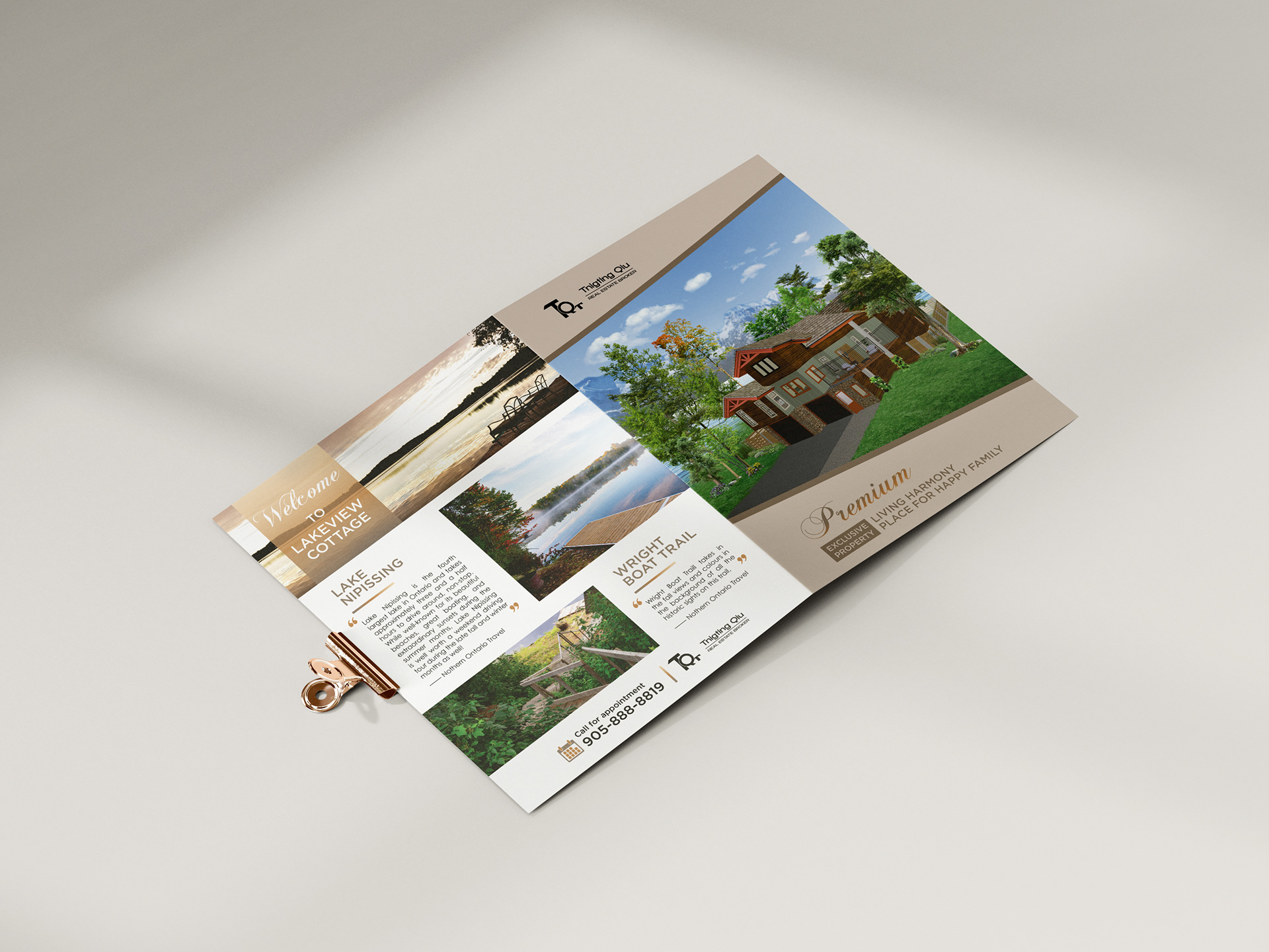
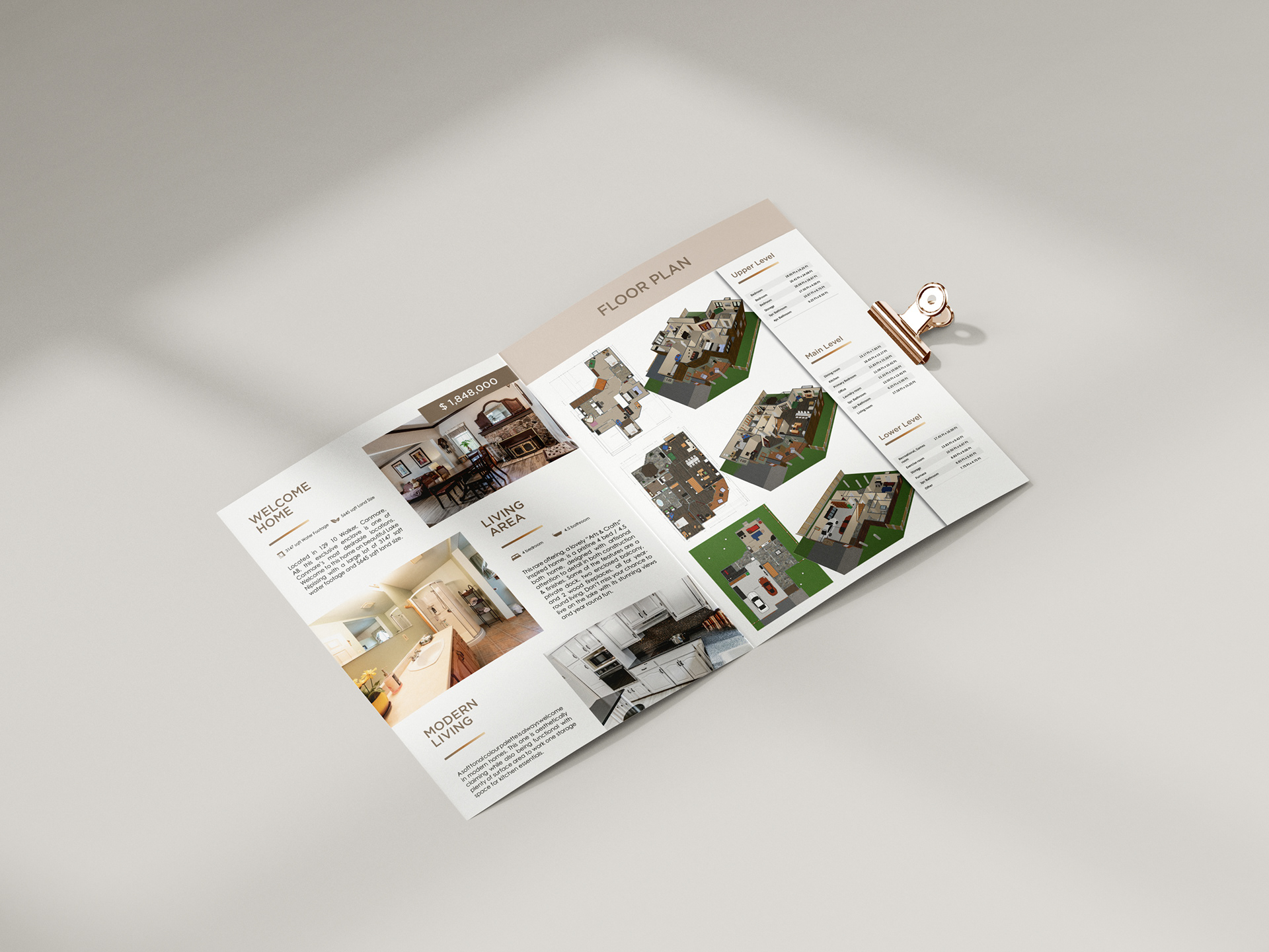
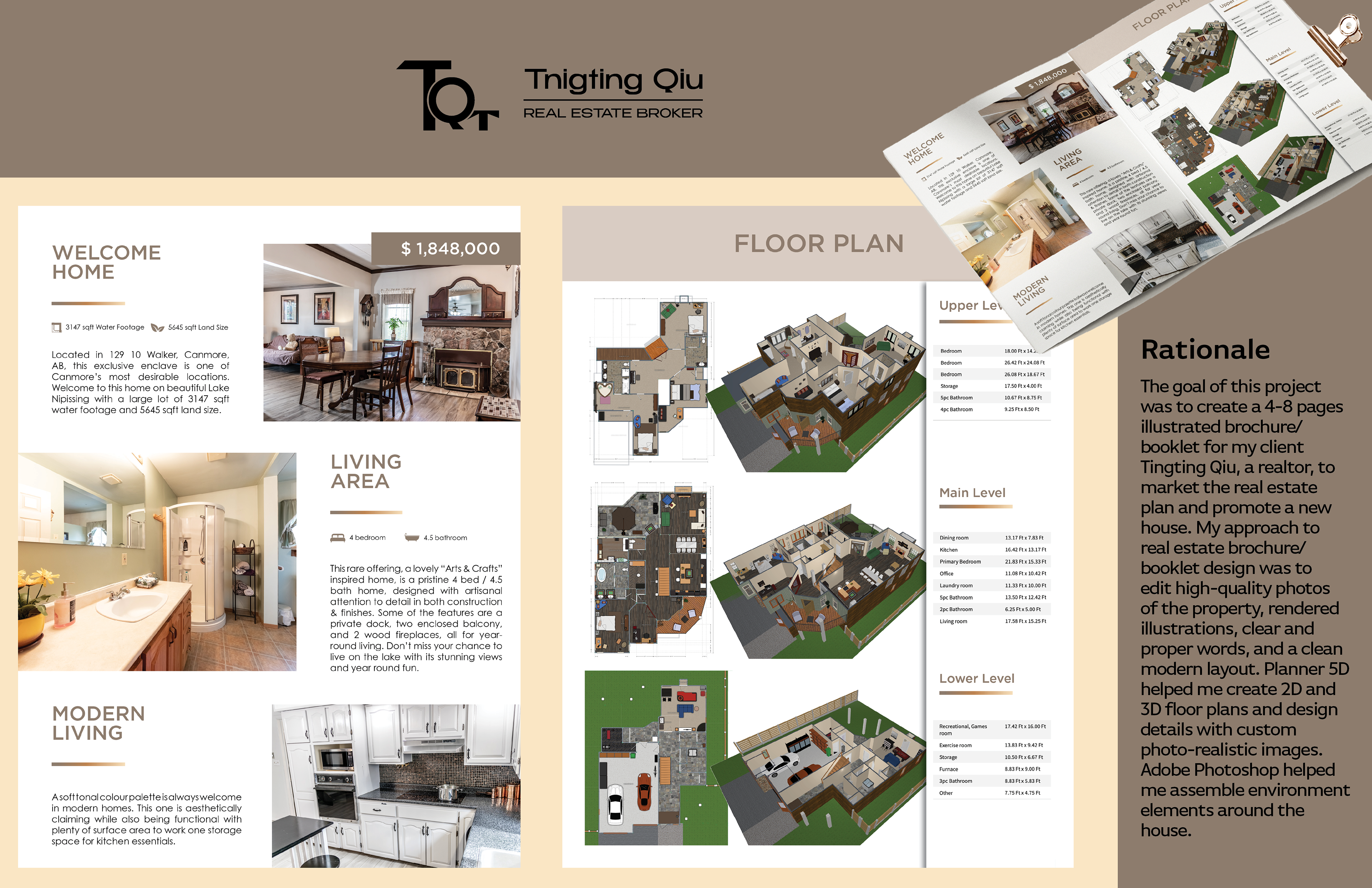
For my real estate brochure/booklet design, I followed a comprehensive approach. Firstly, I shot and edited high-quality photographs of the property and incorporated rendered illustrations. I ensured that the text used was clear and appropriate, and then arranged everything in a clean, modern layout.
To provide a better understanding of the property, I created 2D and 3D floor plans and design details of interiors in Planner 5D. Additionally, I assembled environment elements around the house using Adobe Photoshop. I photographed the interior and exterior environment and later edited the photos using Adobe Lightroom.
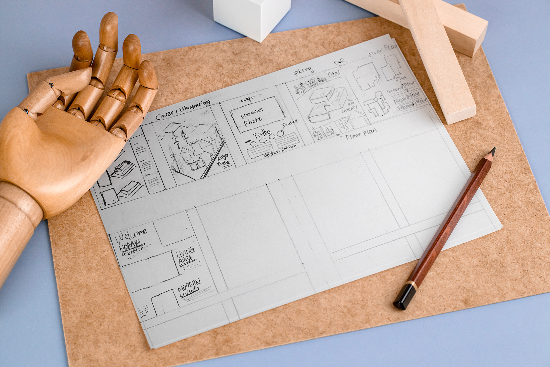
I drew rough sketches or thumbnails of the layout for each page of the brochure. I also designed a brand logo in Adobe Illustrator, which helped the client build brand awareness.
Finally, I assembled all the elements, designed the layout, and edited the content to create a professional and appealing brochure.
Logo Design:
I created this typographic logo by combining the client's initials, reshaping them to resemble roofs and windows, and conveying the message of the client's business service.


Colour Palette:
The house was represented by a colour palette consisting of brown, green, and orange which created a warm and comfortable ambience. The brown colour resembled nature, making it an ideal combination for rural properties. The sub-colour green was well-suited for family homes, while the highlight colour orange evoked feelings of the beach or lake.
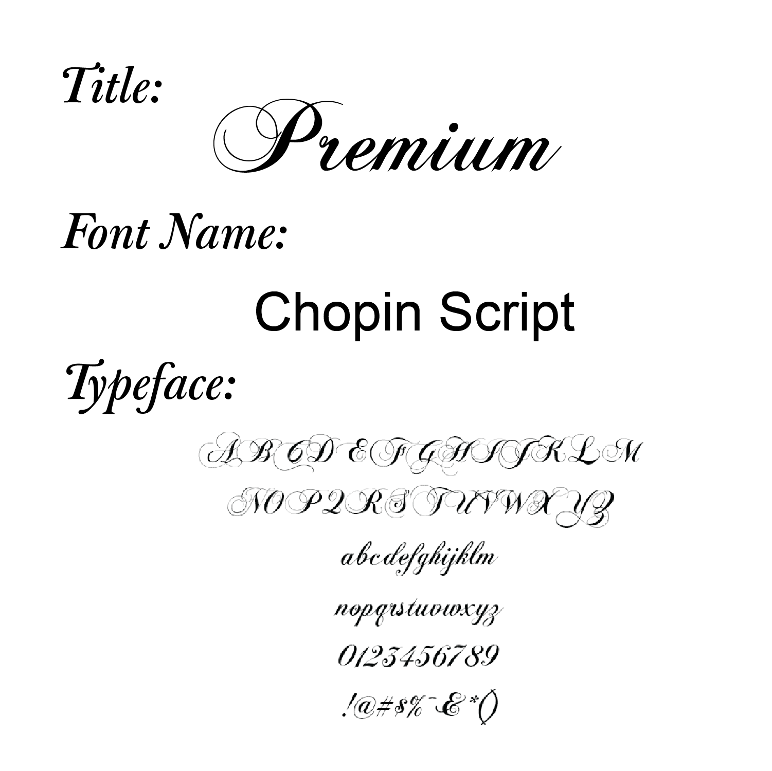
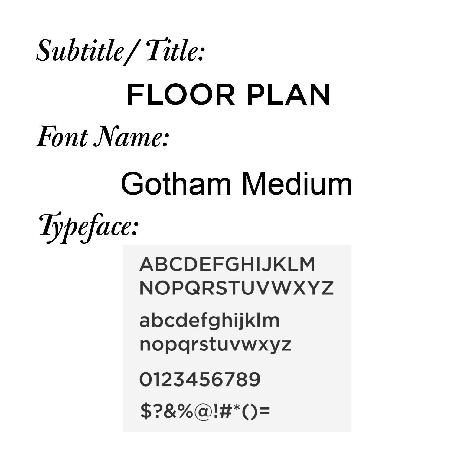
Font Choice:
The Gotham Medium/Regular font family enhances the text's readability, while Chopin Script's handwriting adds visual attraction.
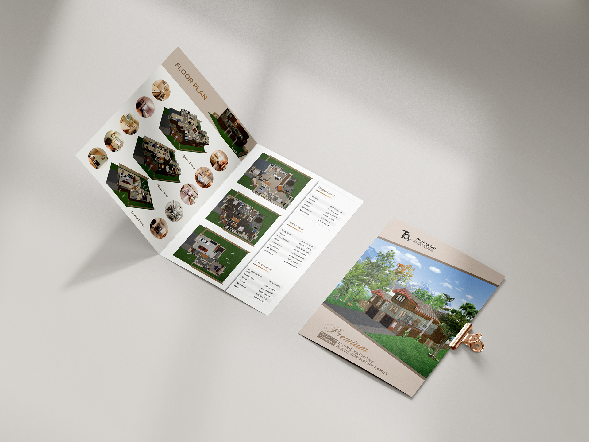
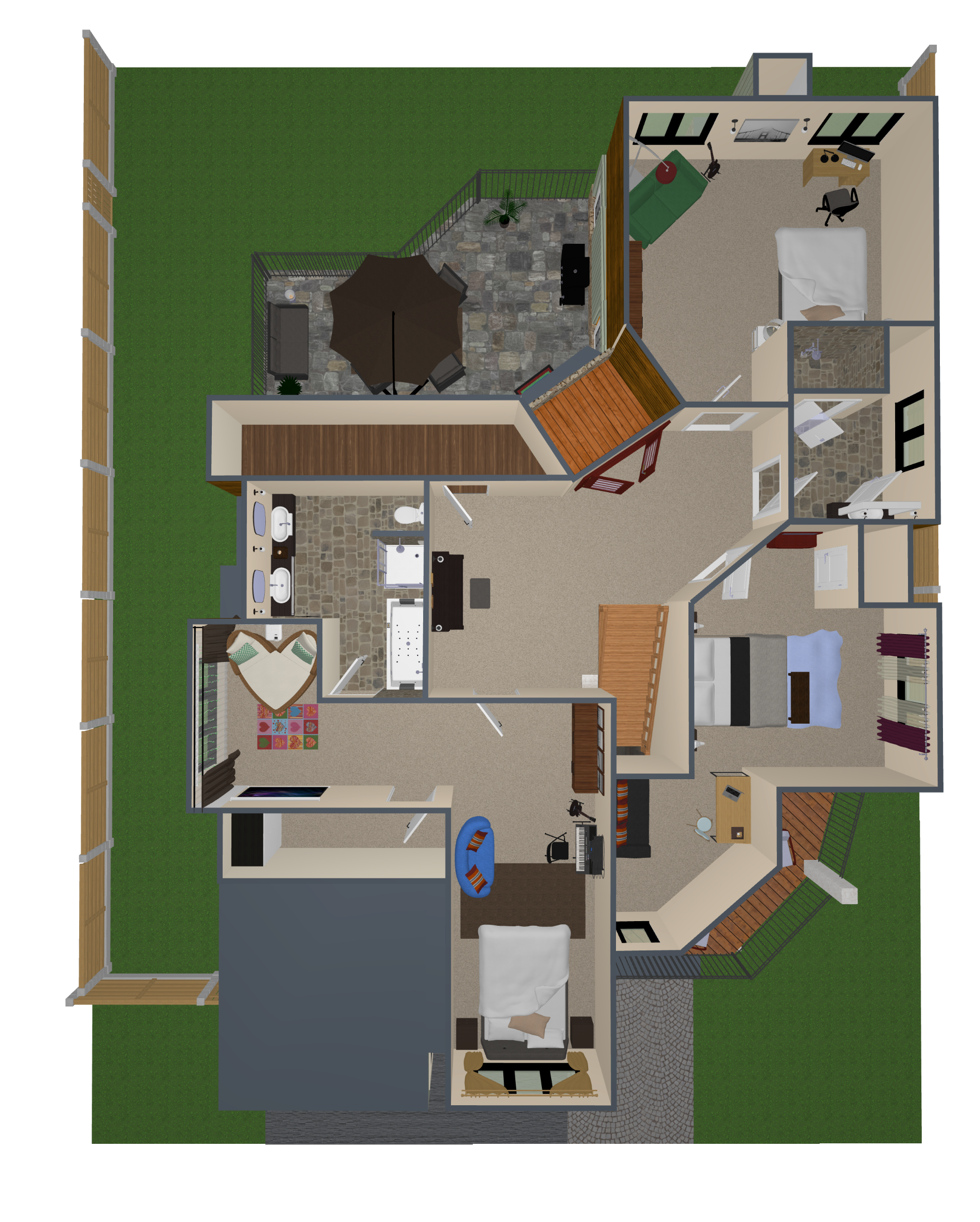
2D and 3D Exterior and Interior Rendering:
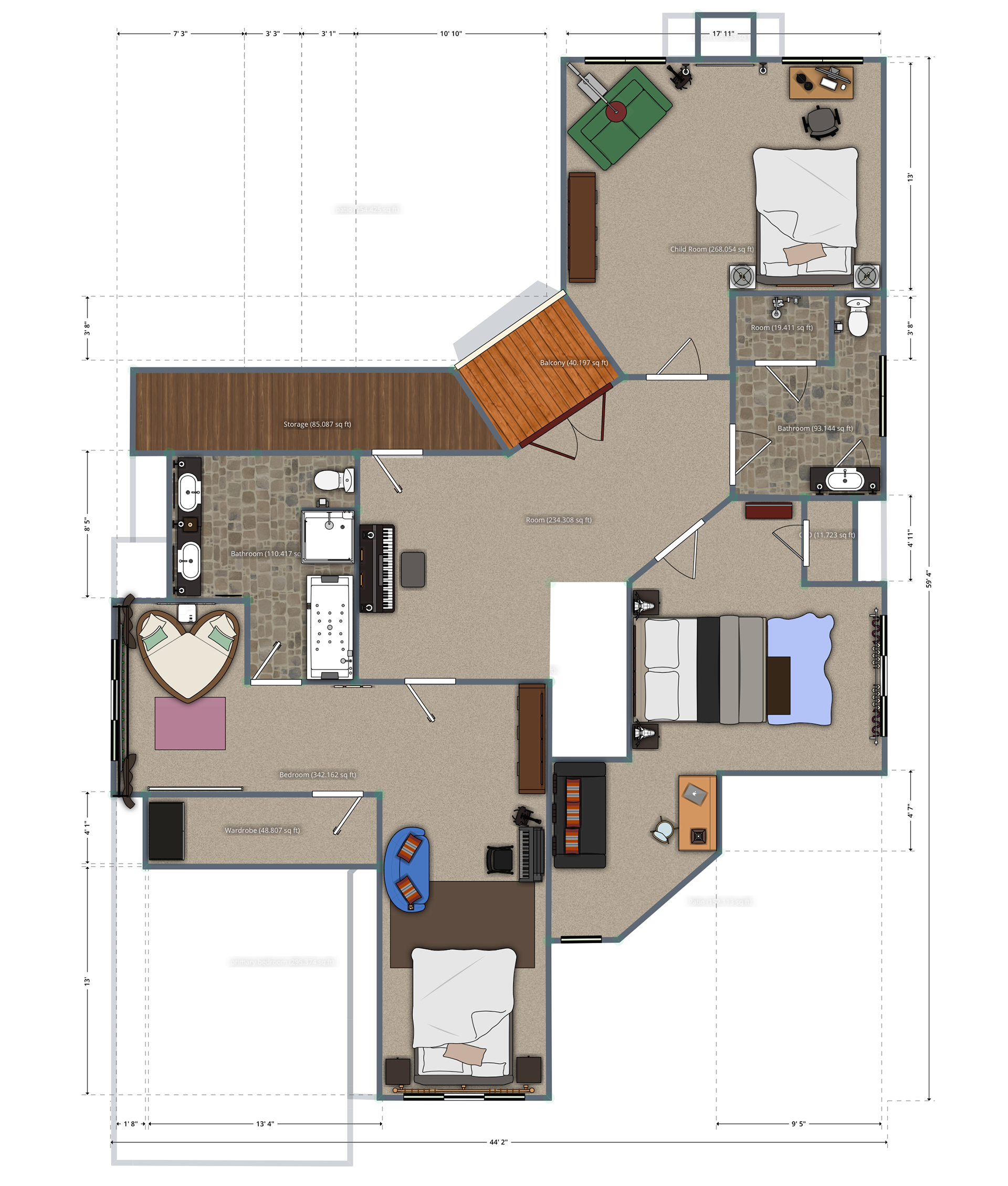
2D and 3D Floor Plan (Second/Upper Floor Vertical View)
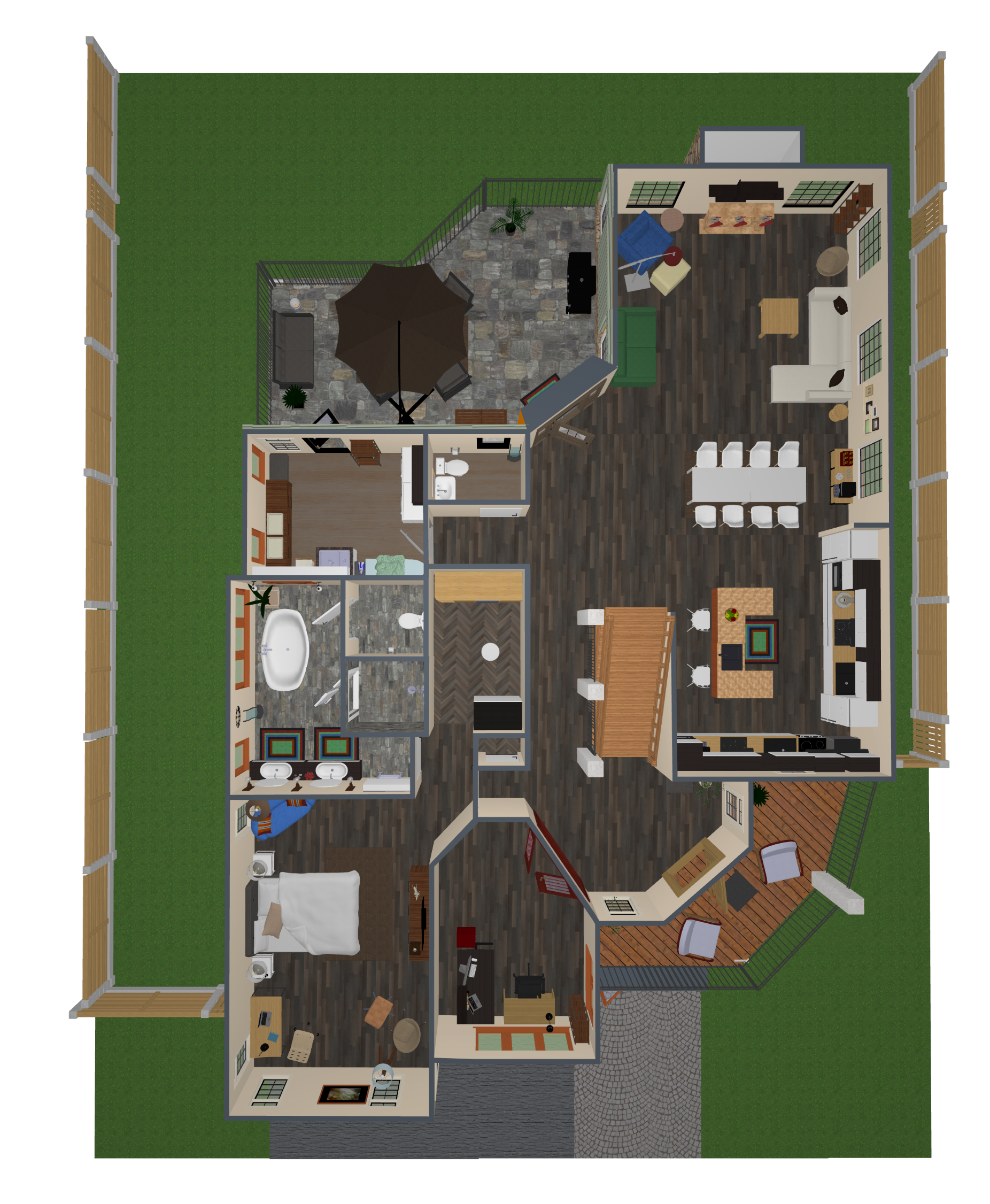
2D and 3D Floor Plan (Main Floor Vertical View)
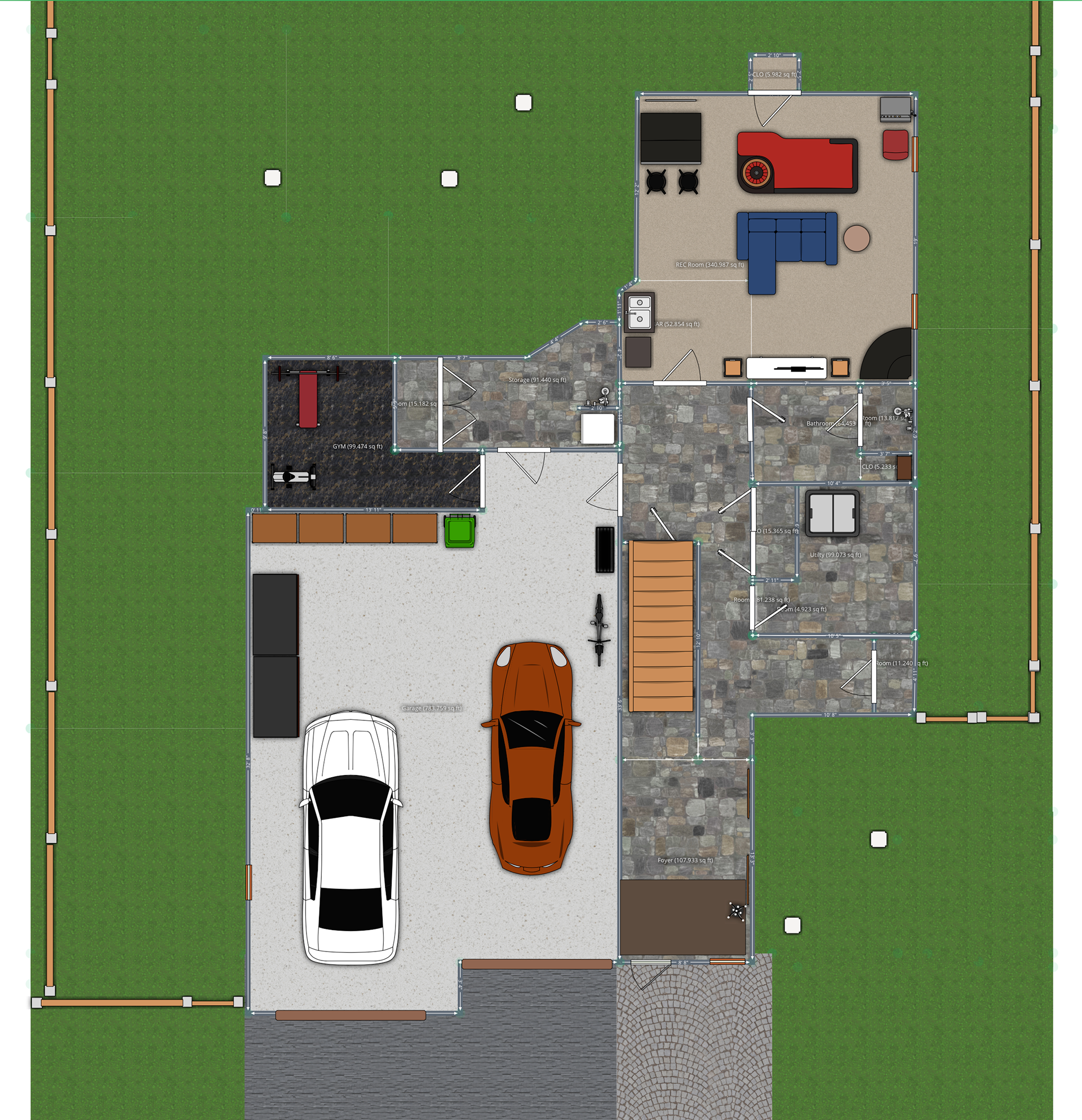
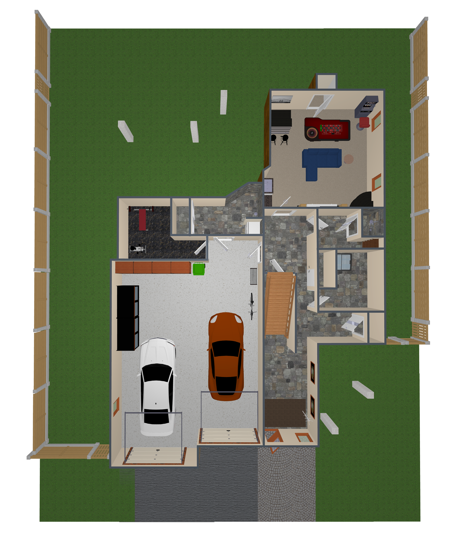
2D and 3D Floor Plan (Lower/1st Floor Vertical View)
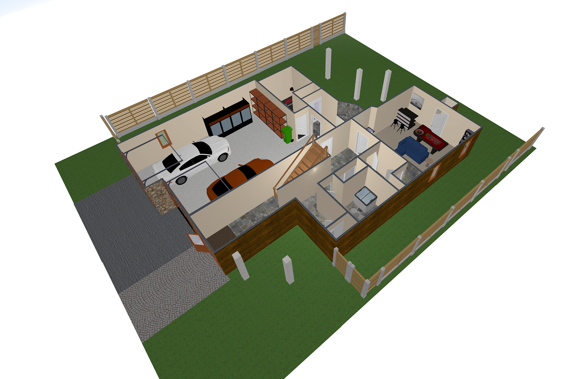
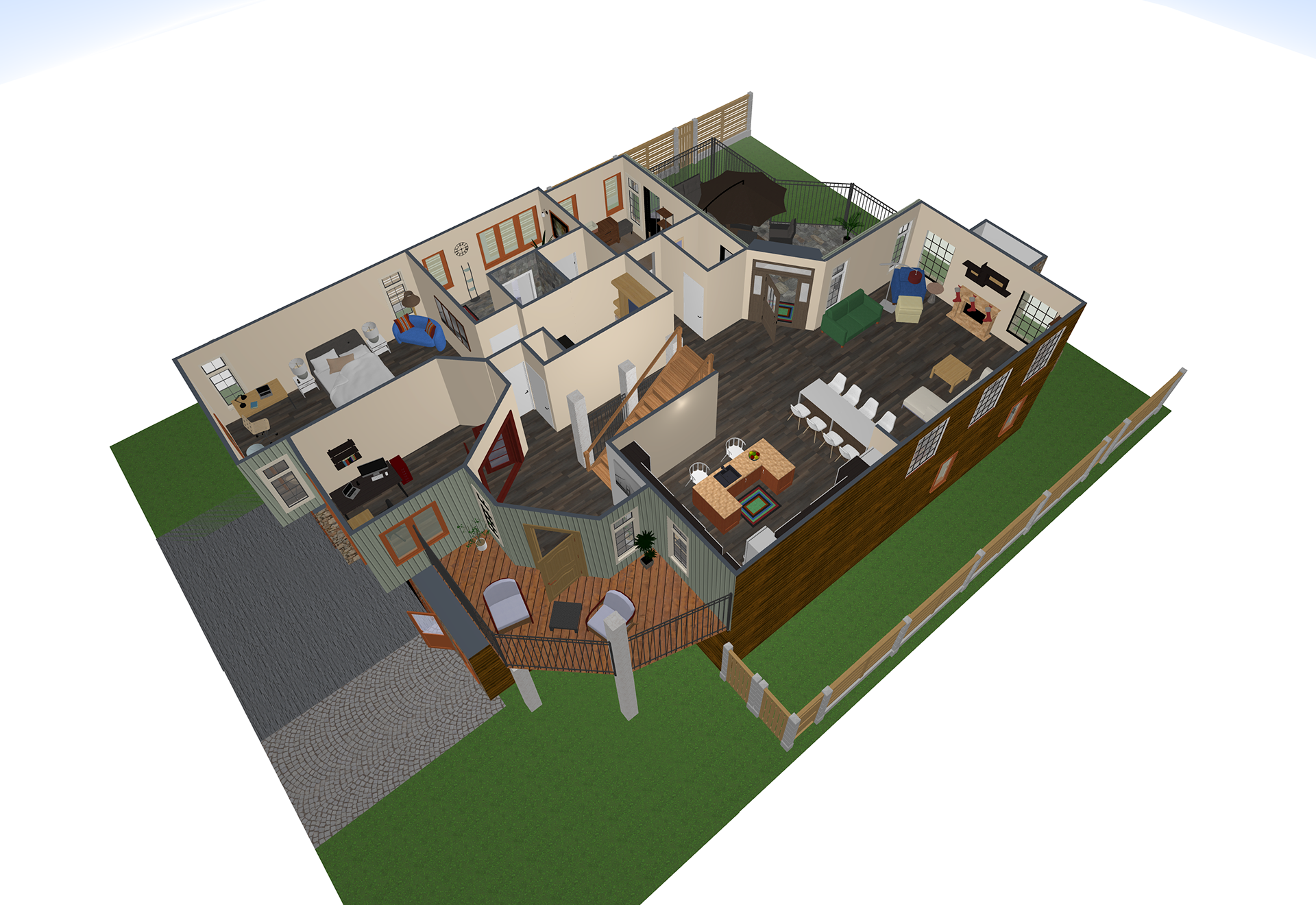
3D floor Plan (Lower/1st Floor Side View) 3D floor Plan (Main Floor Side View)
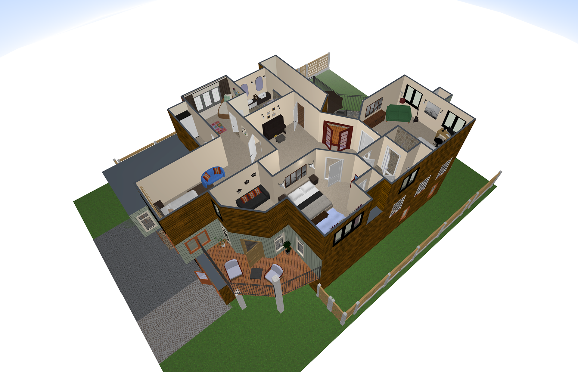
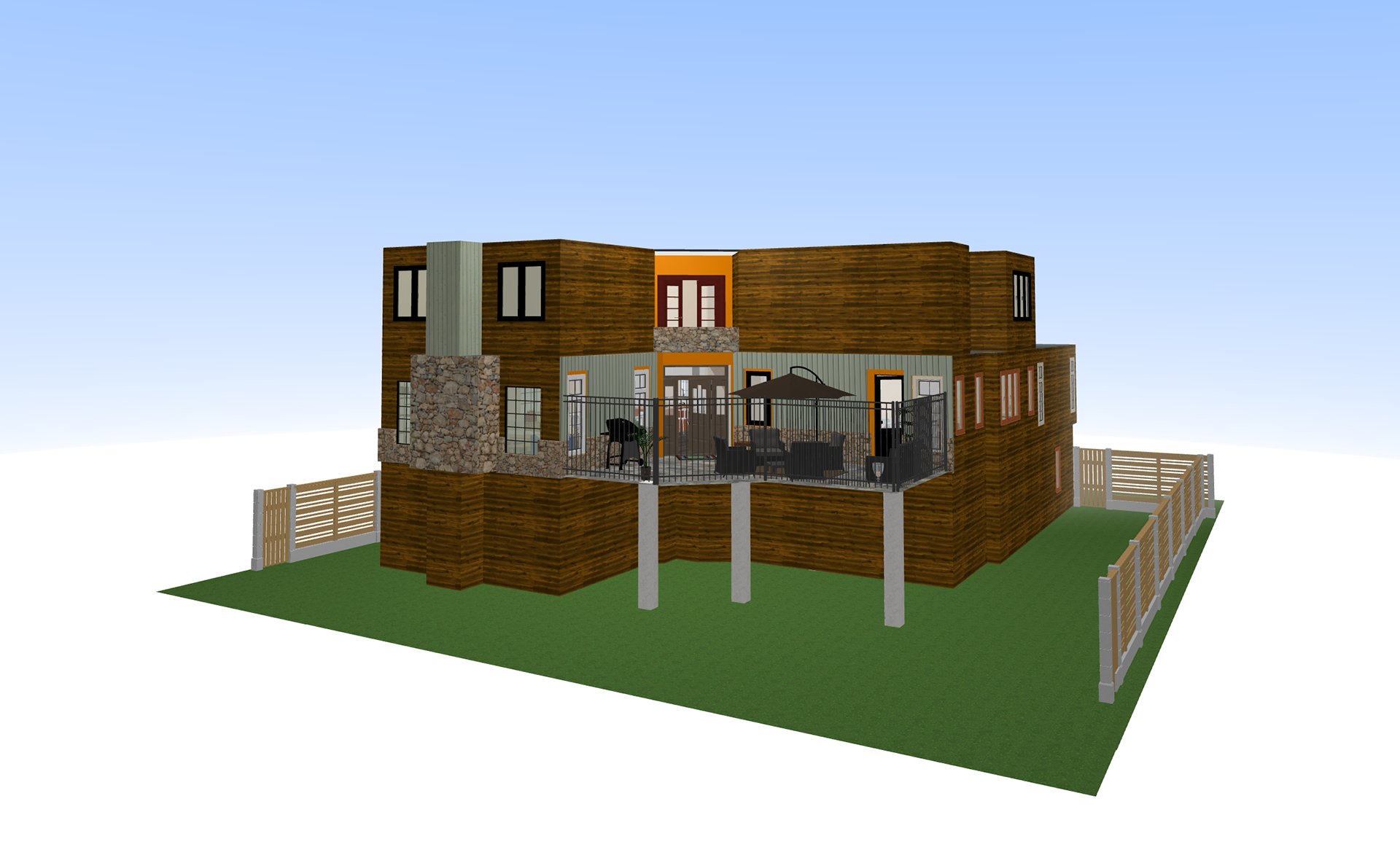
3D floor Plan (Upper/2nd Floor Side View) 3D house (Back View)
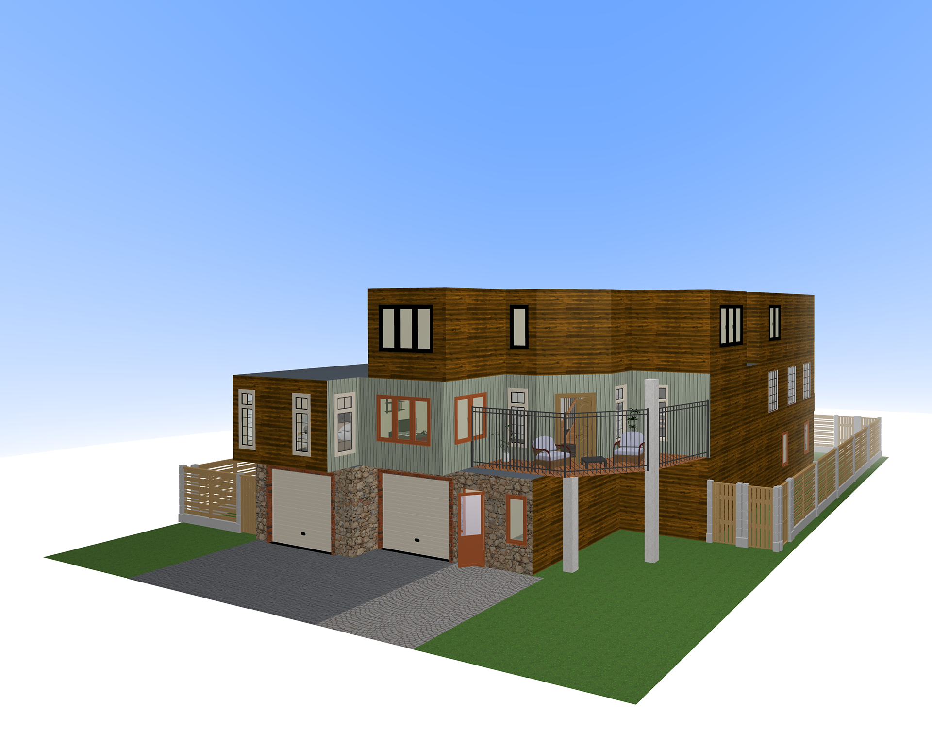
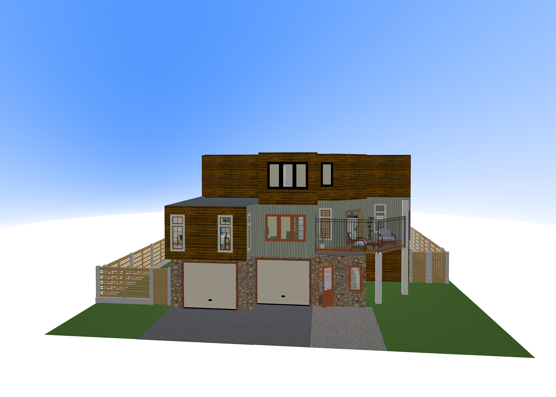
3D house (Side View) 3D house (Front View)
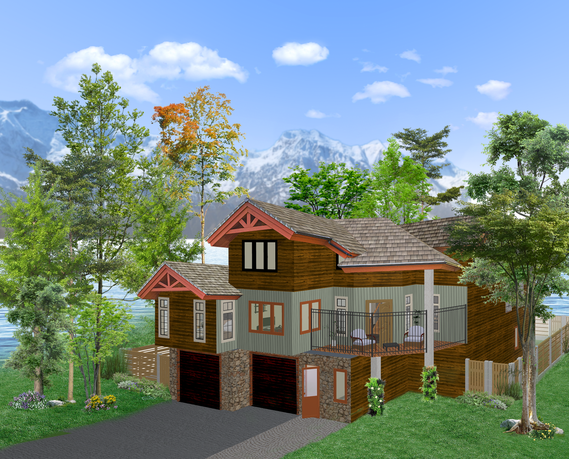
3D Exterior Rendering & Environment and Landscape
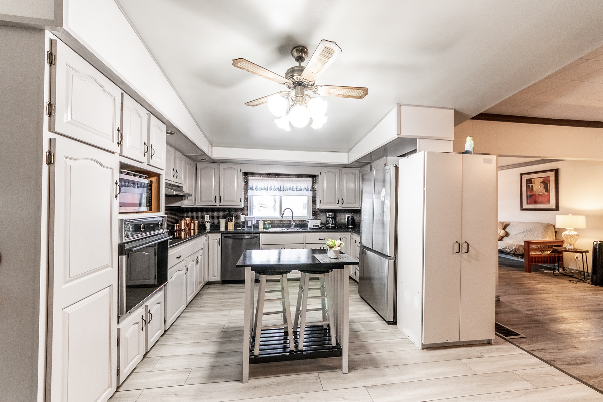
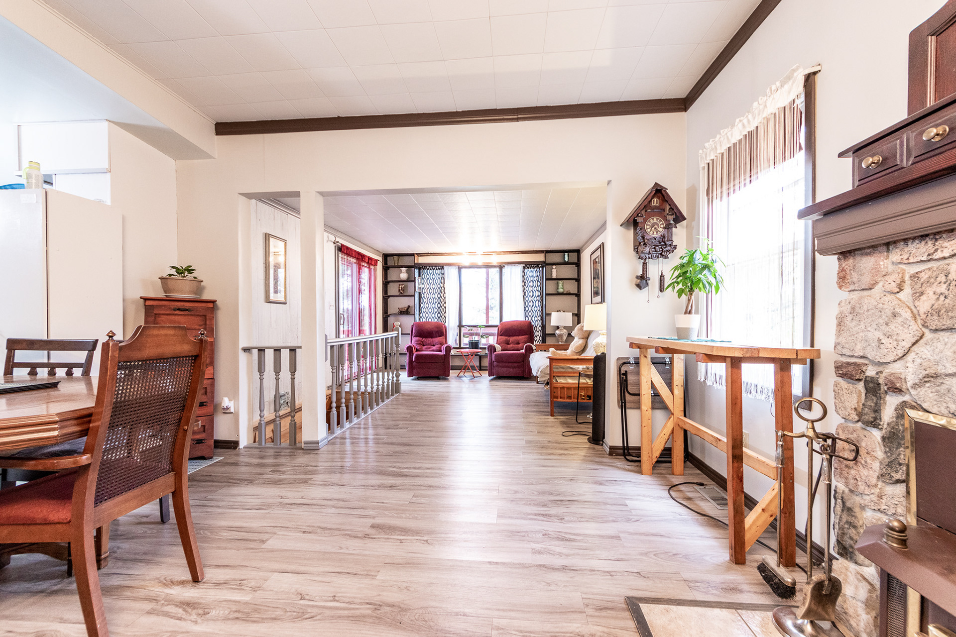
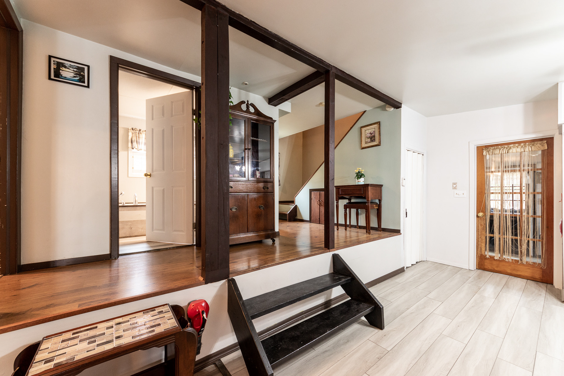
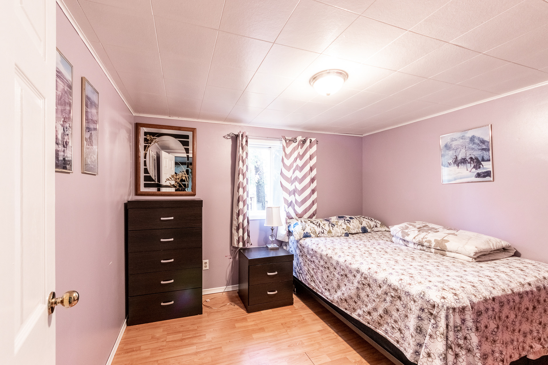
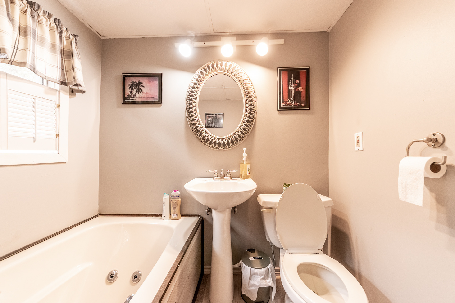
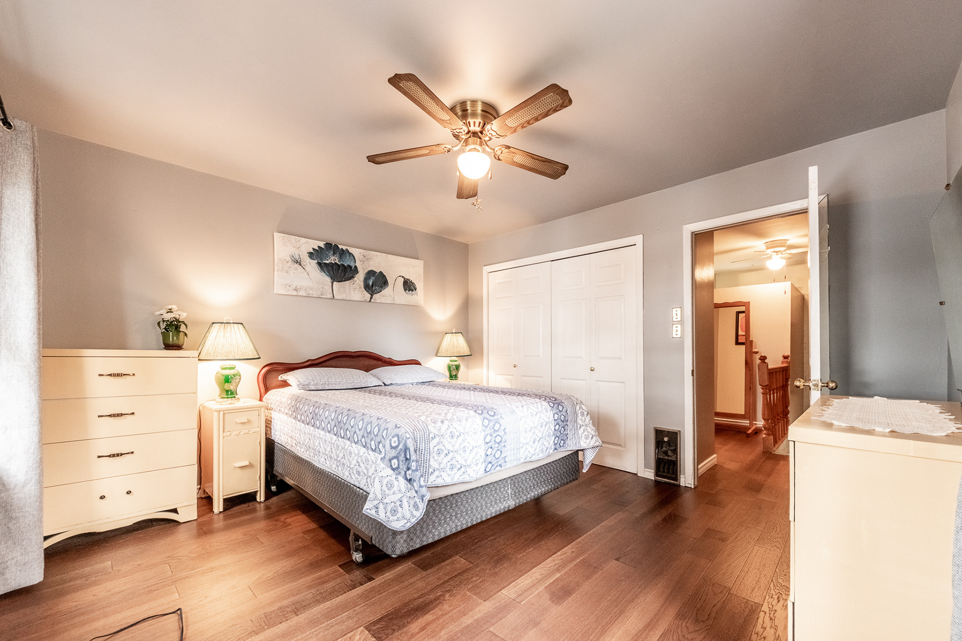
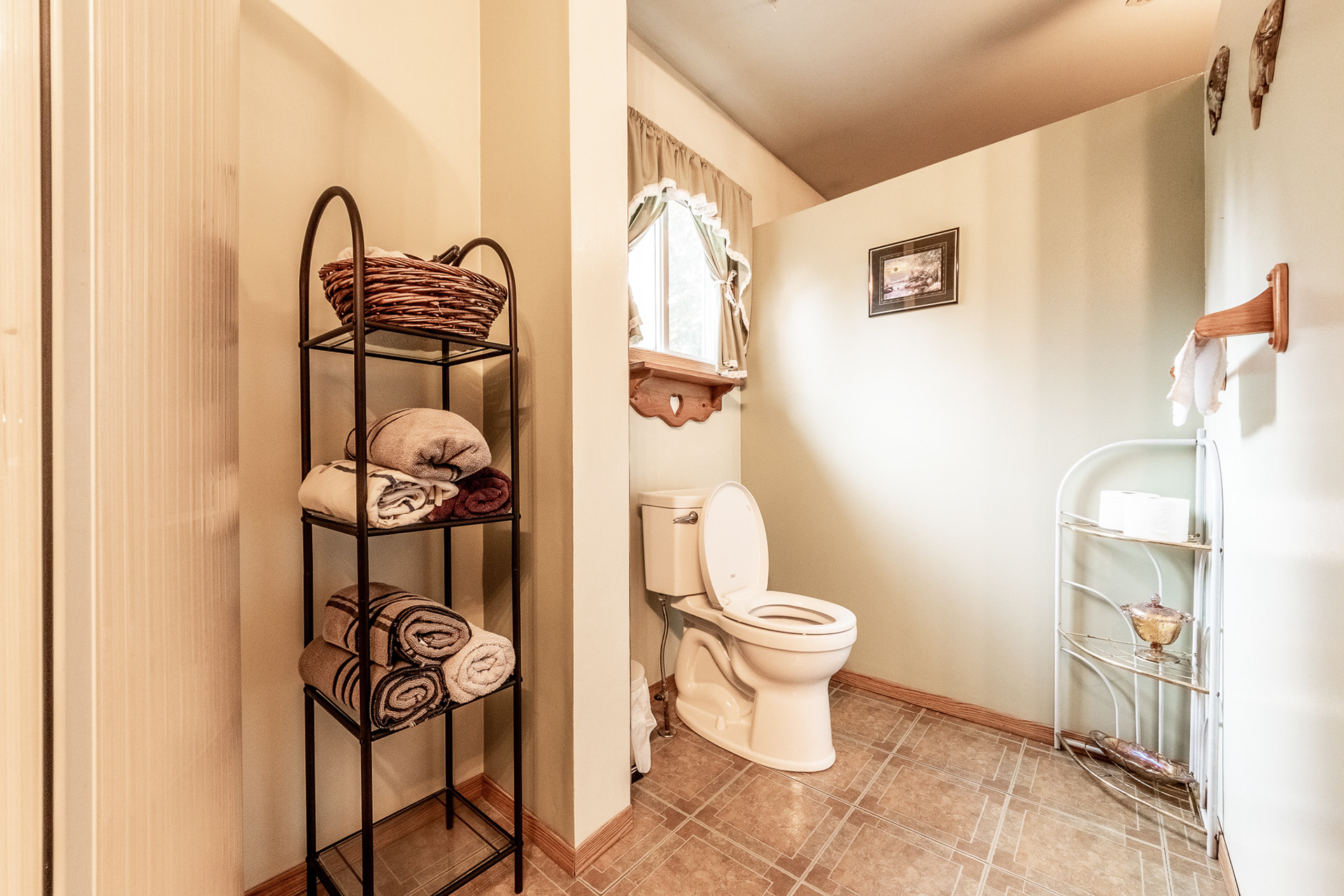
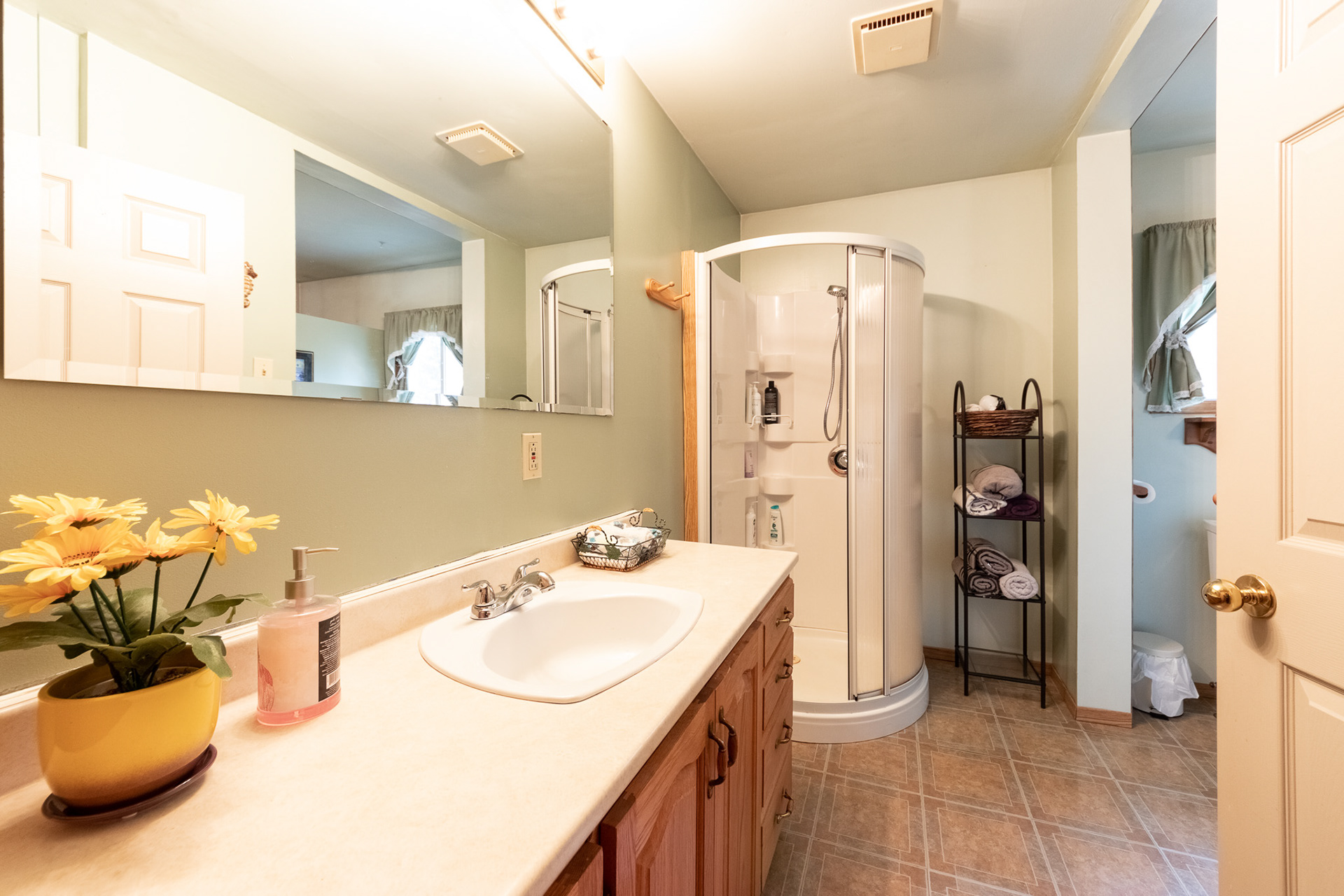
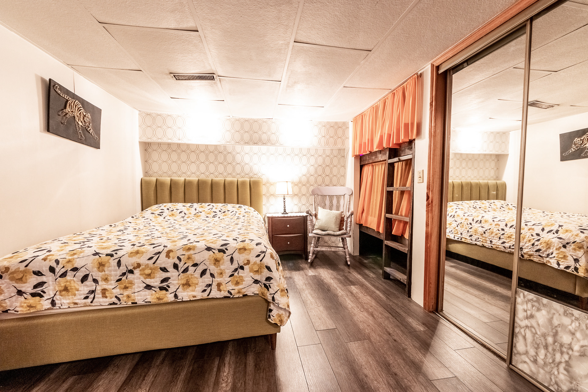
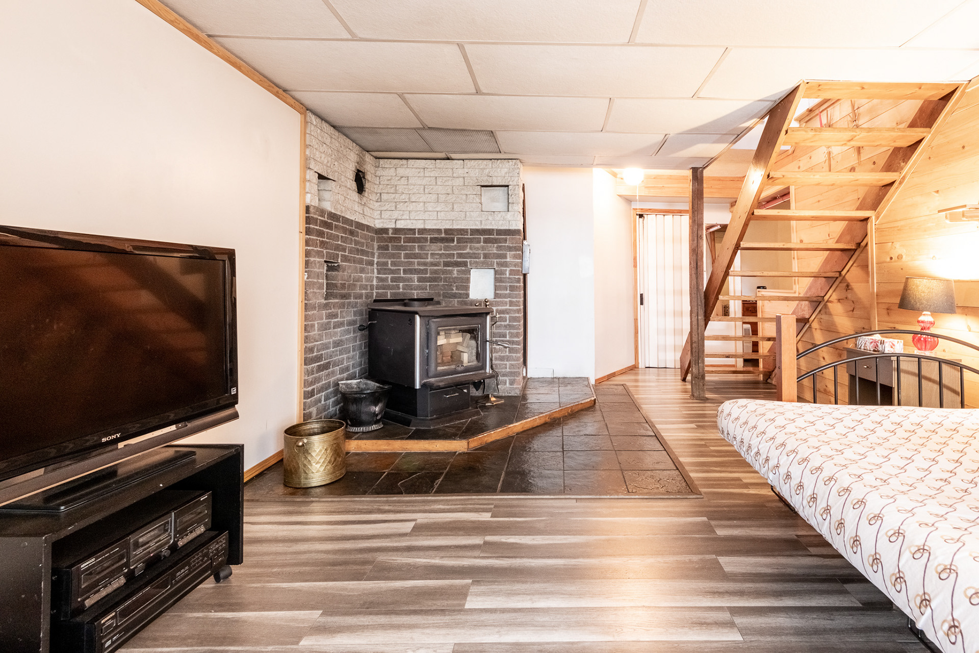
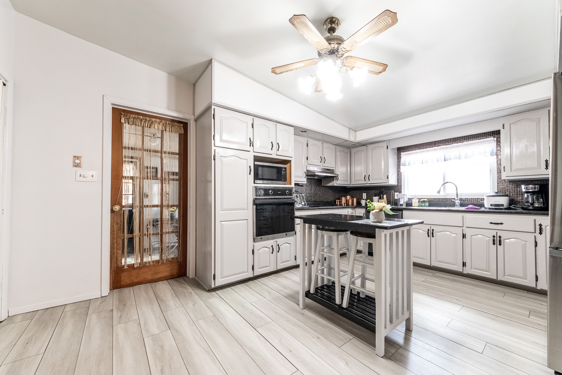
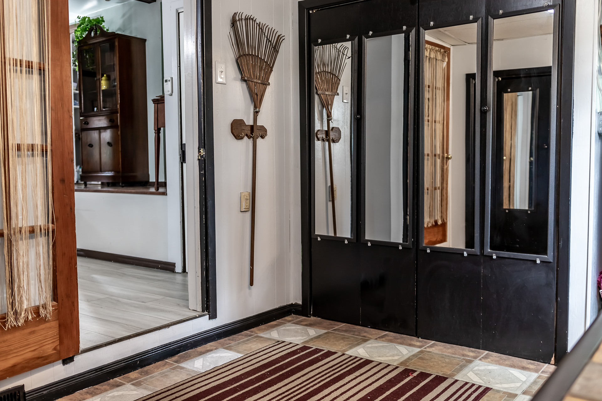
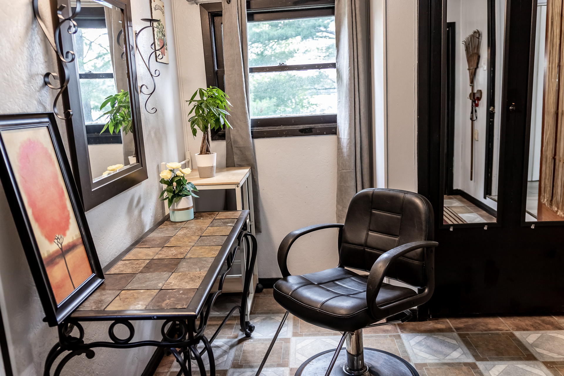
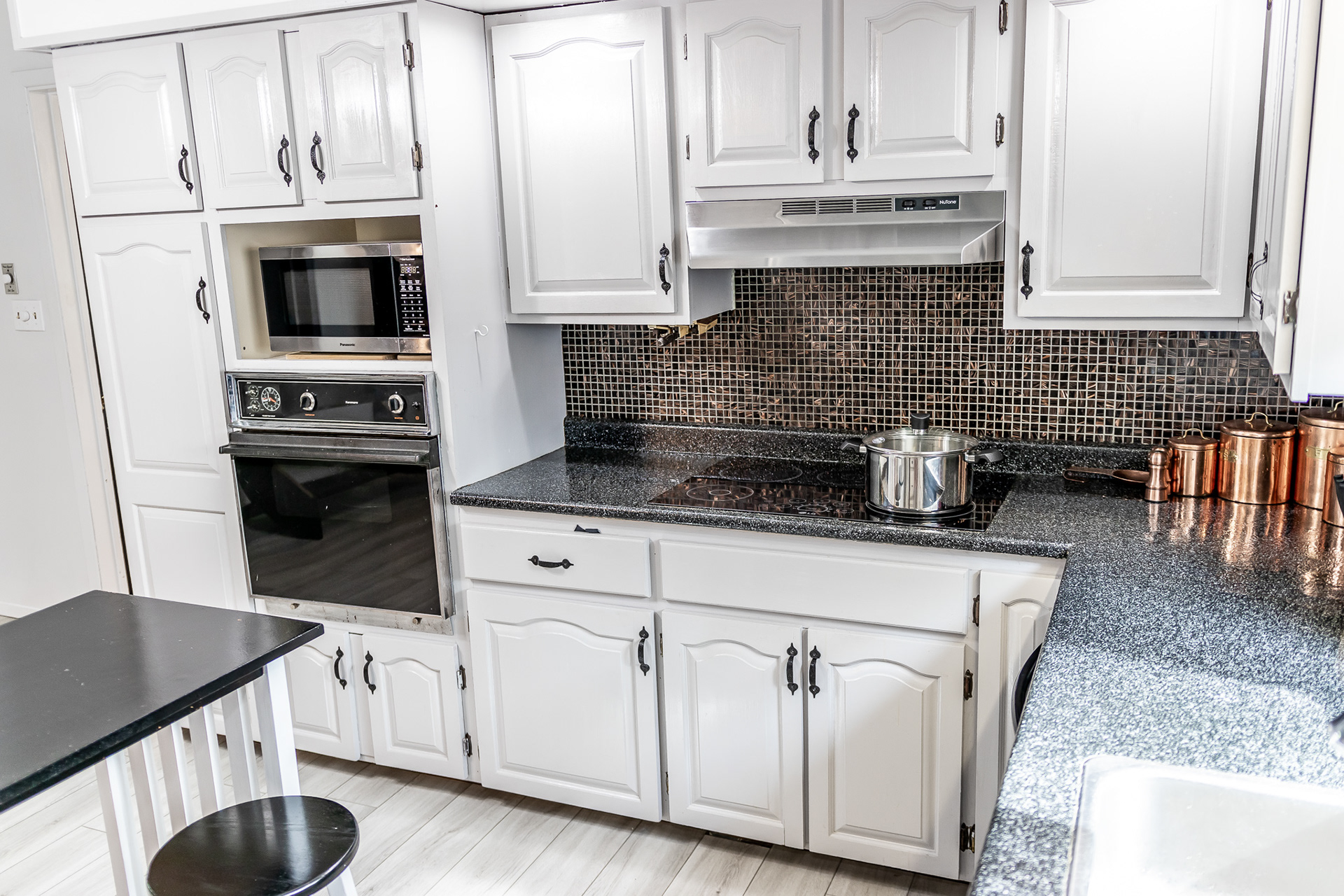
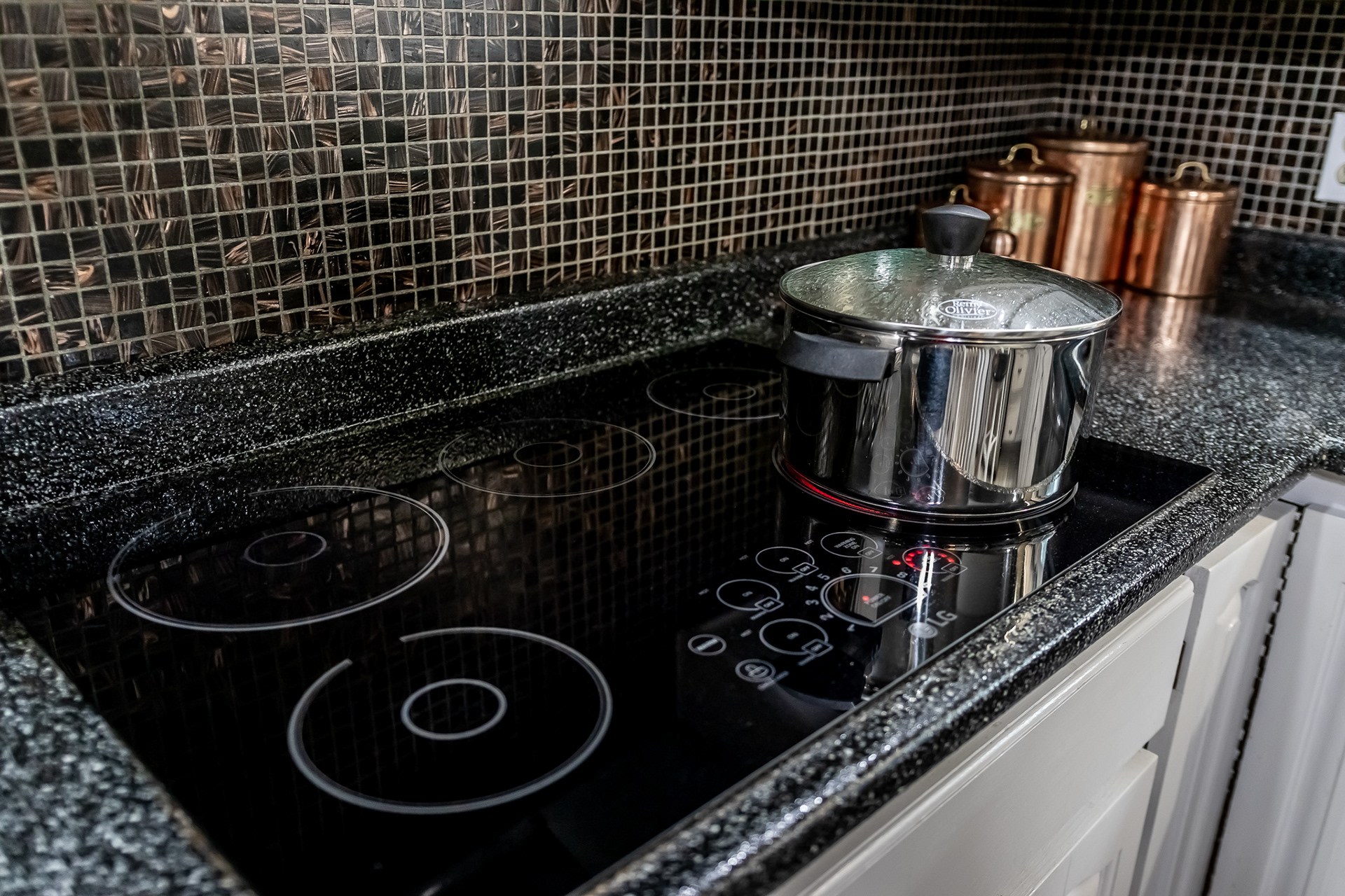
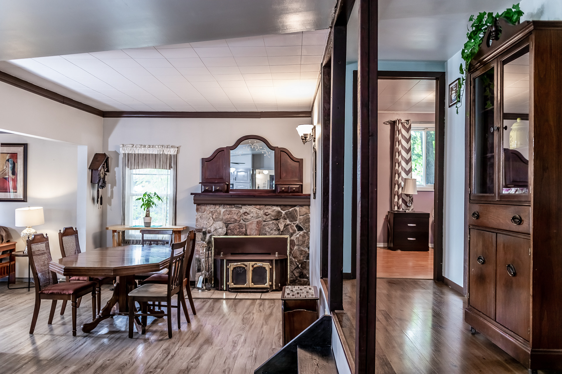
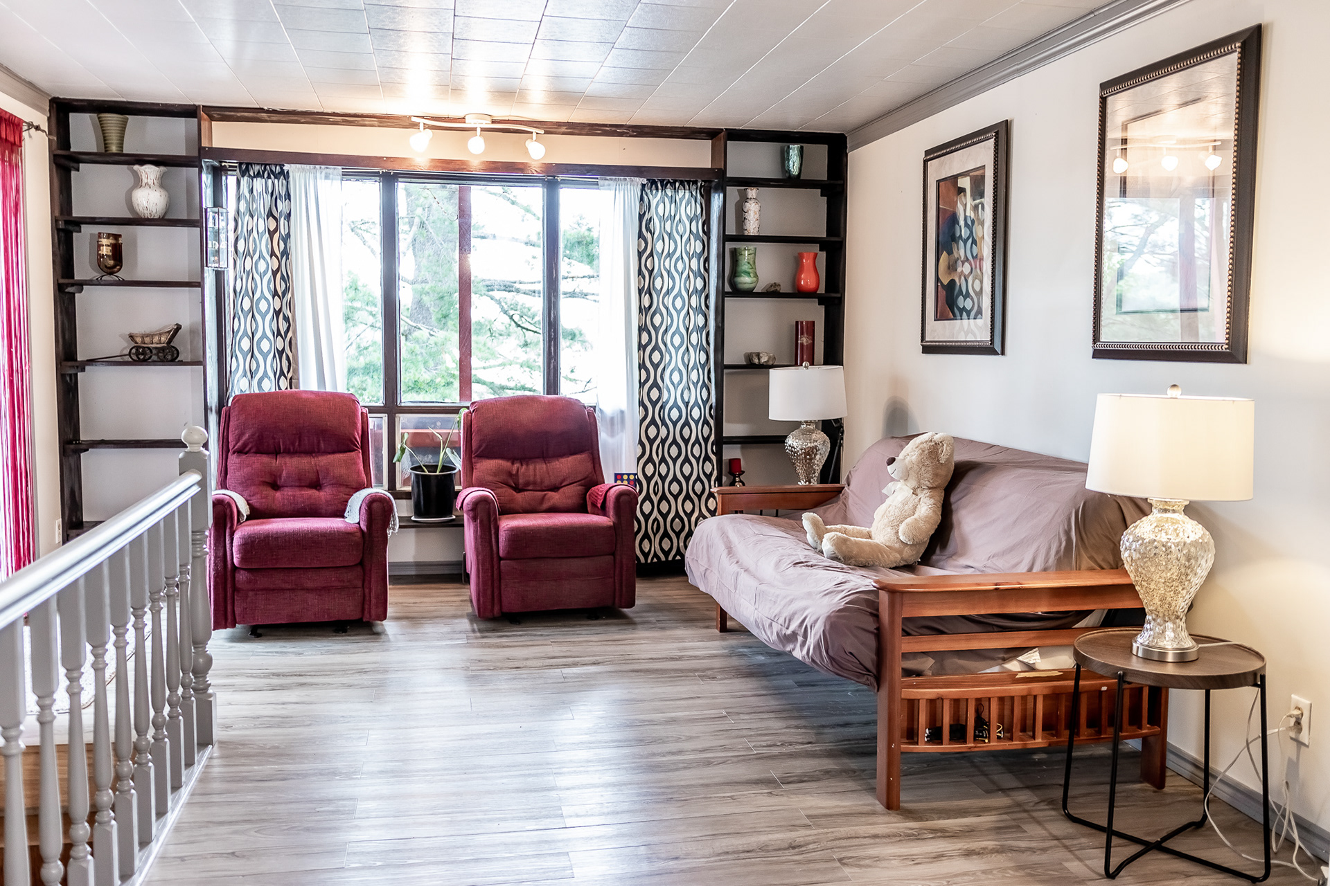
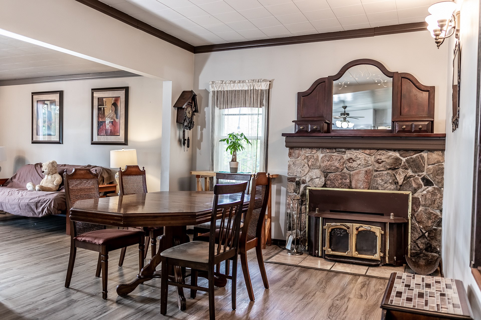
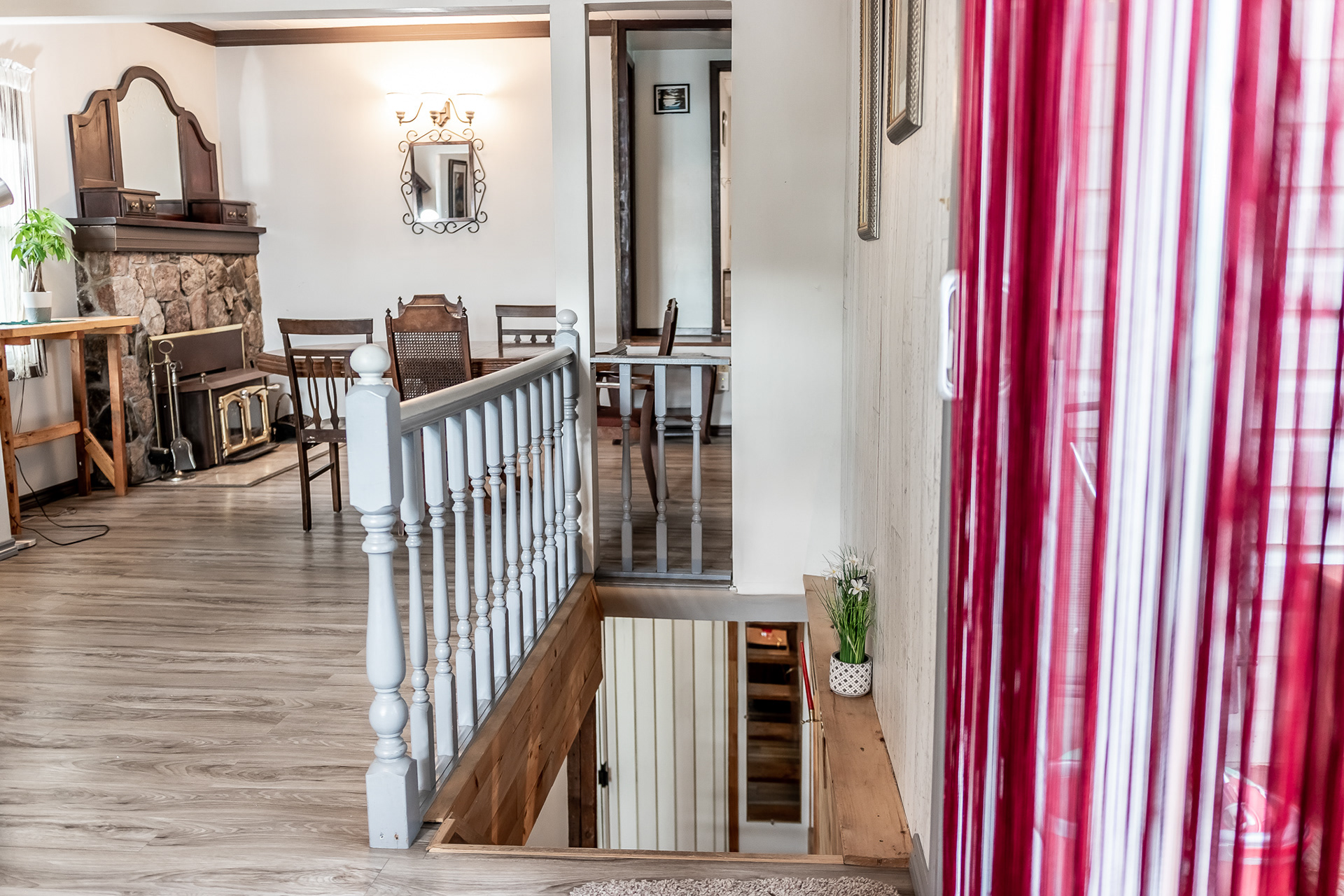
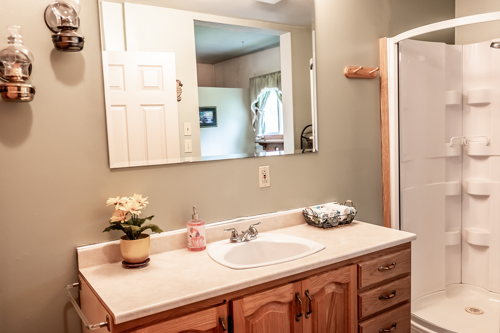
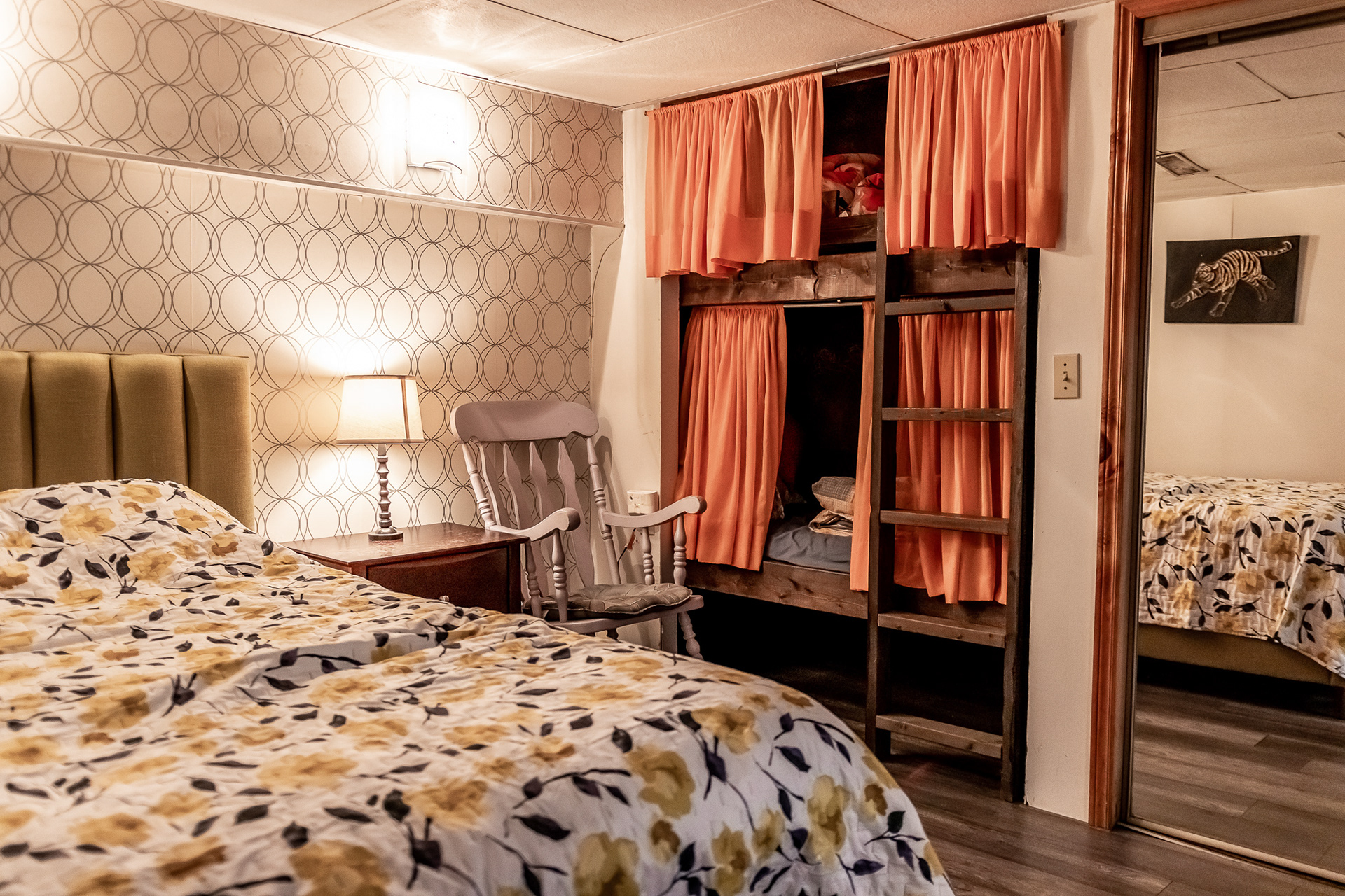
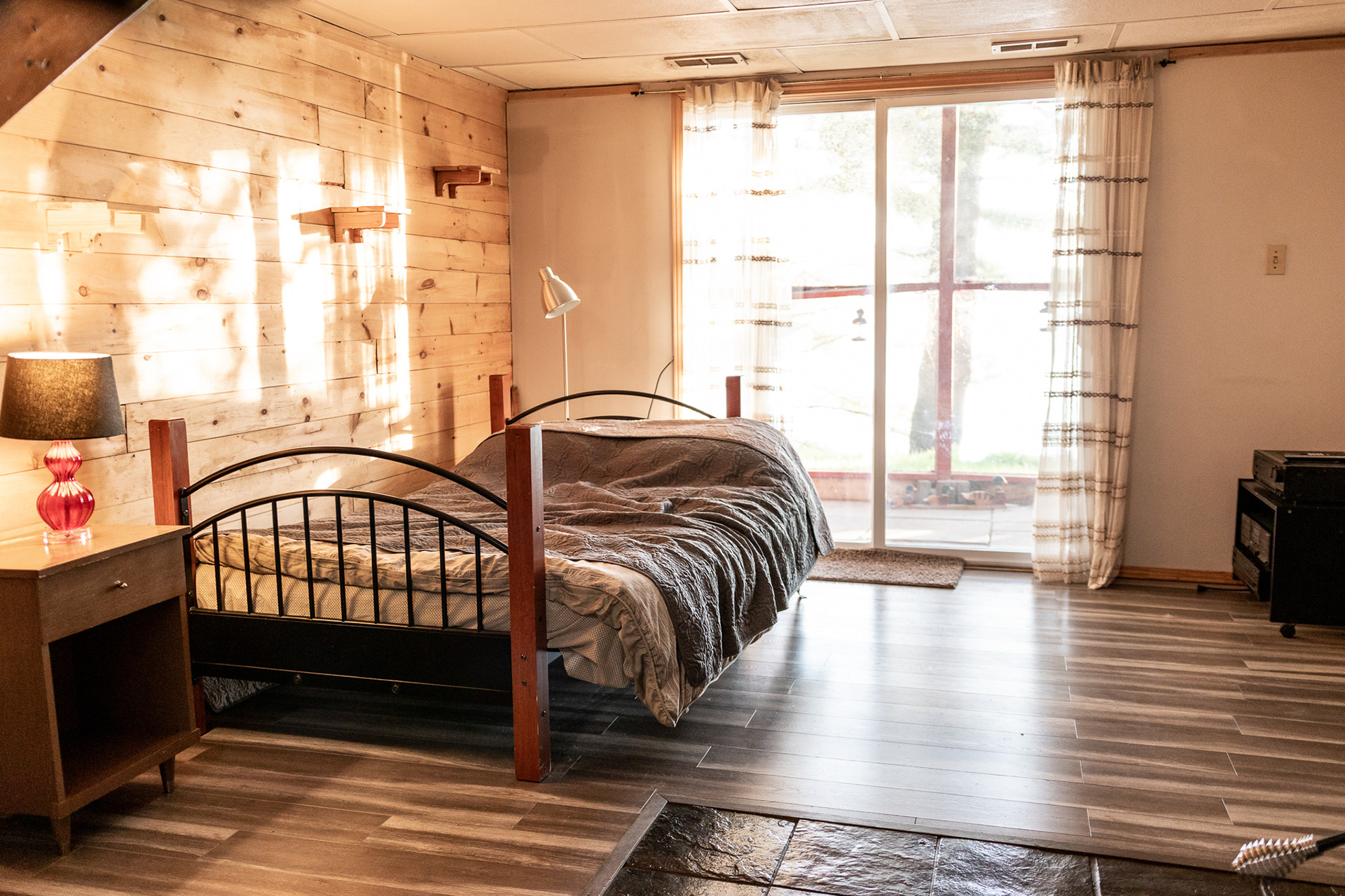
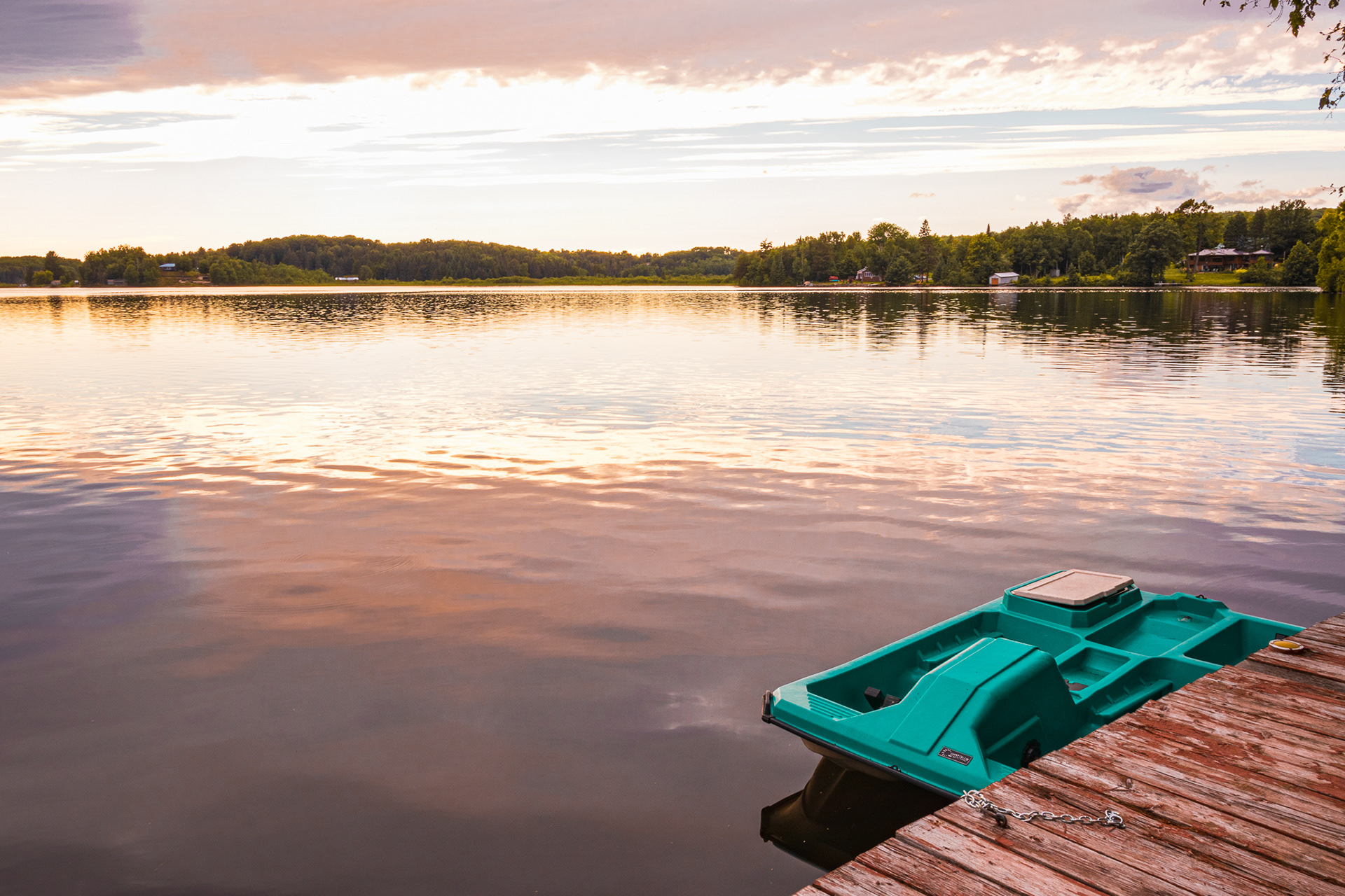
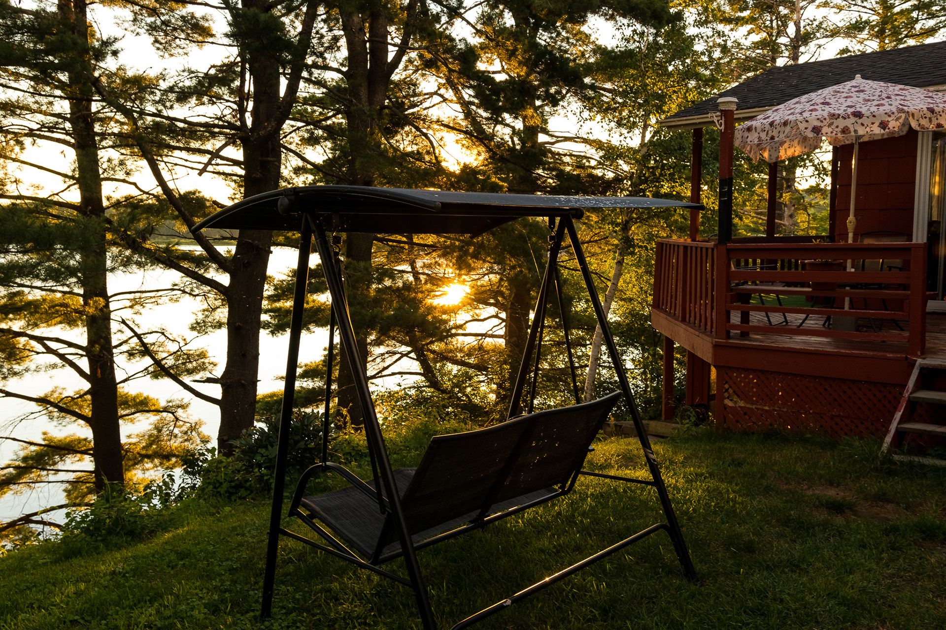
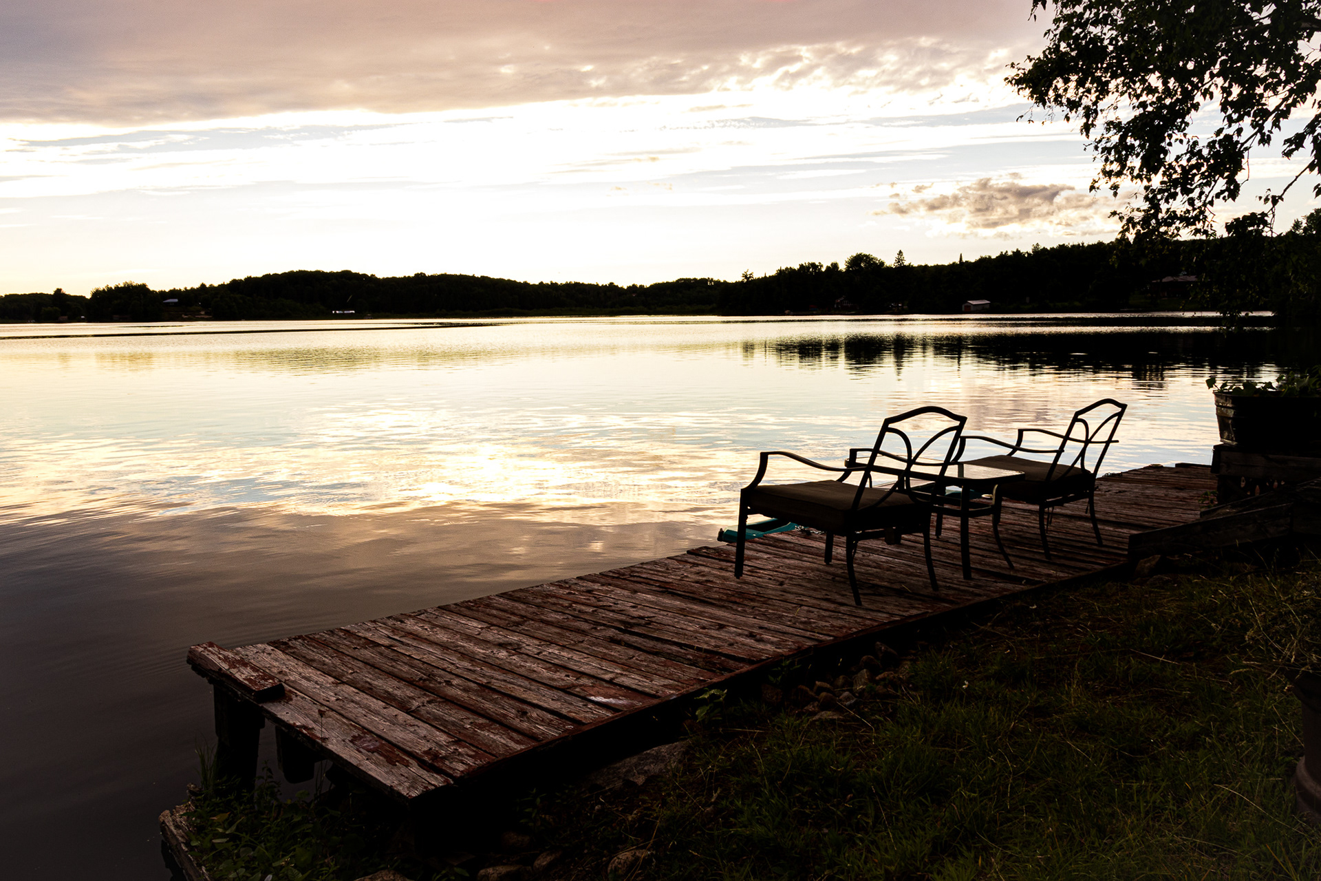
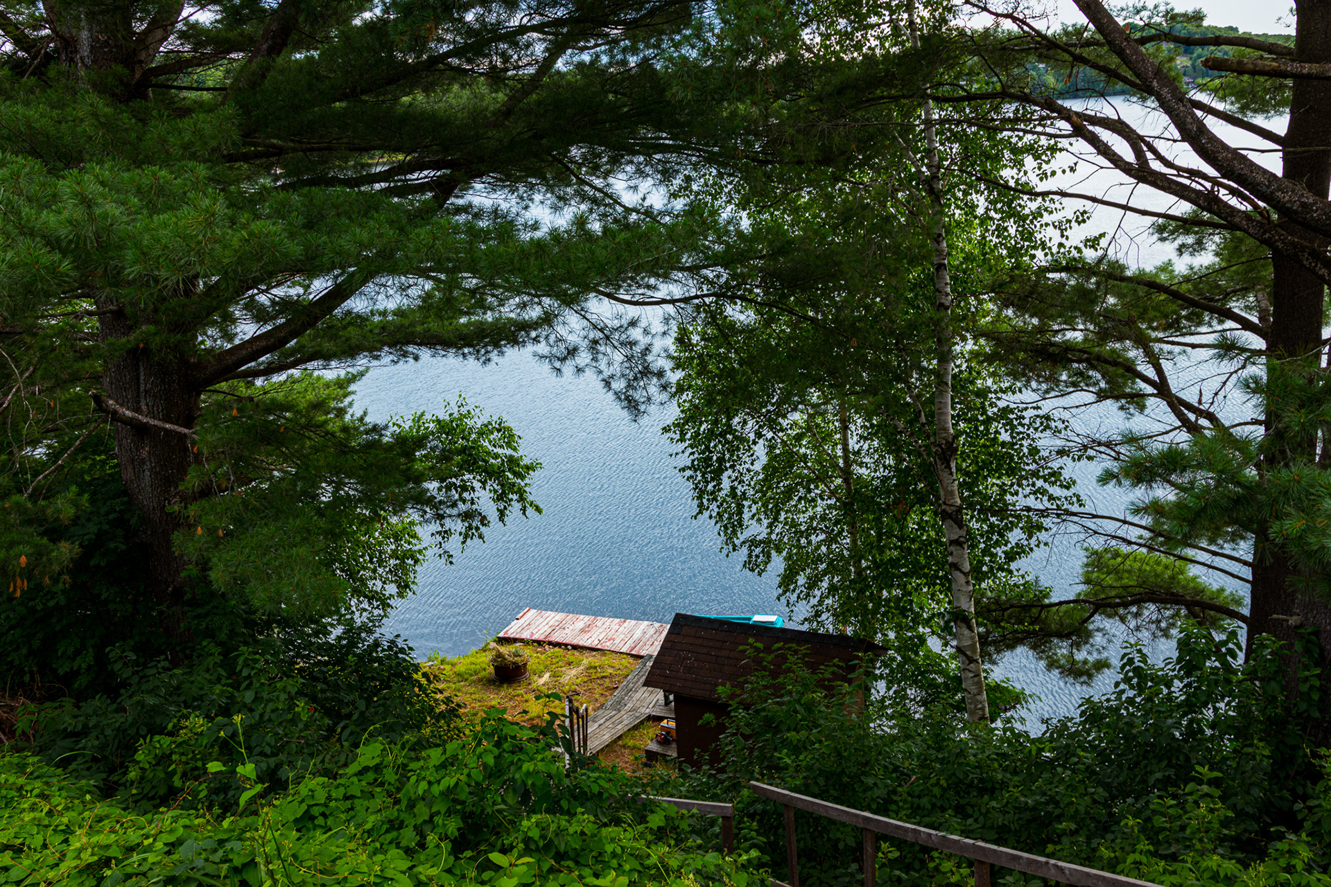
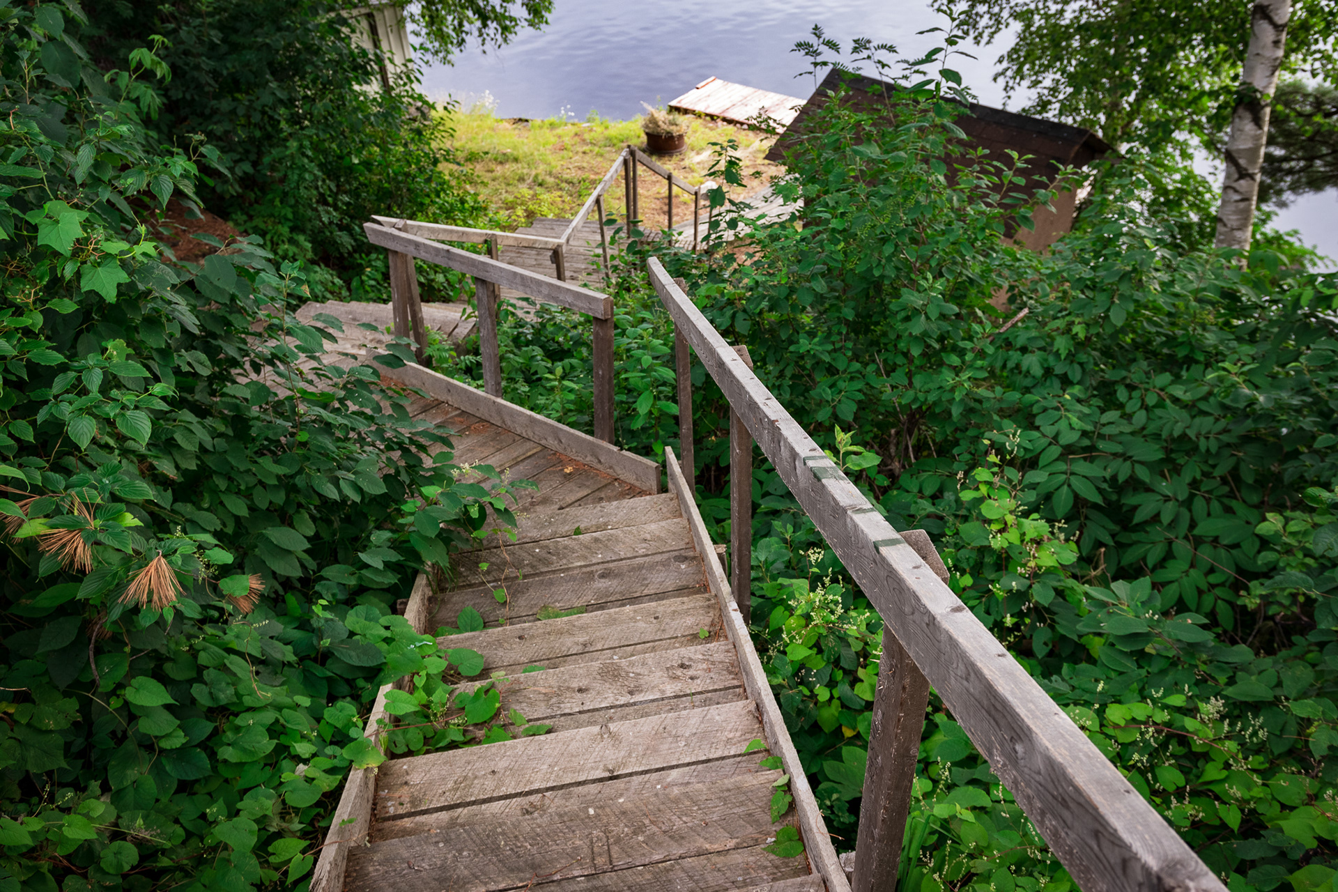
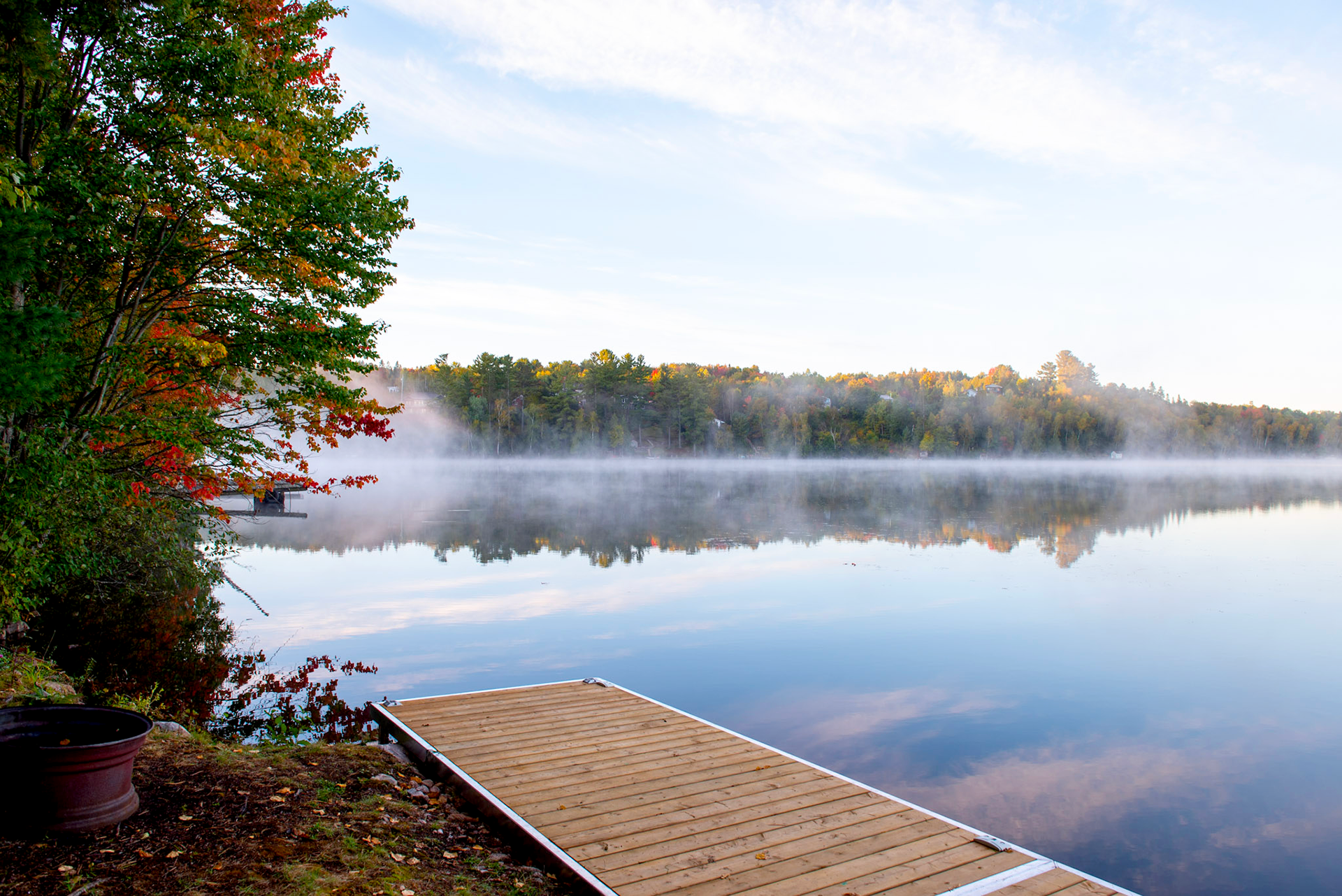
Photography:
Having high-resolution photographs is crucial in capturing the audience's attention. In order to achieve this, I utilized Sigma's ultra-wide-angle lens, which has excellent rendering of detail even up to the corners when used wide open at F2.8. The lens has an aperture range of 10-18mm. There's also a wide-angle lens available with an aperture range of 18-35mm. These lenses were very helpful in capturing entire rooms, even in tight spaces. They produced amazing results for both interior and exterior photos in real estate photography.
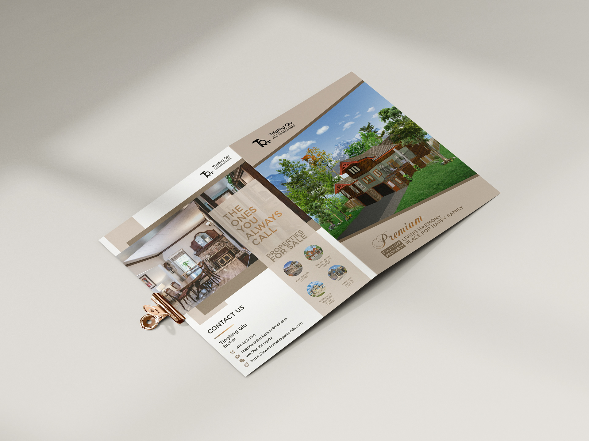
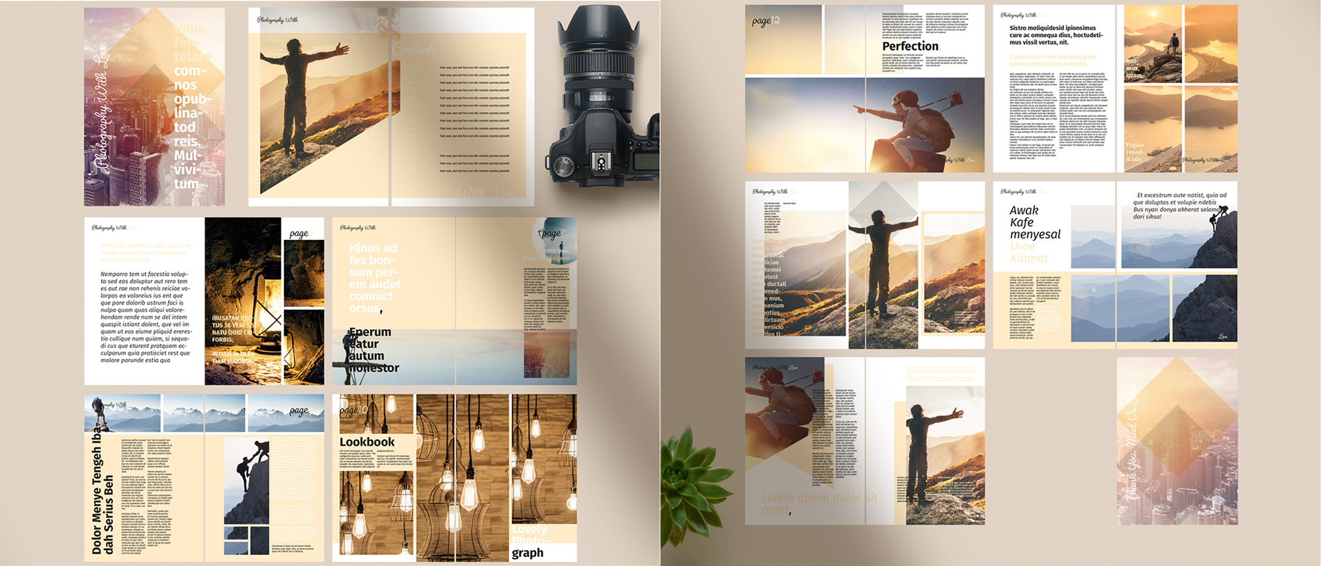
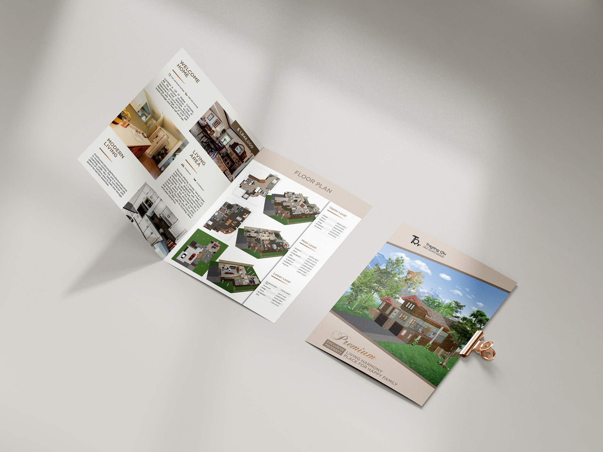
Final Result: 4 pages Real Estate Booklet Design
The brochure or booklet was created with consistency in mind, making sure that the layout, colour, and font used on each page matched the other panels. This was done to ensure readability, clarity of thought, and visual appeal. The use of powerful words and quotes throughout the brochure emphasized the brand's reliability and trustworthiness. The call to action was made more prominent by using larger font sizes and different colours. The icons used in the design supported the meaning of the text and were easy to understand. Finally, a gradient bar was added, which was connected to the subtitle to help keep the layout organized.
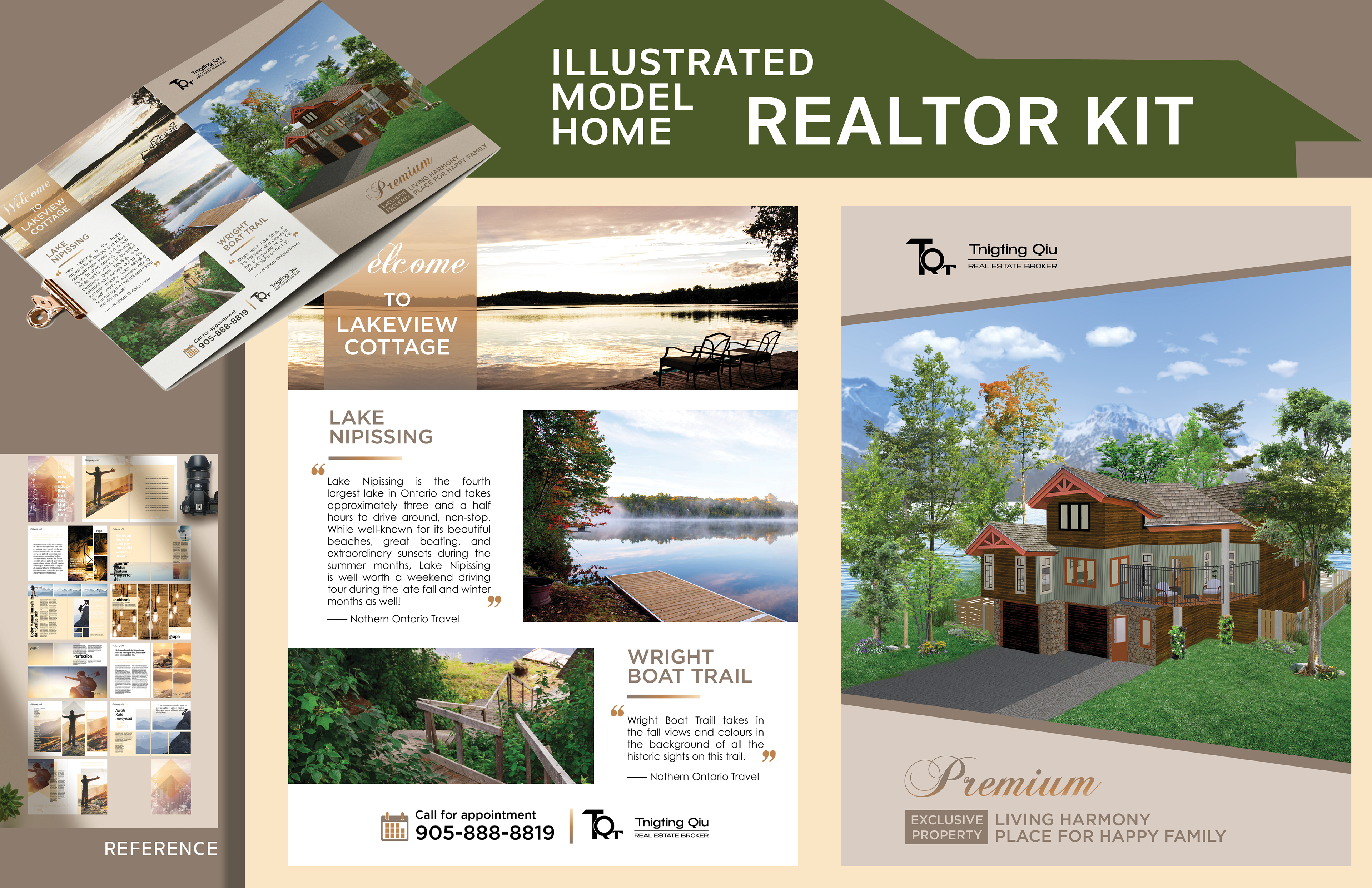
Final Result: 8 pages Real Estate Booklet Design