
Challenge:
The primary difficulty in this project was to portray the vintage style. To achieve this, I researched posters from the Golden Age of Rail Trail, which spanned from 1910 to 1959. Based on this research, I selected the final colour palette. Another challenge was the composition of the artwork. I had to consider the perspective of the landscape to determine the different sizes and layouts of assets, which would capture the scene of Vince City.
Target Audience:
People who like the vintage style.
Inspiration:
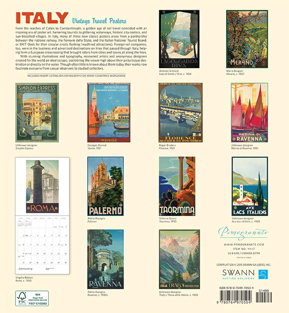
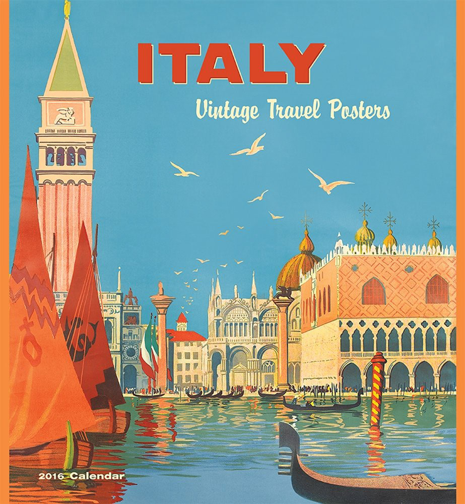
The vintage travel wall calendar featured classic posters advertising destinations on railway lines that passed through Italy, inspiring the project.
Resource:
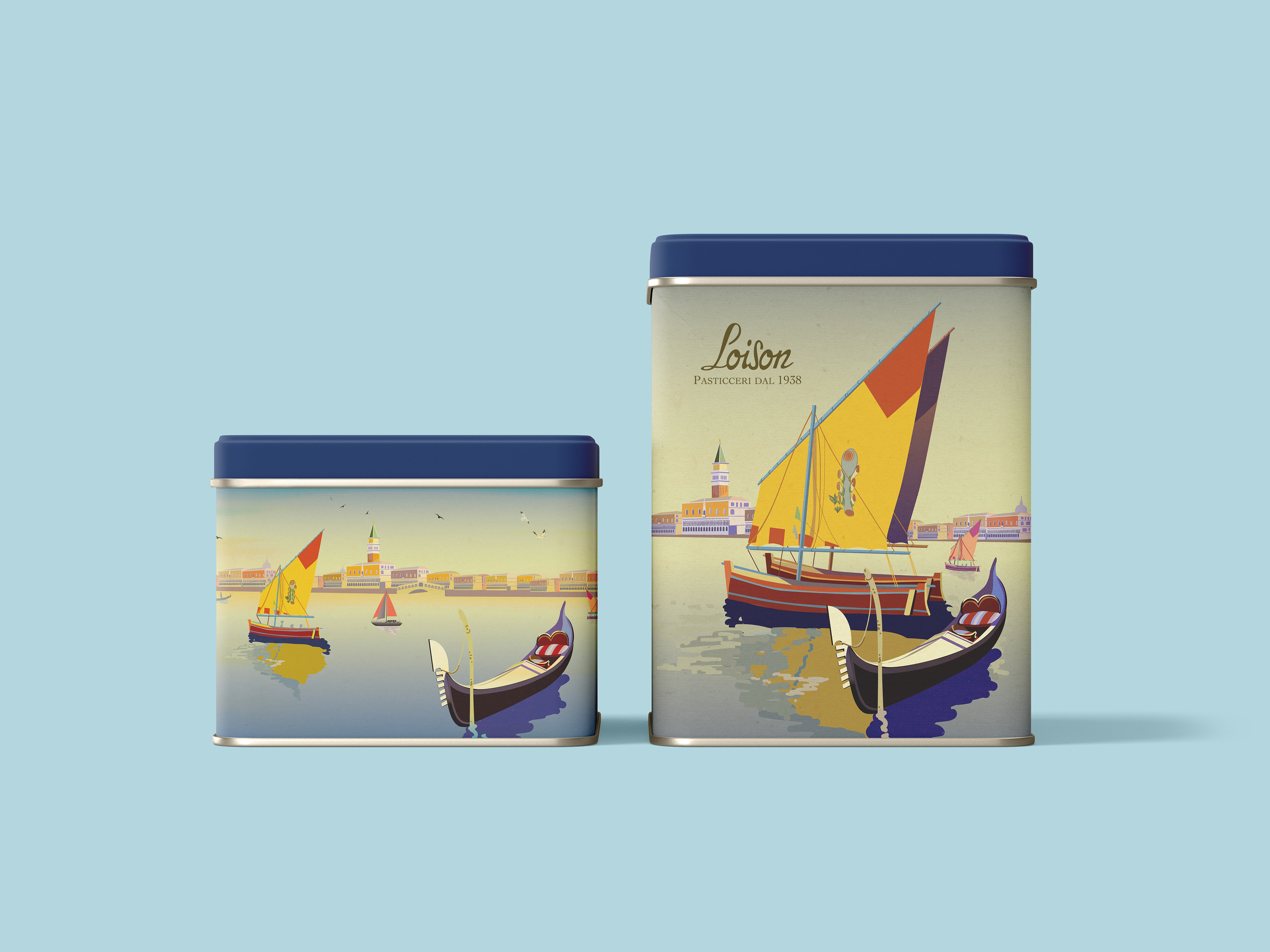
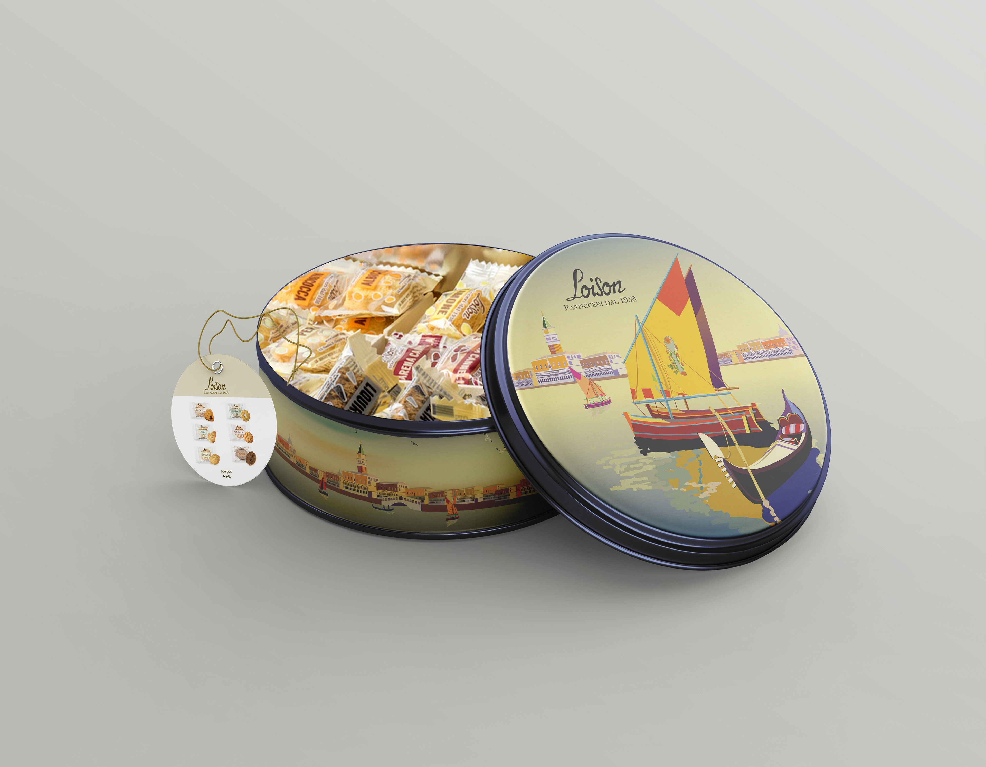
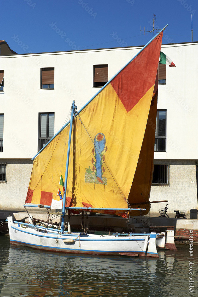
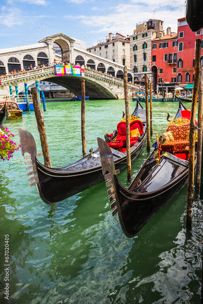
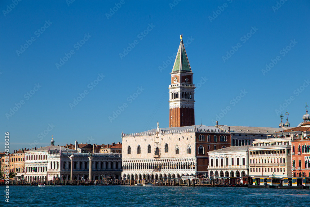
I chose three photographs of famous Venetian tourist attractions to illustrate the characteristics of Venice.
Colour Palette:
I researched posters from the Golden Age of Rail Trail (1910-1959) and selected the final color palette inspired by them.


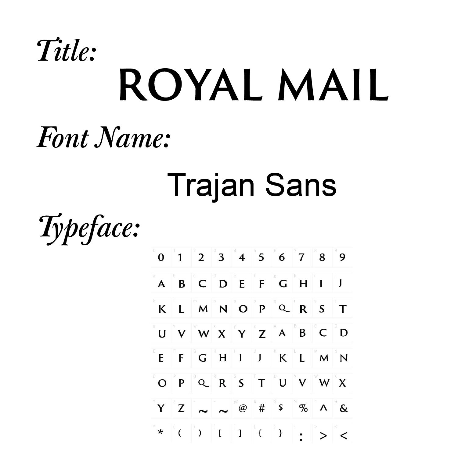
Font Choice:
Process:
I chose some photographs of well-known tourist spots in Venice that are located directly on the water. Then, I adjusted their size and layout and created illustrations of them using Adobe Illustrator. The result is a neat, simple and geometric design. After that, I added ink and paper textures to the poster using Adobe Photoshop's brushes and blending modes to make it look authentic. Finally, I created different sizes and assets of the poster using Adobe Photoshop and Illustrator for the final product.
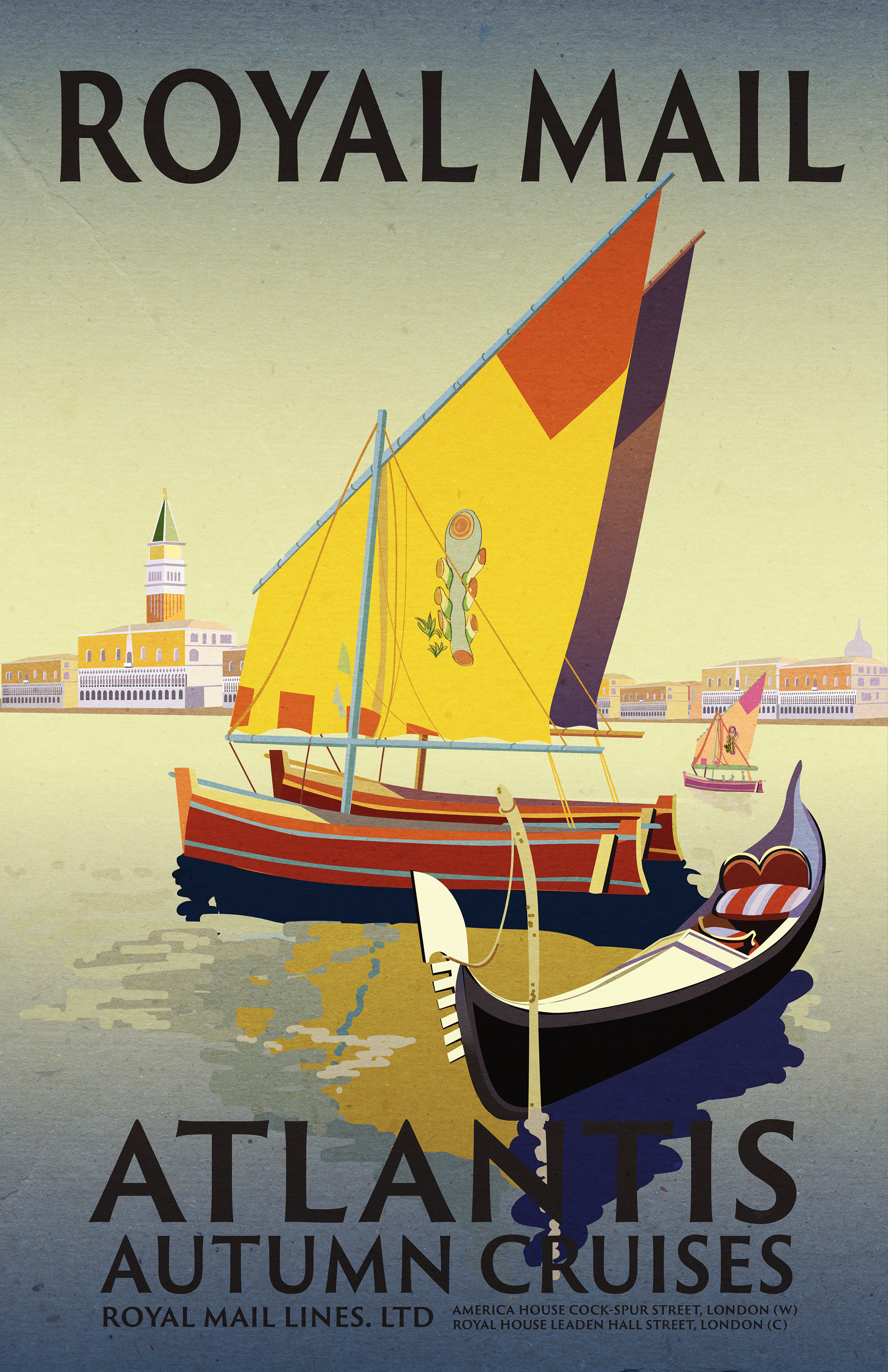
Textural Illustration created in Adobe Photoshop
Result (Animation & Packaging):
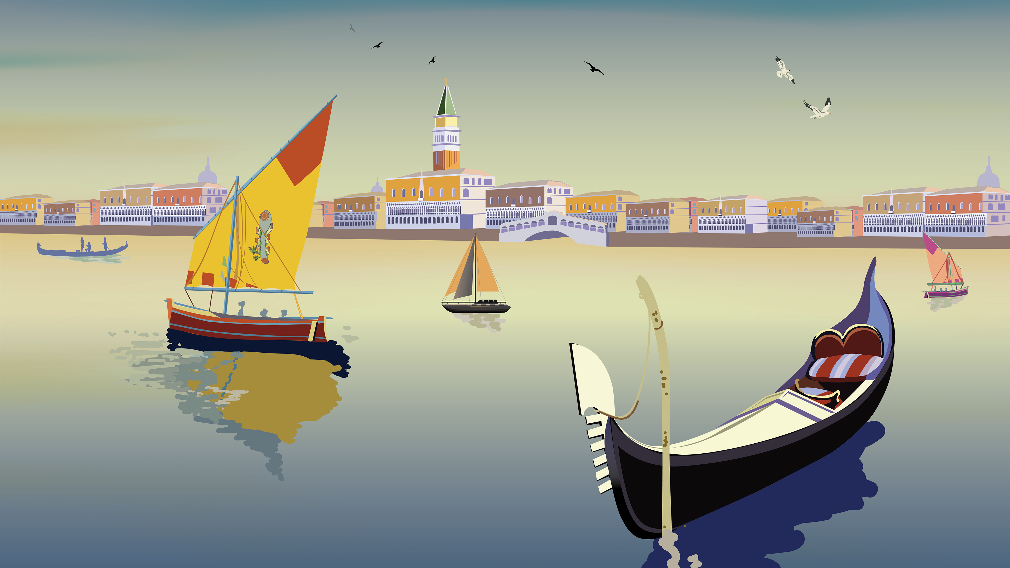
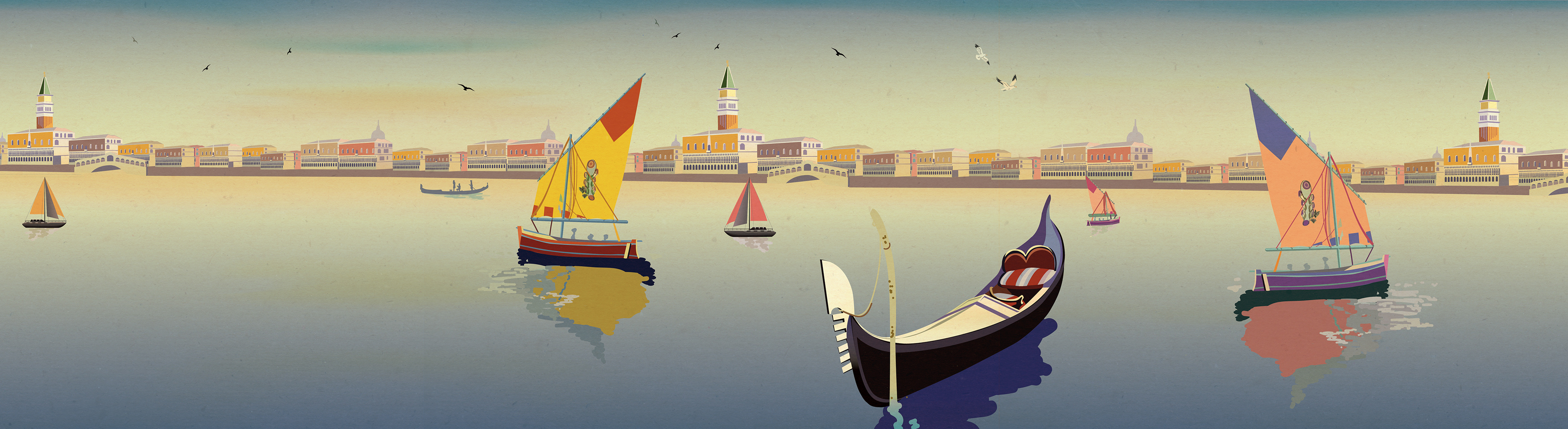
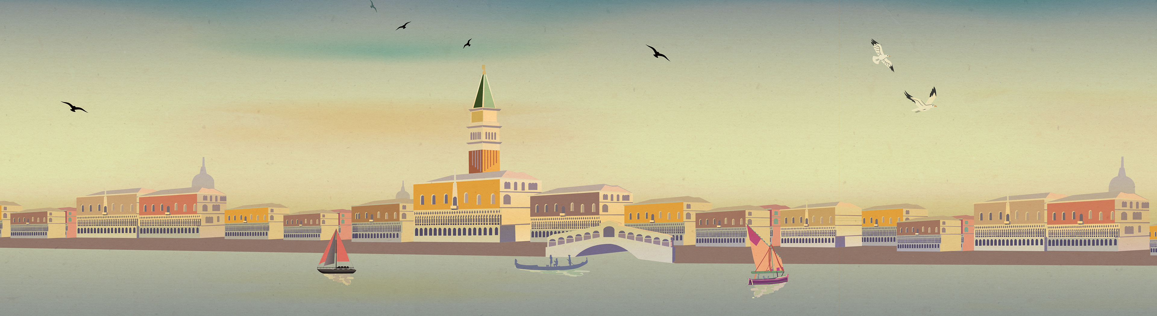
This vintage illustration is versatile and suitable for various mediums such as print, packaging, web, and motion to meet clients' requirements. I crafted a landscape diorama scene with added movement to give the audience an immersive experience. Additionally, I designed two cookie packages for the Italian company named Loison to promote its longstanding business and good reputation.