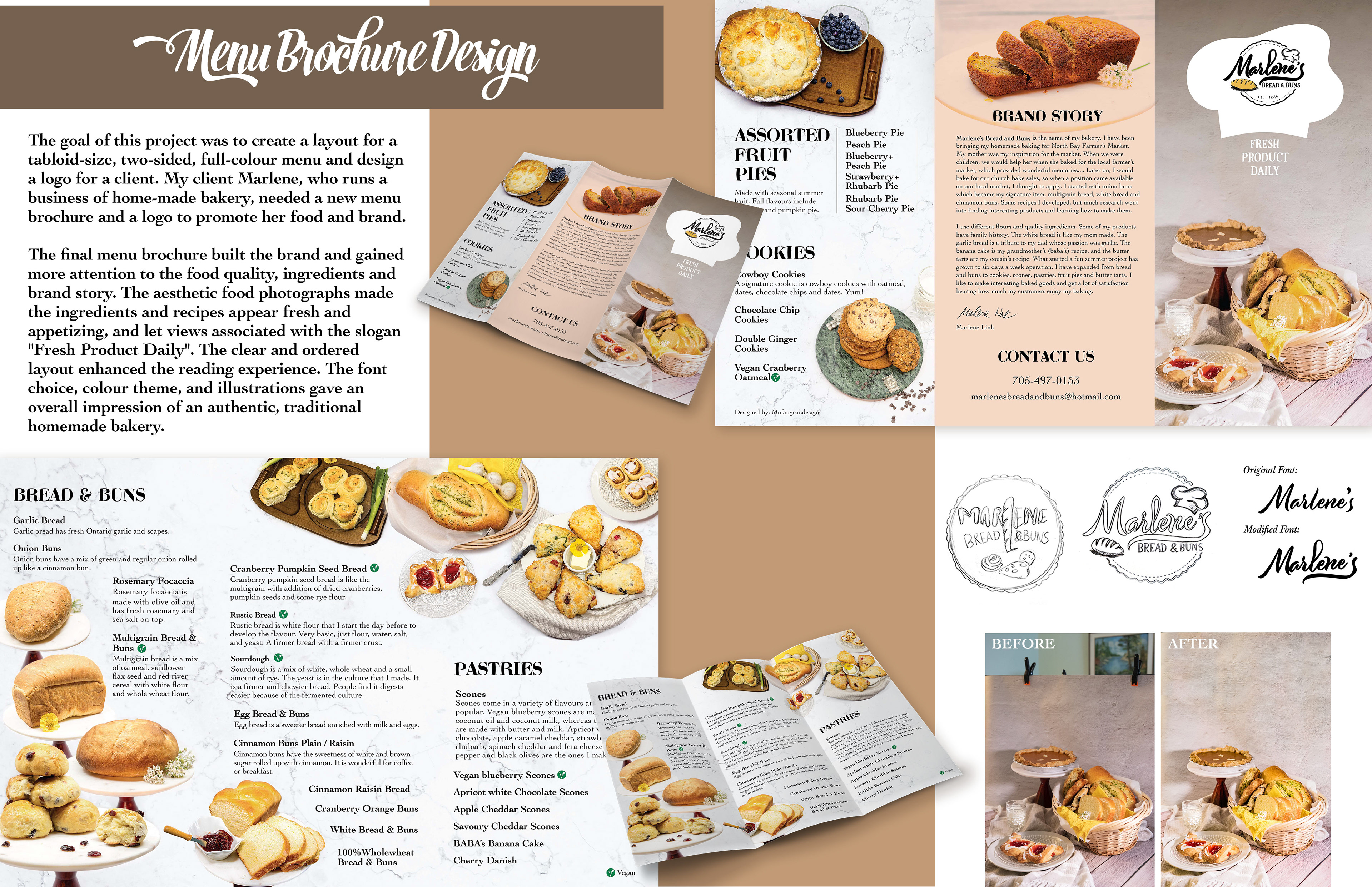

Challenge:
I faced two challenges in this case. First, arranging the text and photos to create a clear, attractive, and comprehensive layout was an essential design step. Second, maintaining regular communication with the client and keeping them informed about the design process was crucial. Efficiently communicating with clients was key to meeting their expectations without having to repeatedly make corrections to the design.
Target Audience:
Individuals seeking fresh bread, buns, pastries, cookies, and pies. They prioritize high-quality food over large quantities and low prices.
Background:
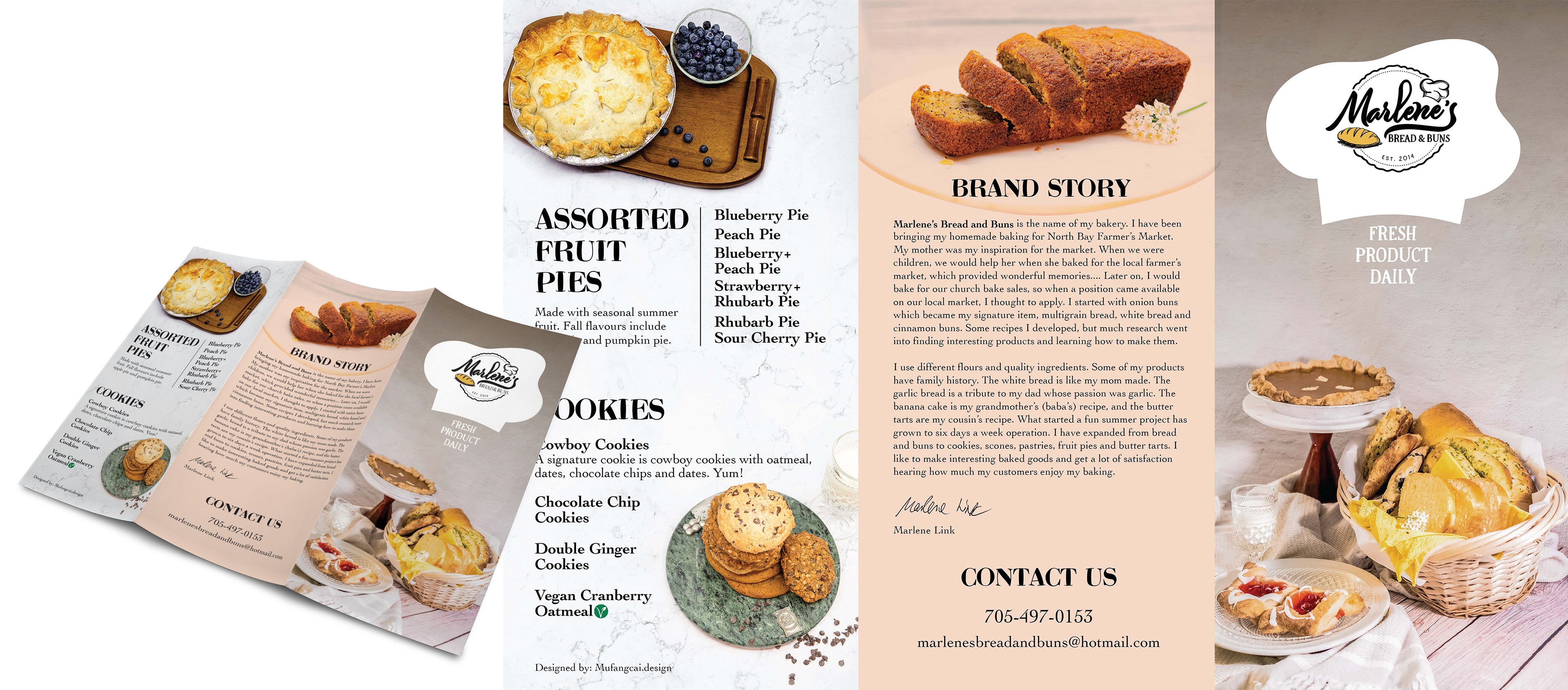
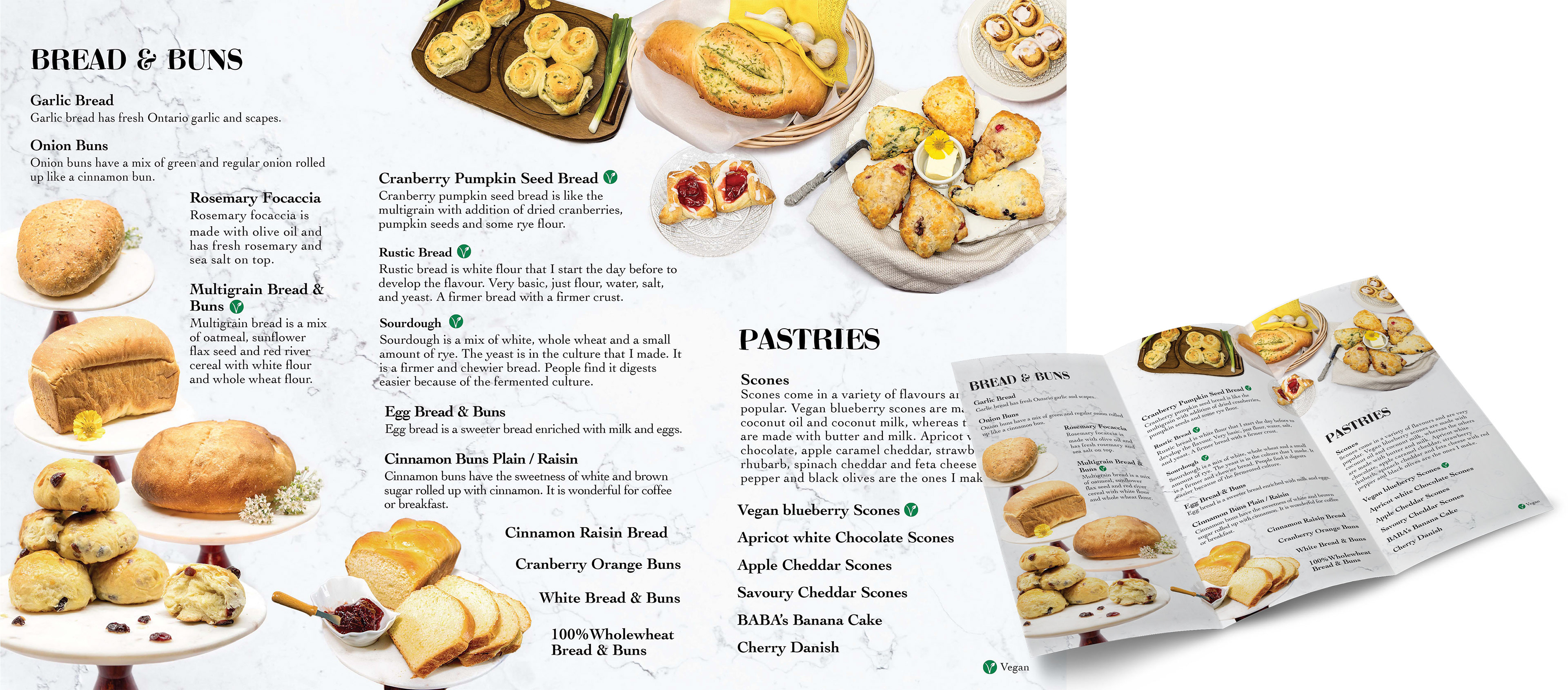
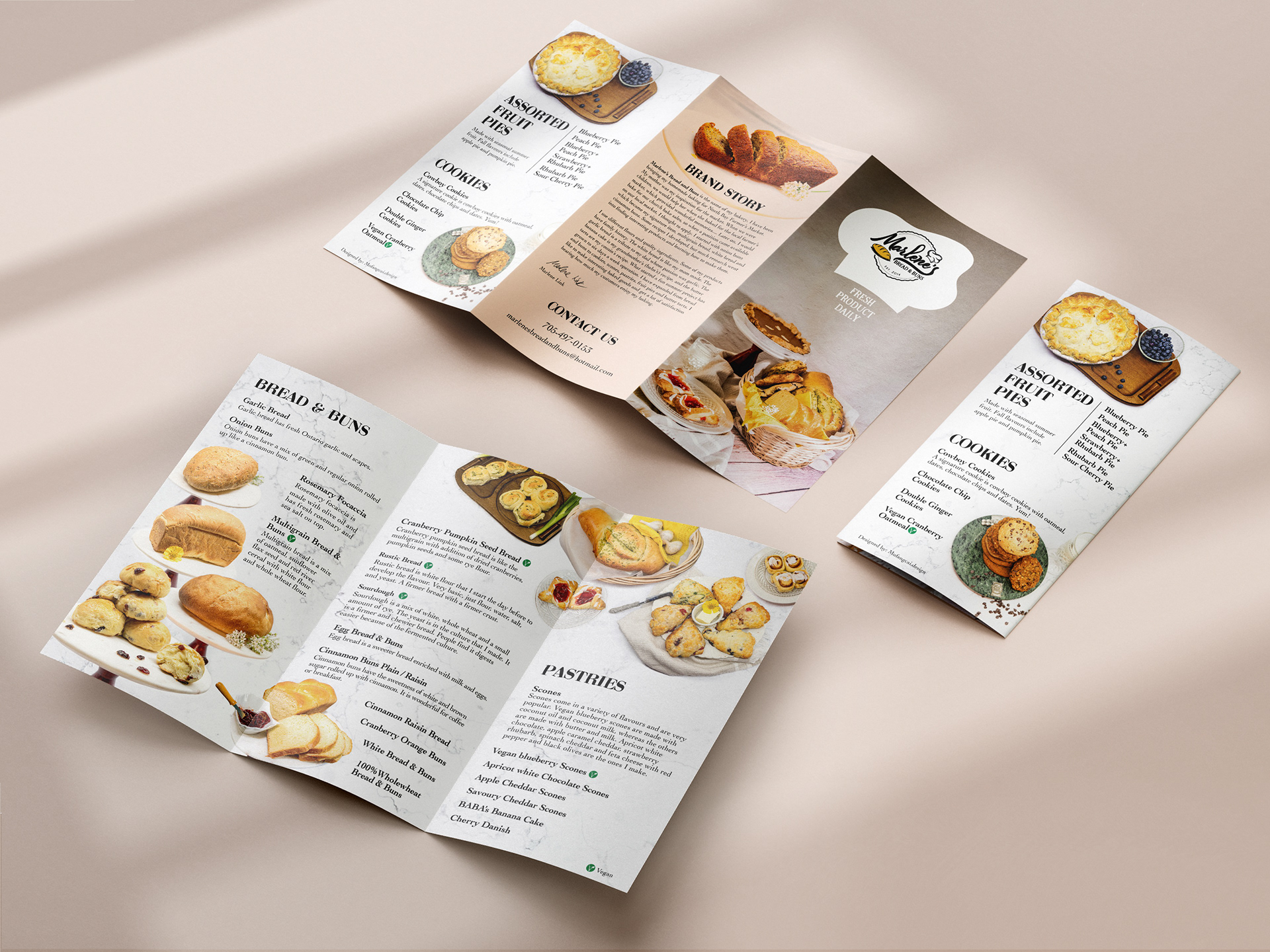
Marlene's Bread and Buns is the name of my client Marlene's bakery. She has been bringing her homemade baking to the North Bay Farmer's Market for eight years since she retired. Her bread and buns are moist, soft, spongy, and delicious, which is why I am passionate about promoting her food. However, her previous menu and logo do not effectively showcase her appetizing food or convey a strong selling point. The menu only consists of text and the font makes it difficult to read. Additionally, her previous logo, which was a stock icon, is too small. These issues need to be addressed in this project.

Marlene's Kitchen
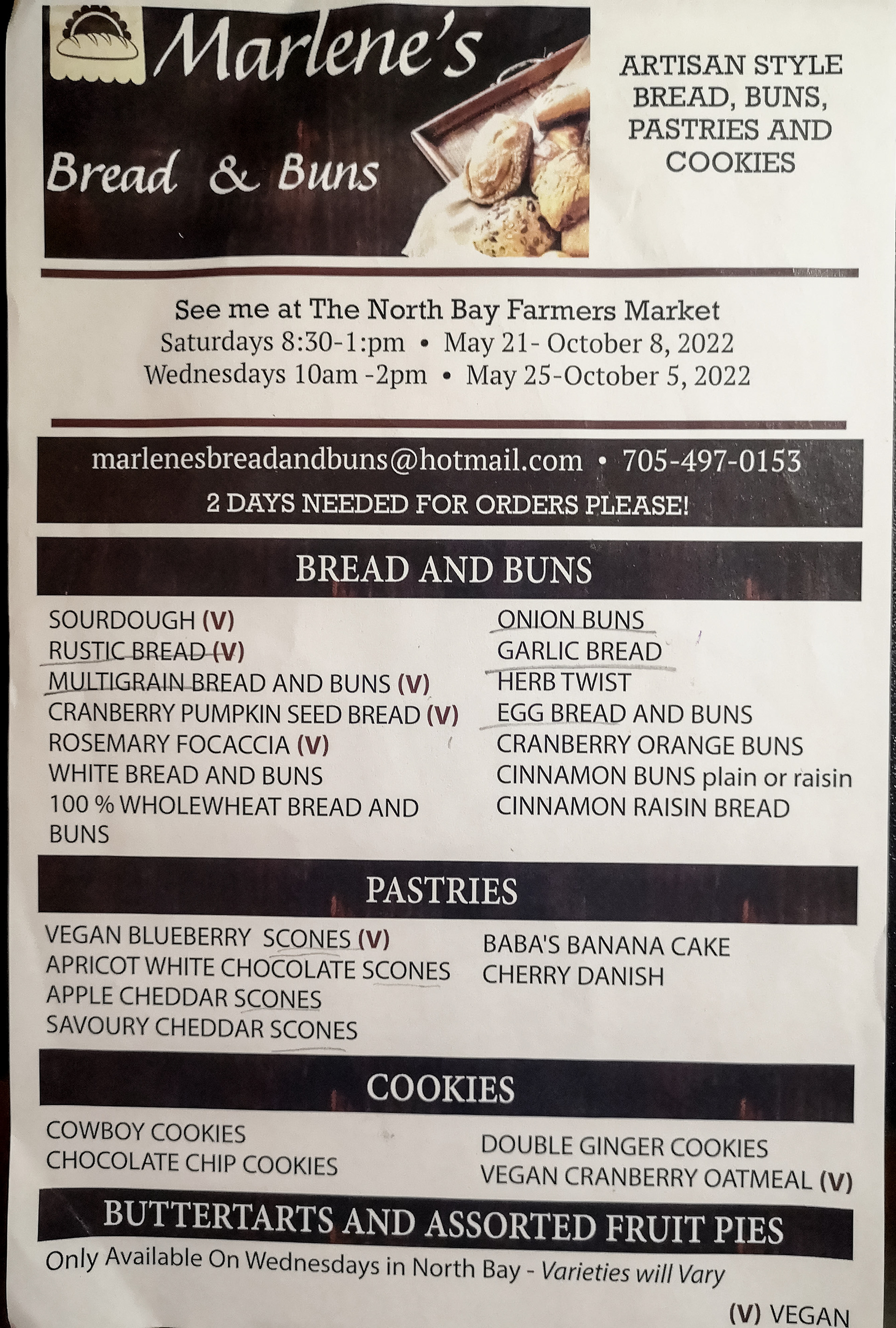
Previous Menu
Marlene's Kitchen Previous Menu
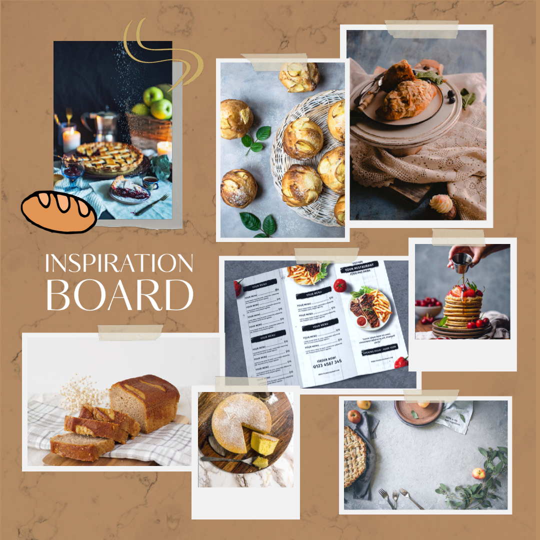
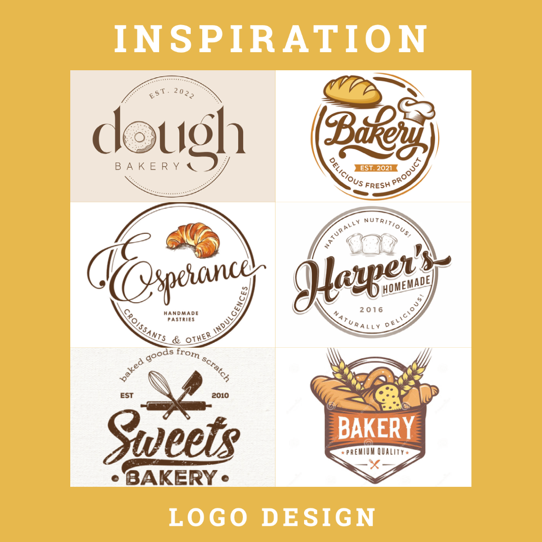
Inspiration:
I derived inspiration from the food photographs on Unsplash.com, the bakery's logo design, and the chef's brand story. Once I grasp the concept of the client's business, I aim to convey a sense of fresh food every day and narrate the story of my client and her product. This approach can draw more attention to the food quality and generate interest in the story behind the food.
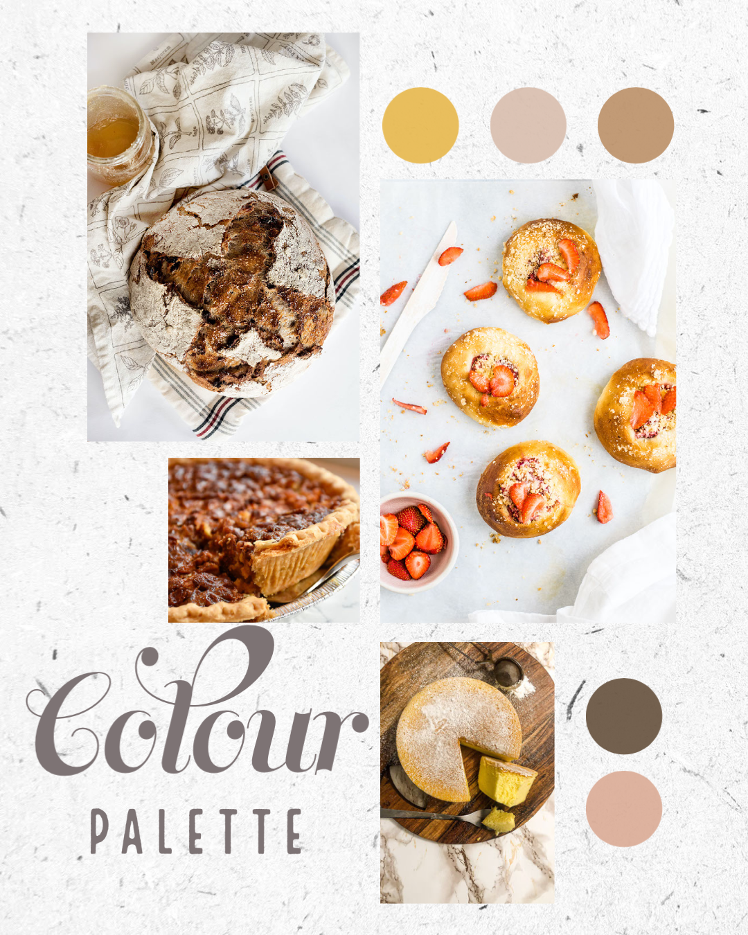
Colour Palette & Font Research:
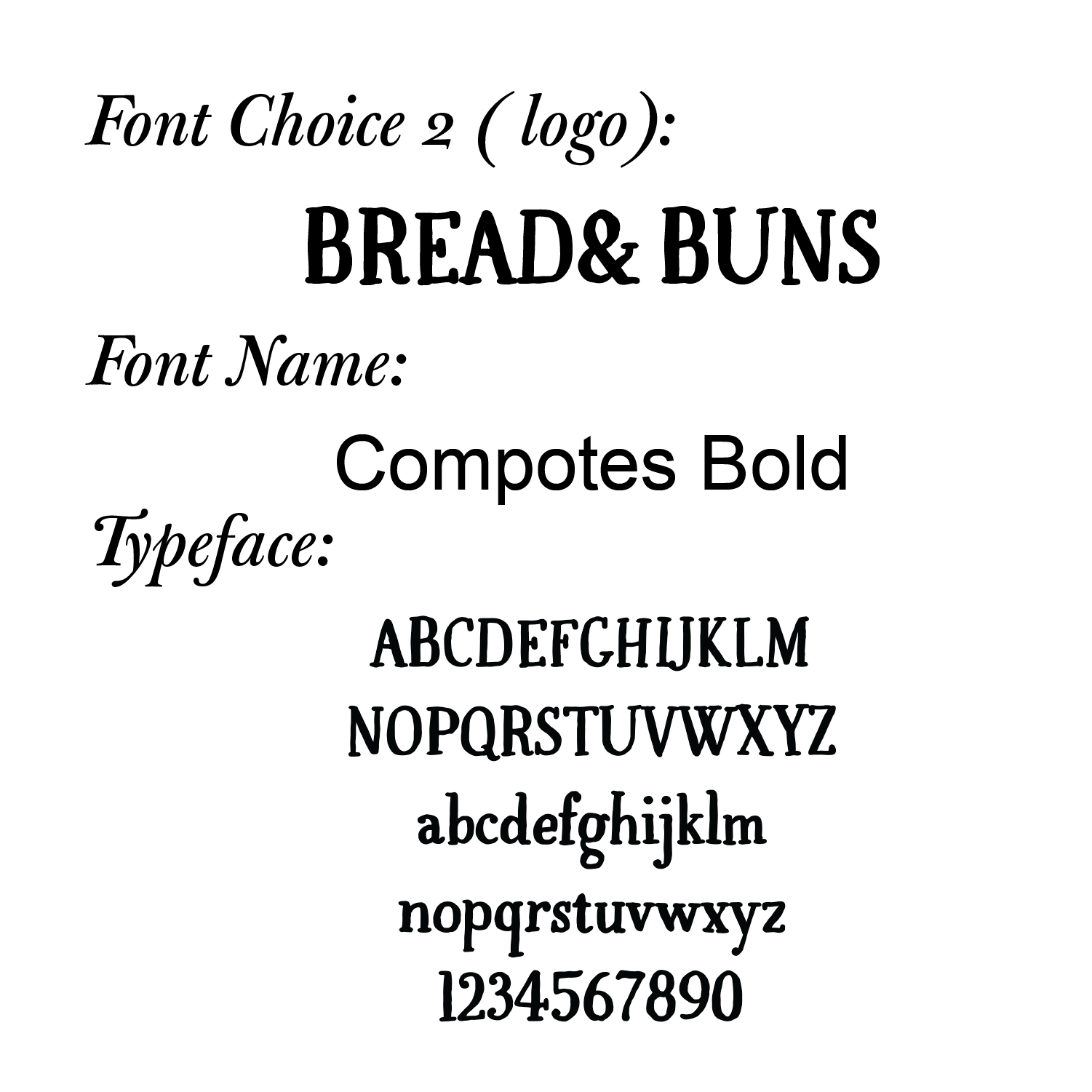
I chose soft white and grey colours for the background to contrast with the yellow and orange subjects. I opted for a chunky and playful serif font for the header, which is associated with the shape of bread.
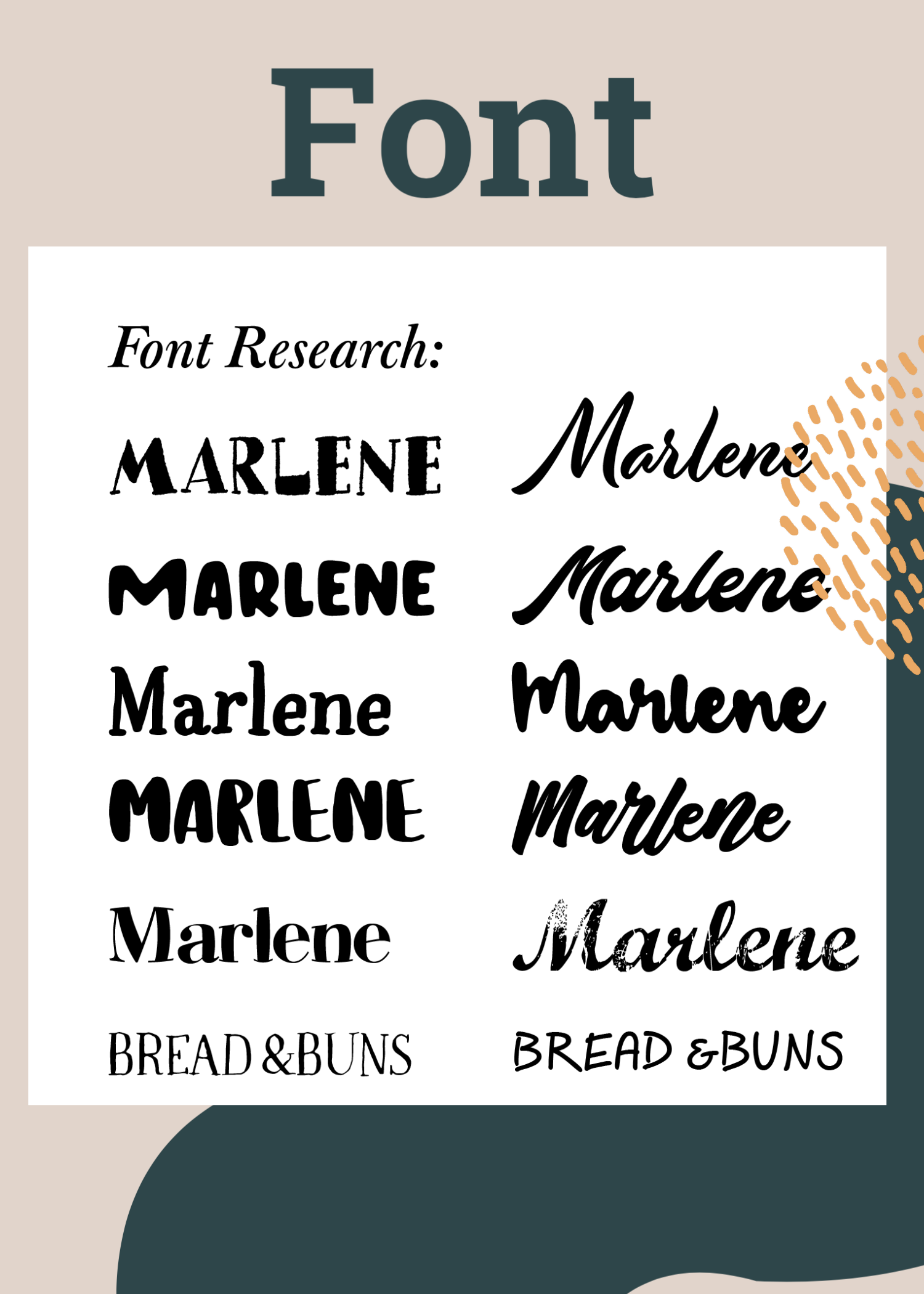
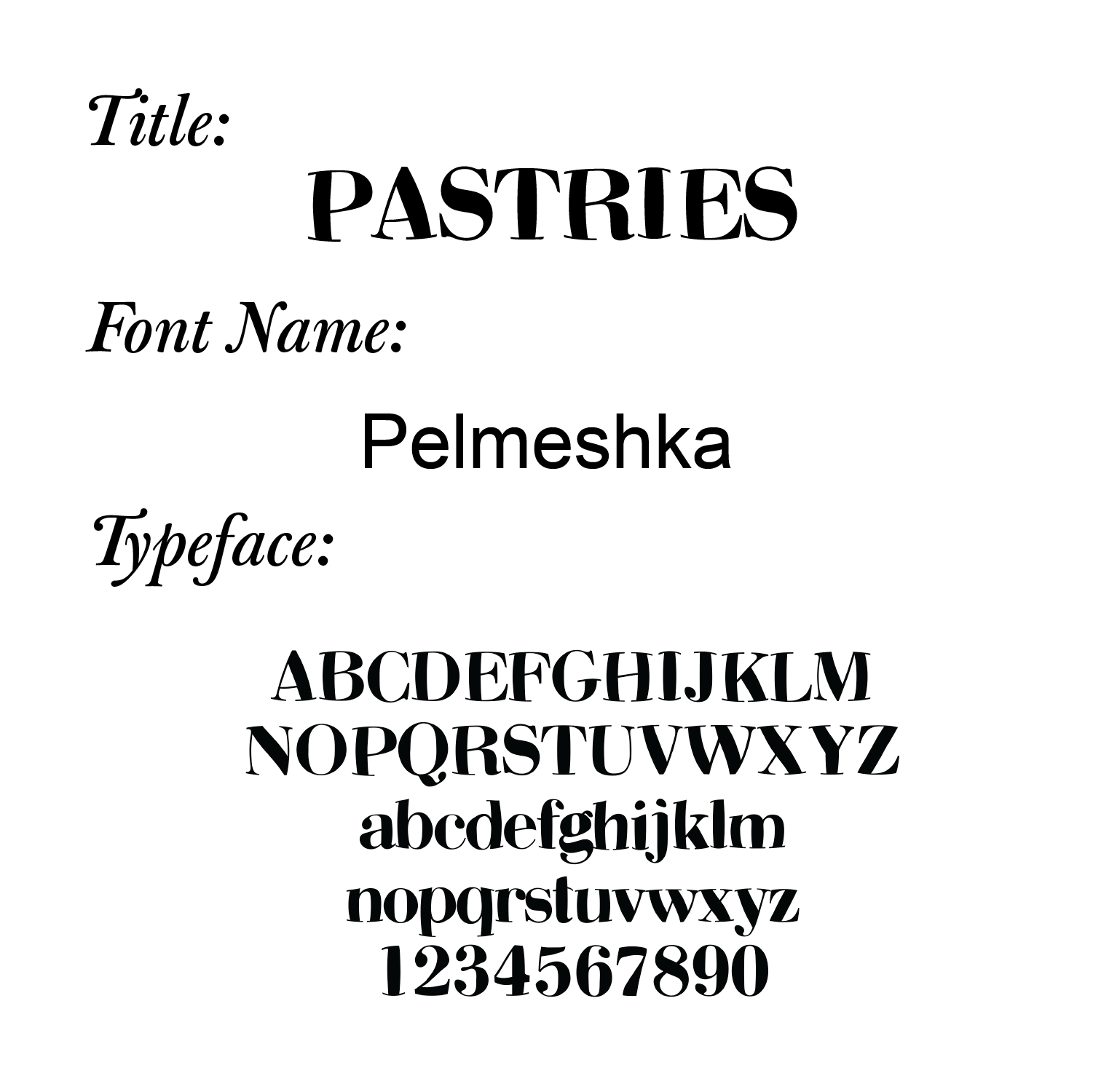
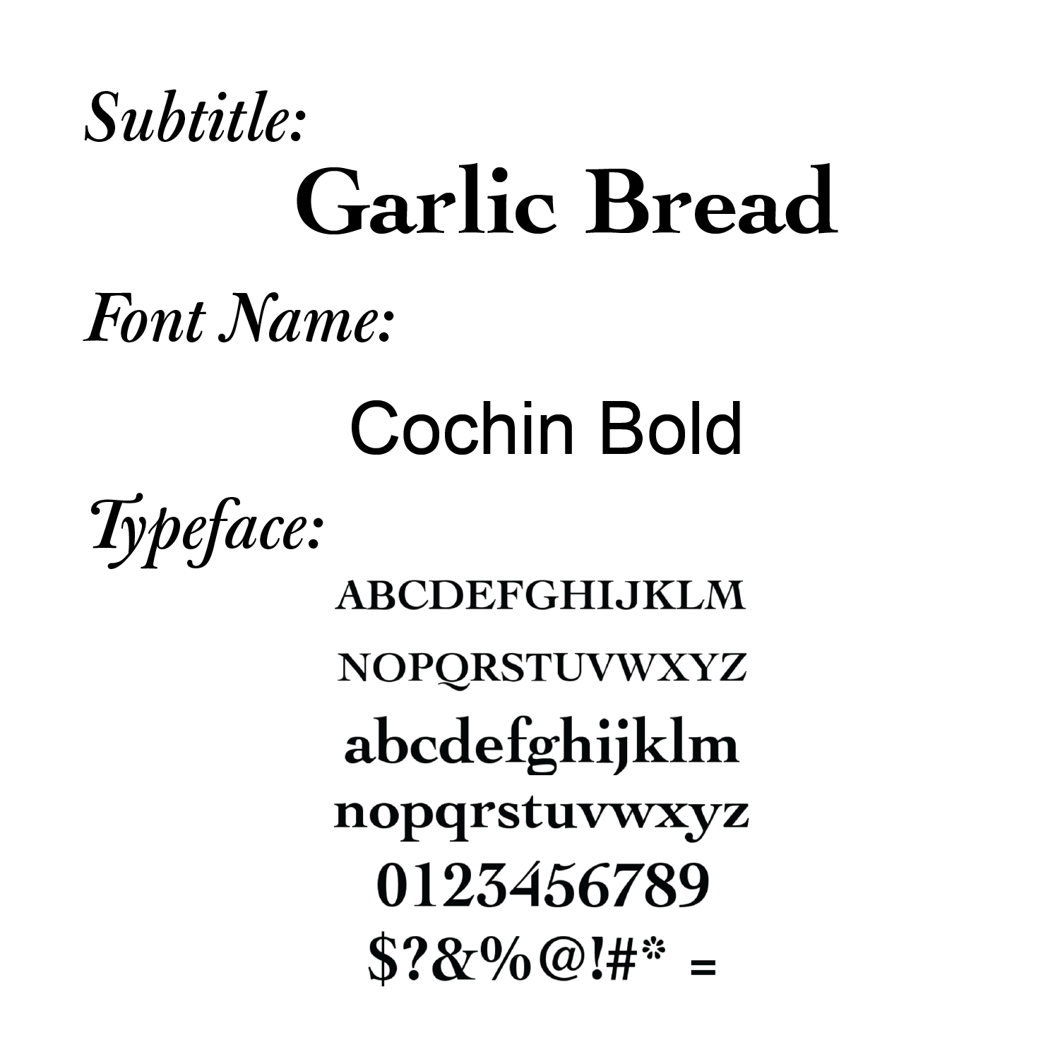
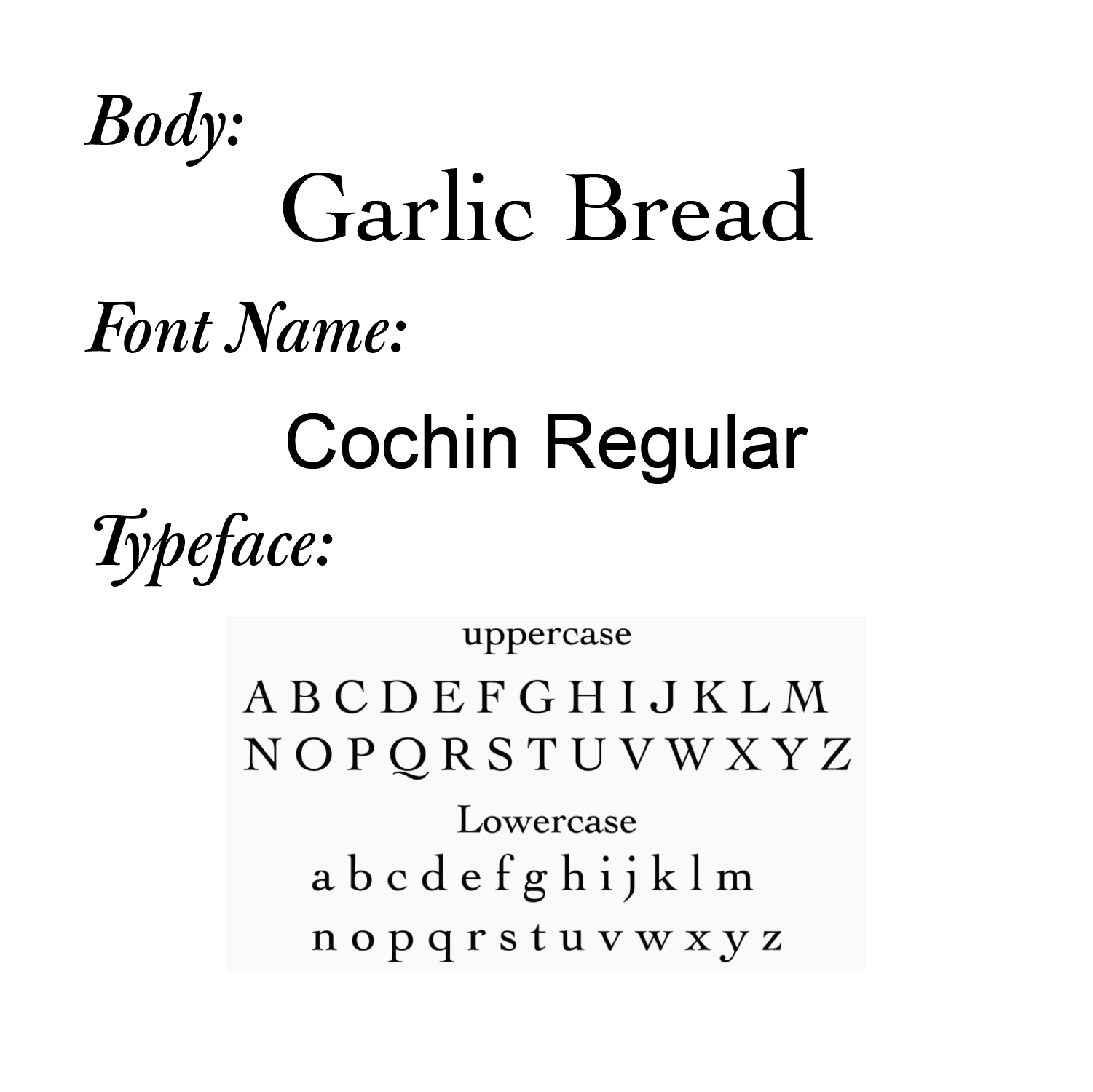
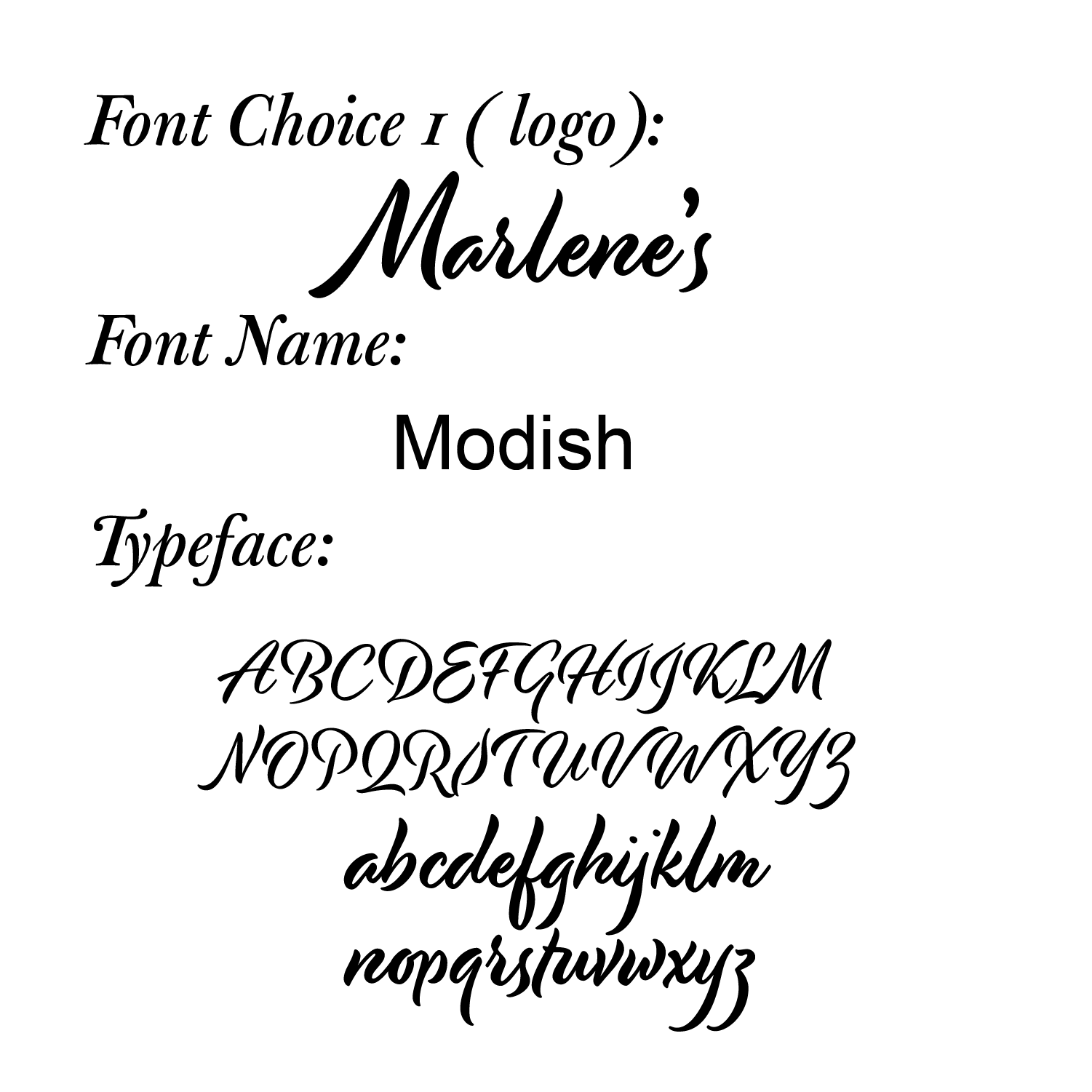
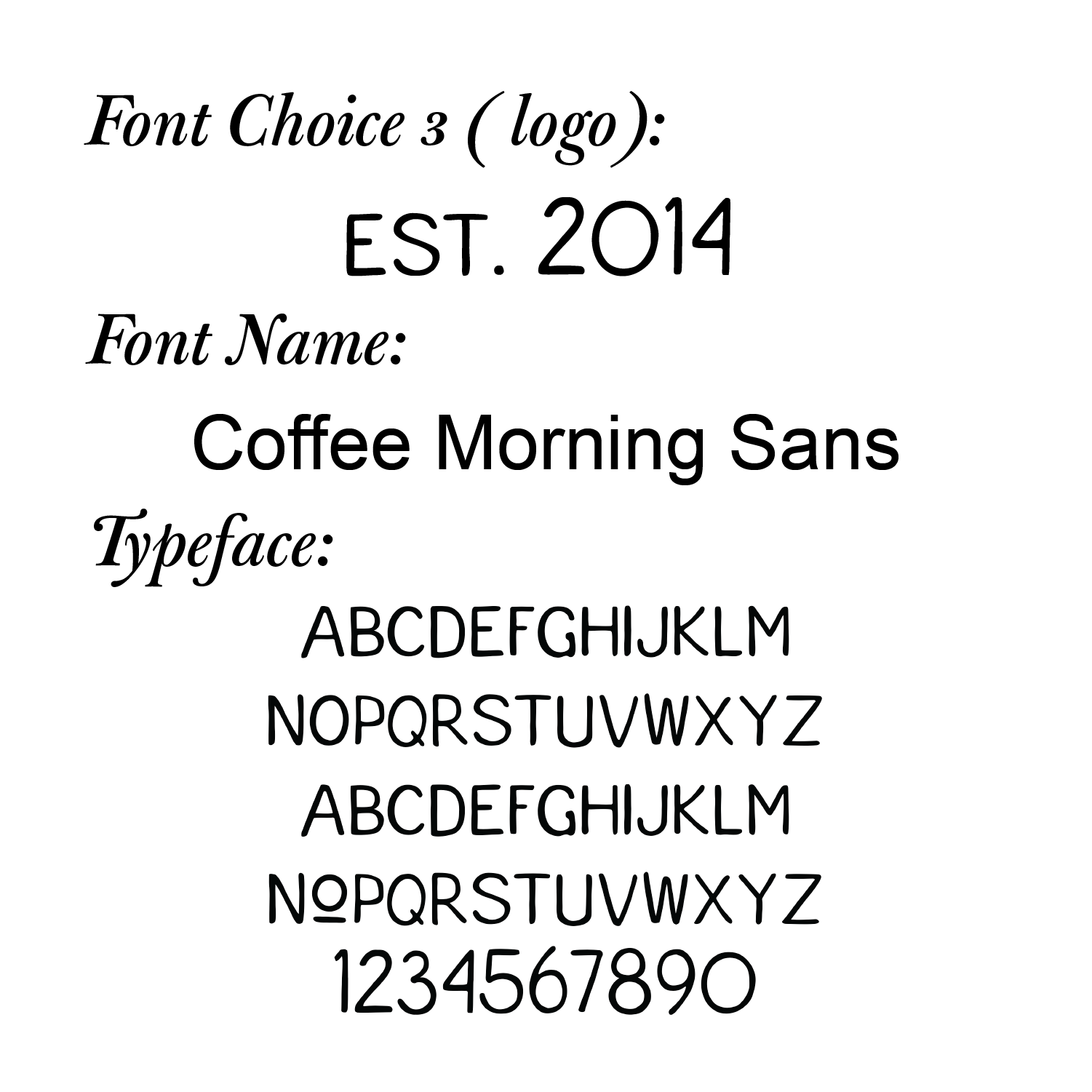
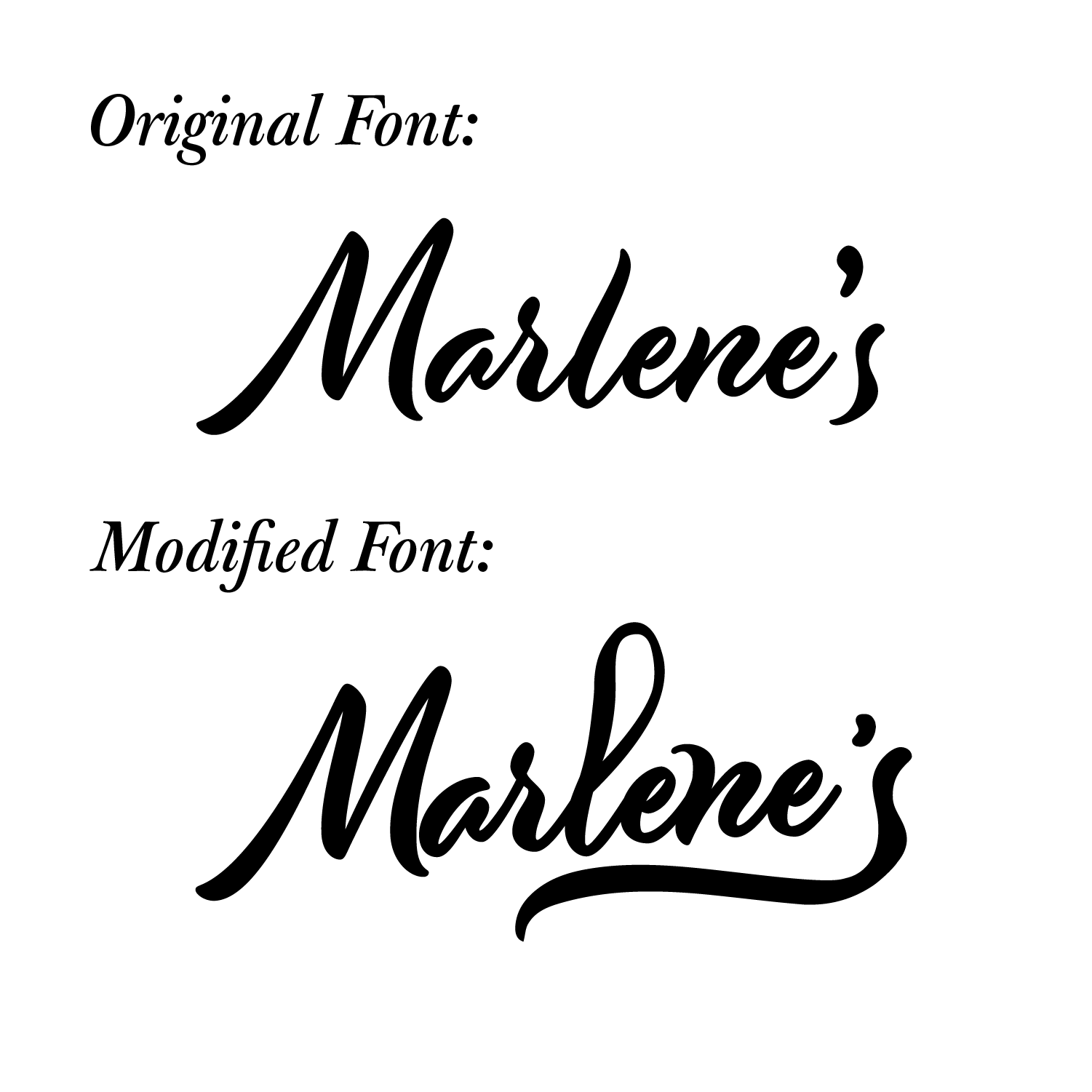
Font Choice:
Process:
I created drafts with ideas for the inside and outside page layout on US letter-sized paper, then folded it equally into a mockup.
I presented the drafts and inspiration/reference pictures to the client, discussed food photography concepts, and presented the design proposal and process.
I took photos of the client's food at her house, incorporating her feedback on food and props. I edited these photos in Adobe Lightroom and assembled them in Adobe Photoshop.
Using the edited photos and text of the food categories and descriptions from the client, I created the layout in Adobe Illustrator. I provided the client with two logo drafts and made the necessary changes based on her input.
Throughout the process, I stayed in touch with the client, making any necessary changes for a better result. After proofing the final menu brochure, I printed a sample for the client's review. I adjusted the colours of the photos until they met the client's requirements and printed the menu brochure once she approved. Finally, I completed the necessary paperwork to record the time and money spent.
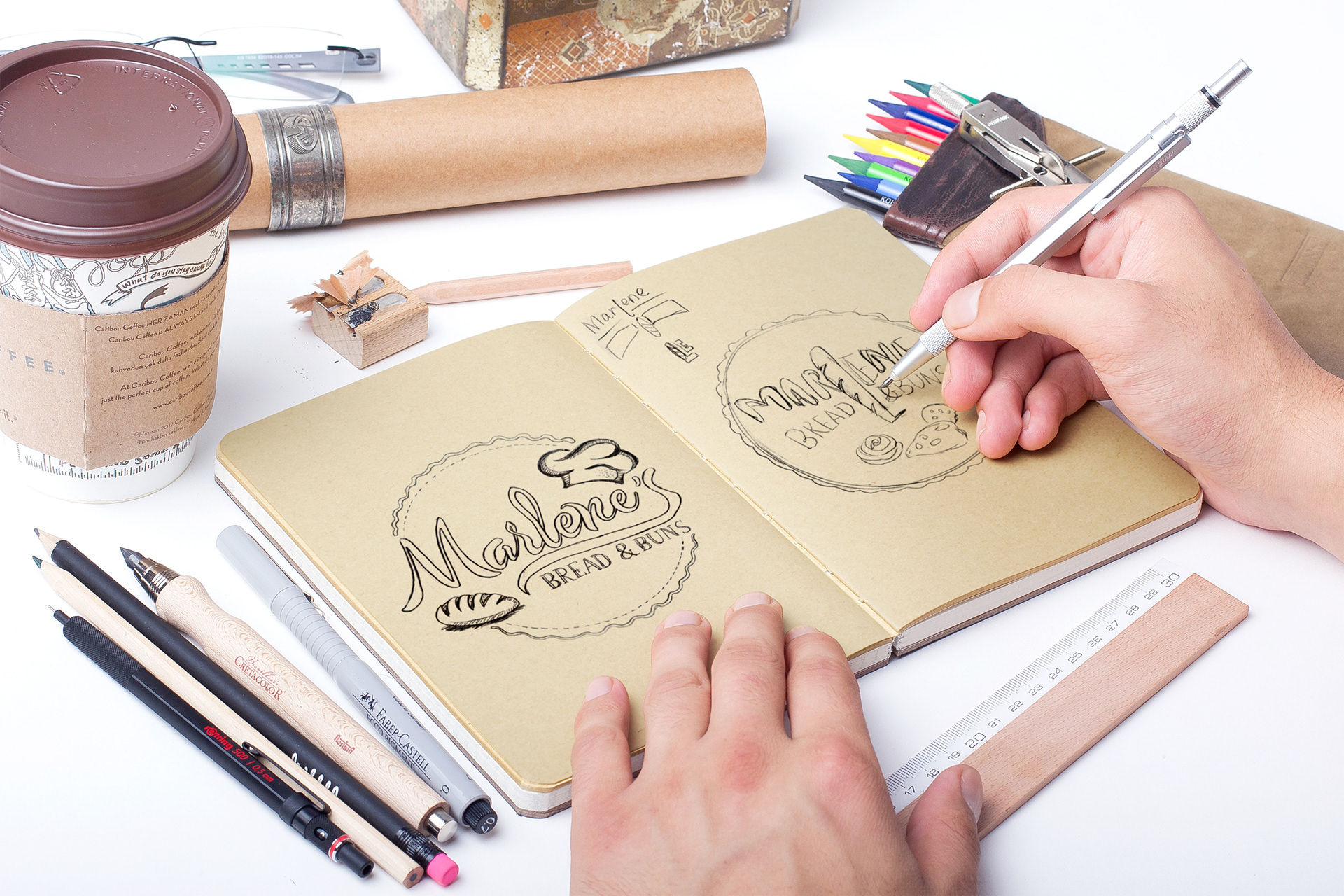
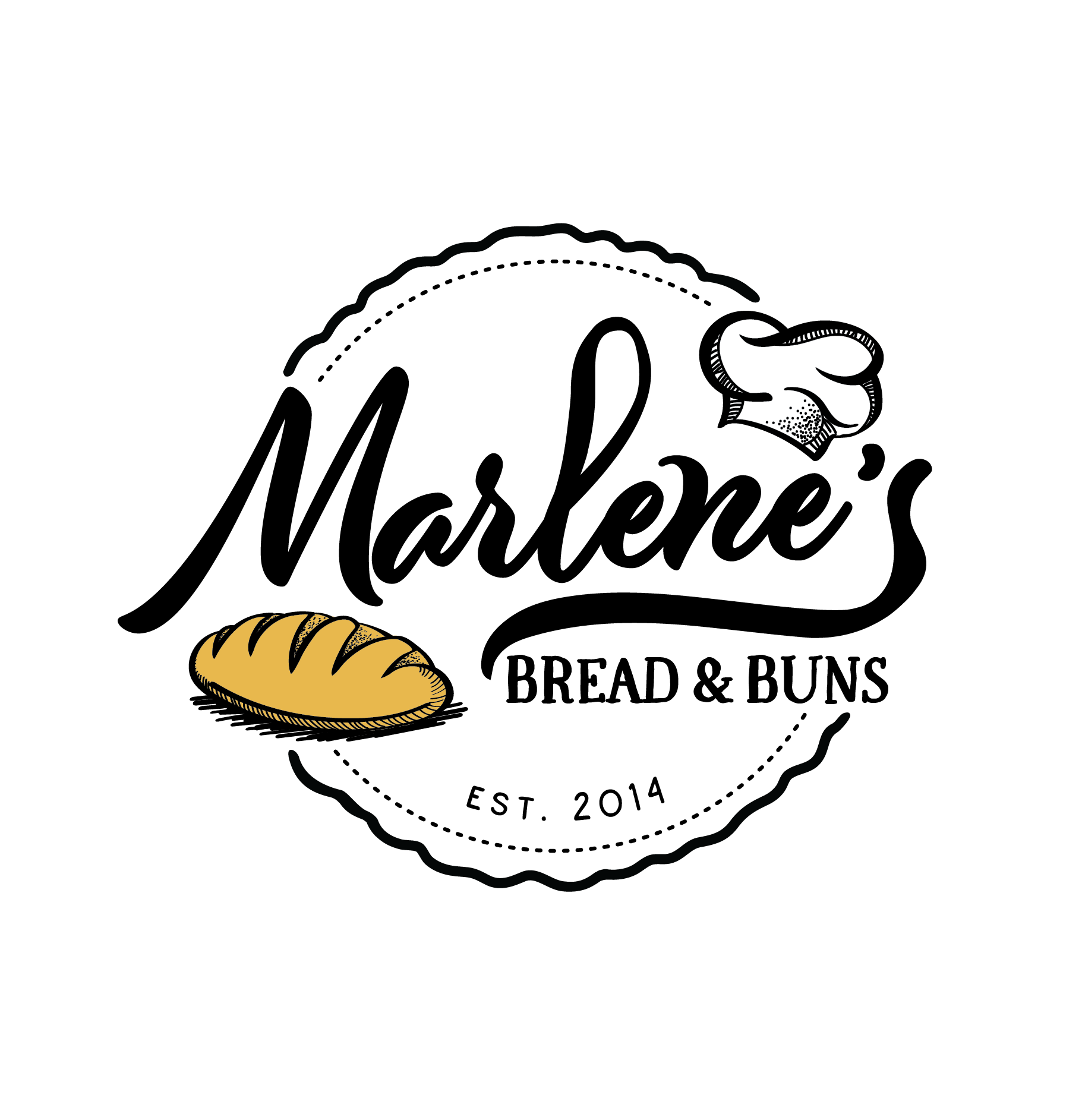
Two Drafts of Logo Design
Font Choice (Logo):


Illustrations of Logo Design
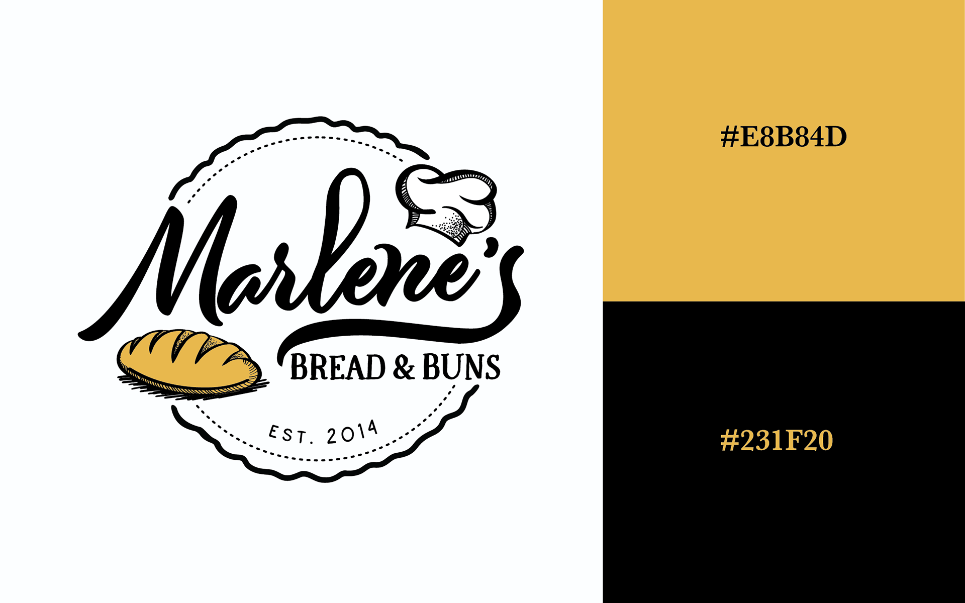
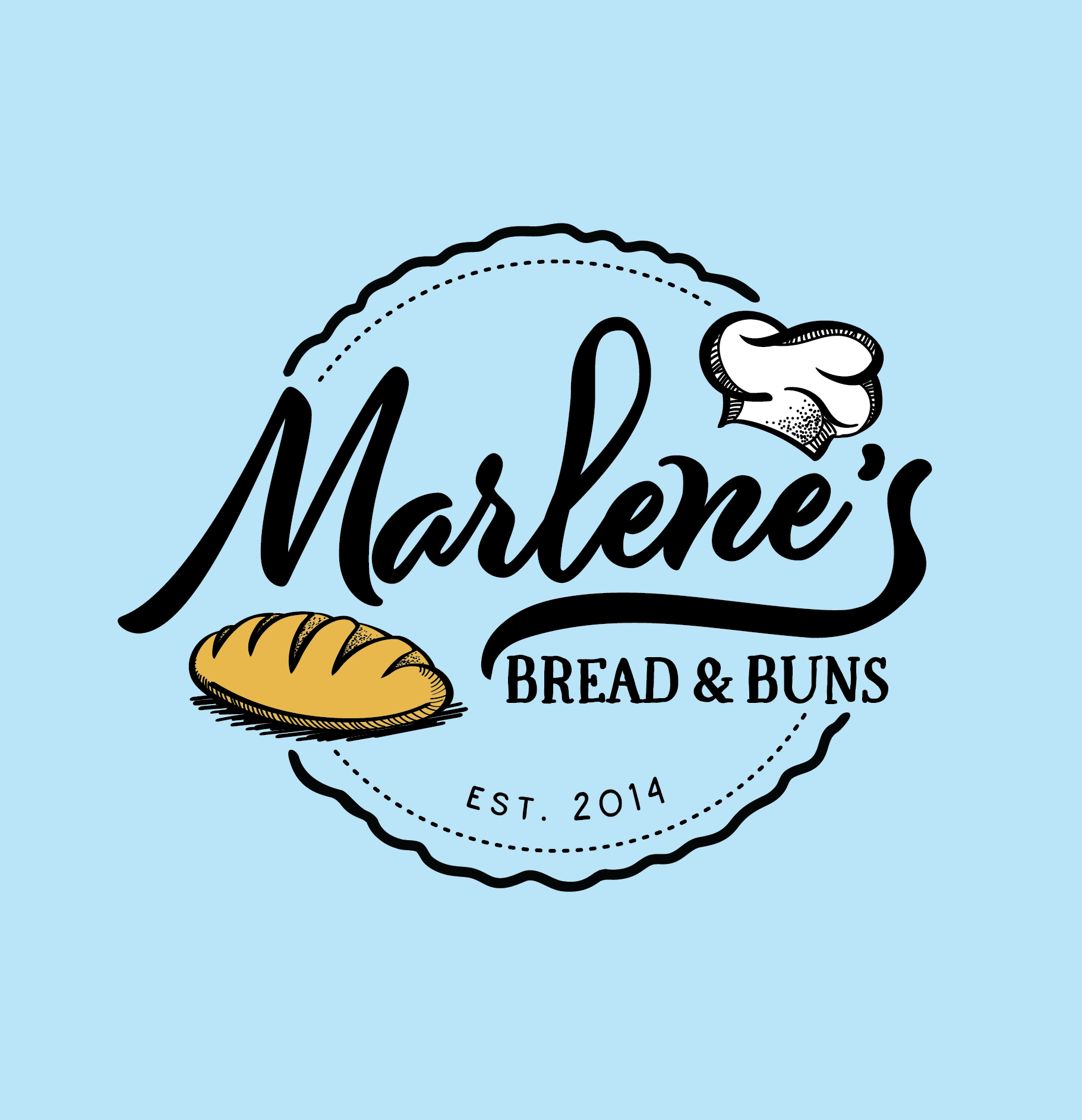
Logo Colour Palette
Invert
Original
colour match
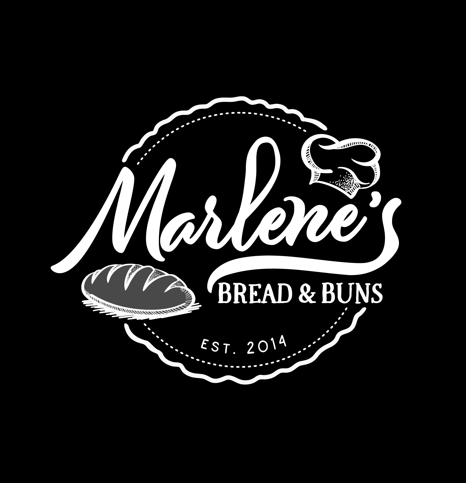
Logo Variations
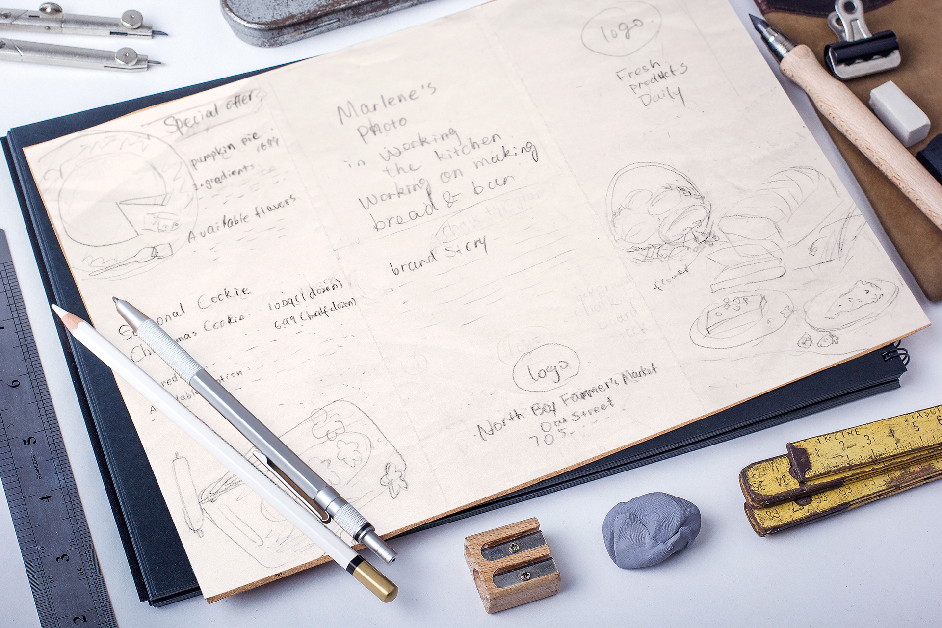
Draft of the Brochure Design
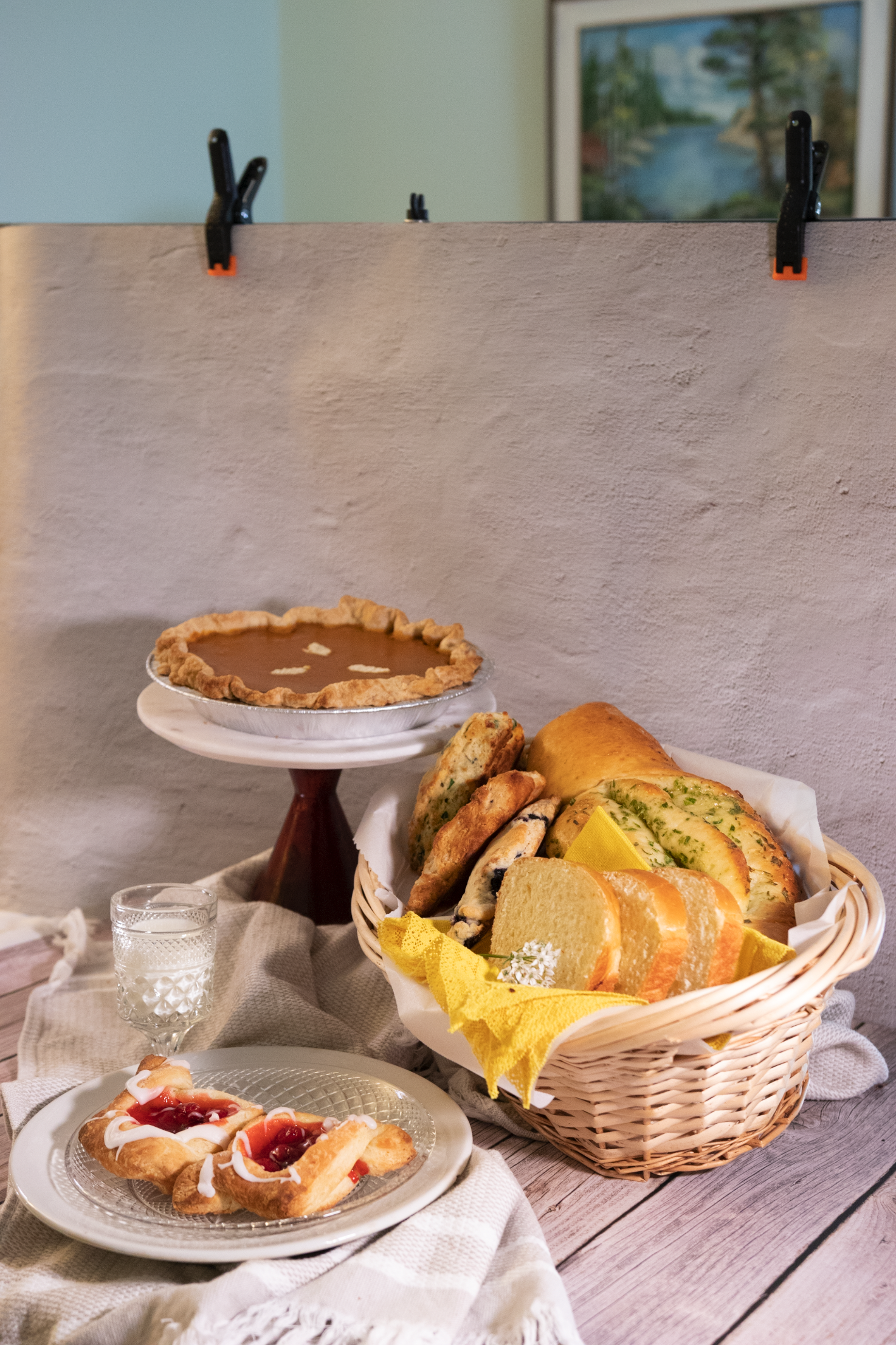
Before (Original Photo)
After (Edited Photo)
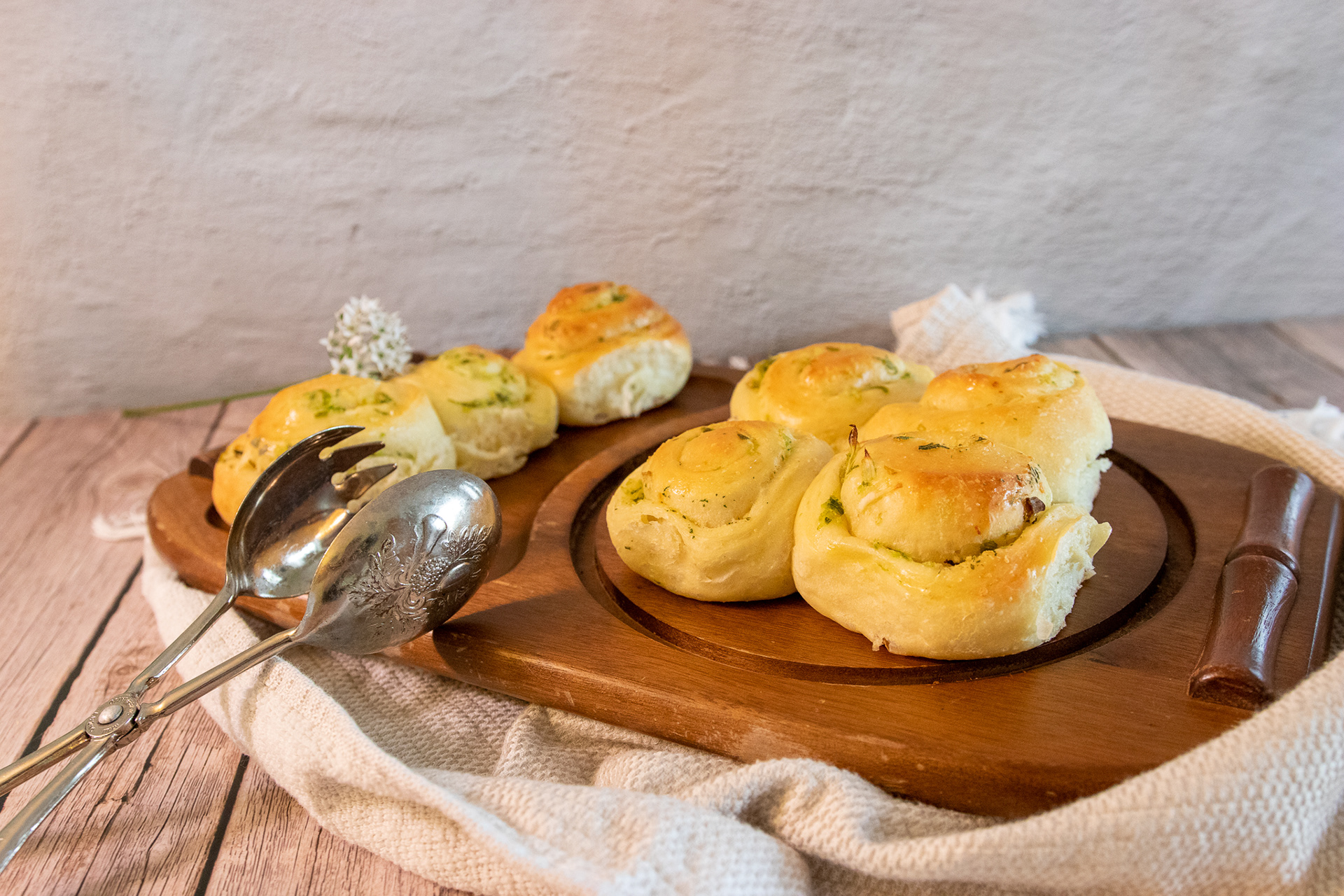
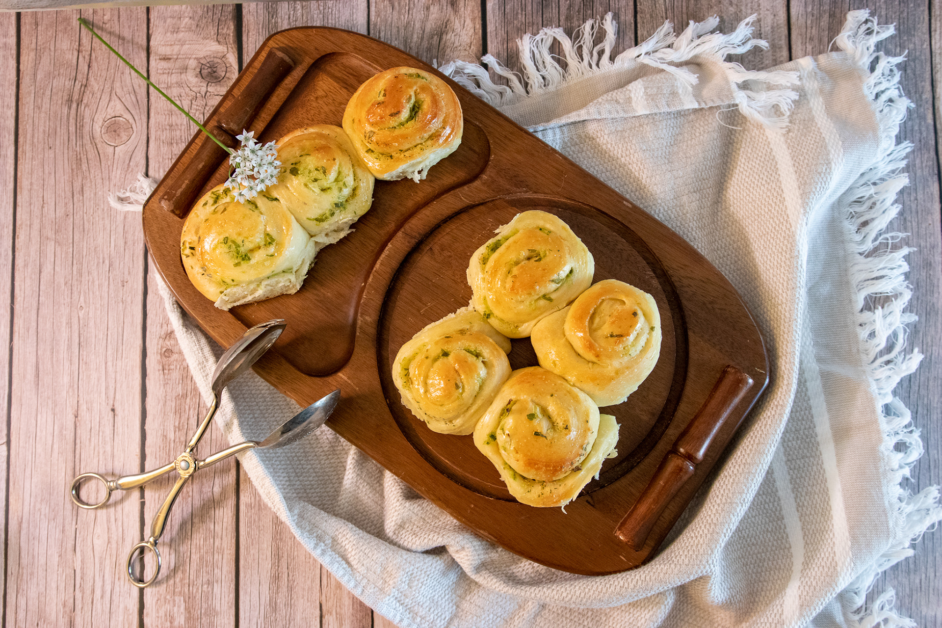
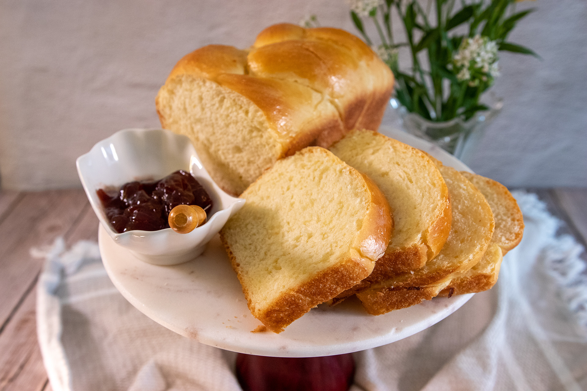
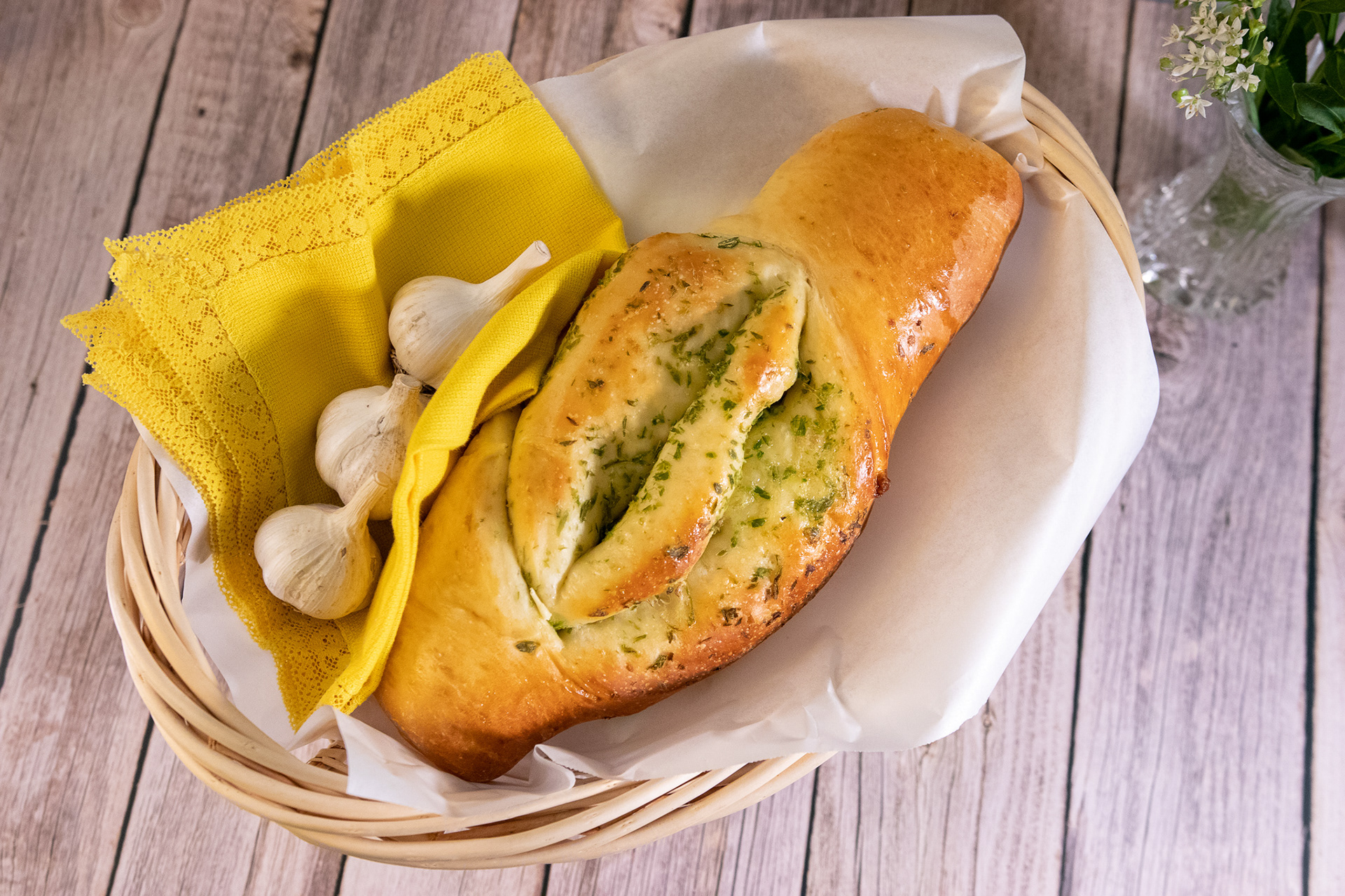
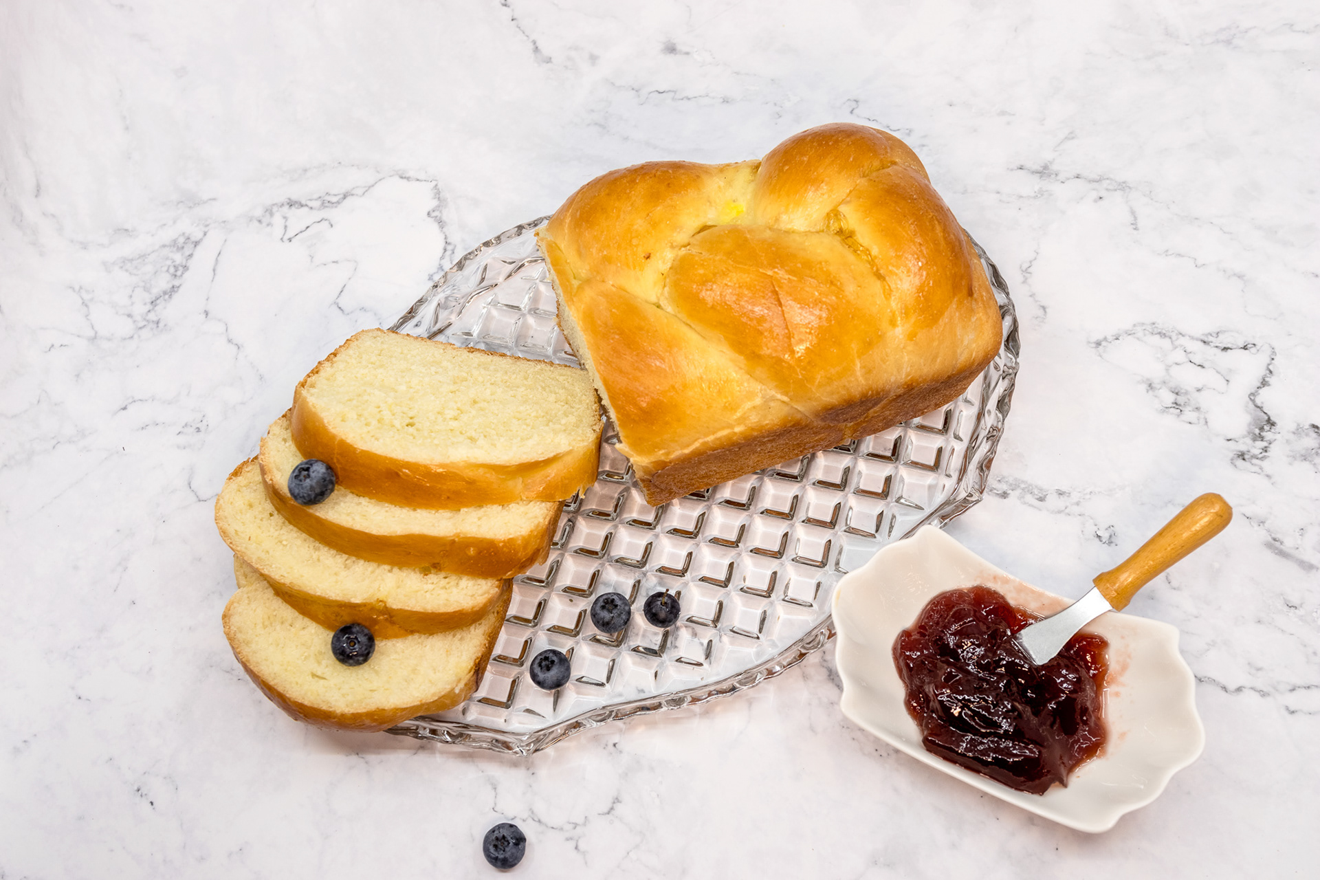
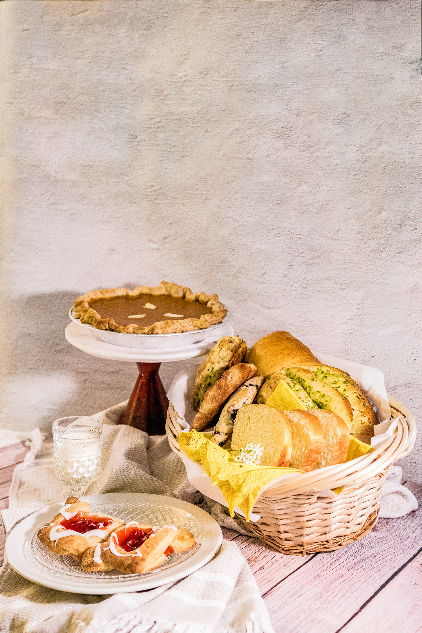
Other Edited Photos for Posting on Social Media and Website
Result:
The final menu brochure strengthened the brand and drew more attention to the food quality, ingredients, and brand story. The appealing food photographs made the ingredients and recipes look fresh and appetizing, aligning with the slogan "Fresh Product Daily". The well-organized layout improved the reading experience. The font choice, colour theme, and illustrations created an overall impression of an authentic, traditional homemade bakery.