Challenge:
The challenge was to provide a pleasing customer experience to the client. I accomplished this by communicating with the client according to his needs, helping him to understand how my design would solve his specific problems, and ensuring that we were on the same page through agreed-upon documentation. By following these effective practices, I could prevent misunderstandings and build trust with our clients.
Target Audience:
People who were interested in Asian cuisine and wanted to try different flavours.
Background:
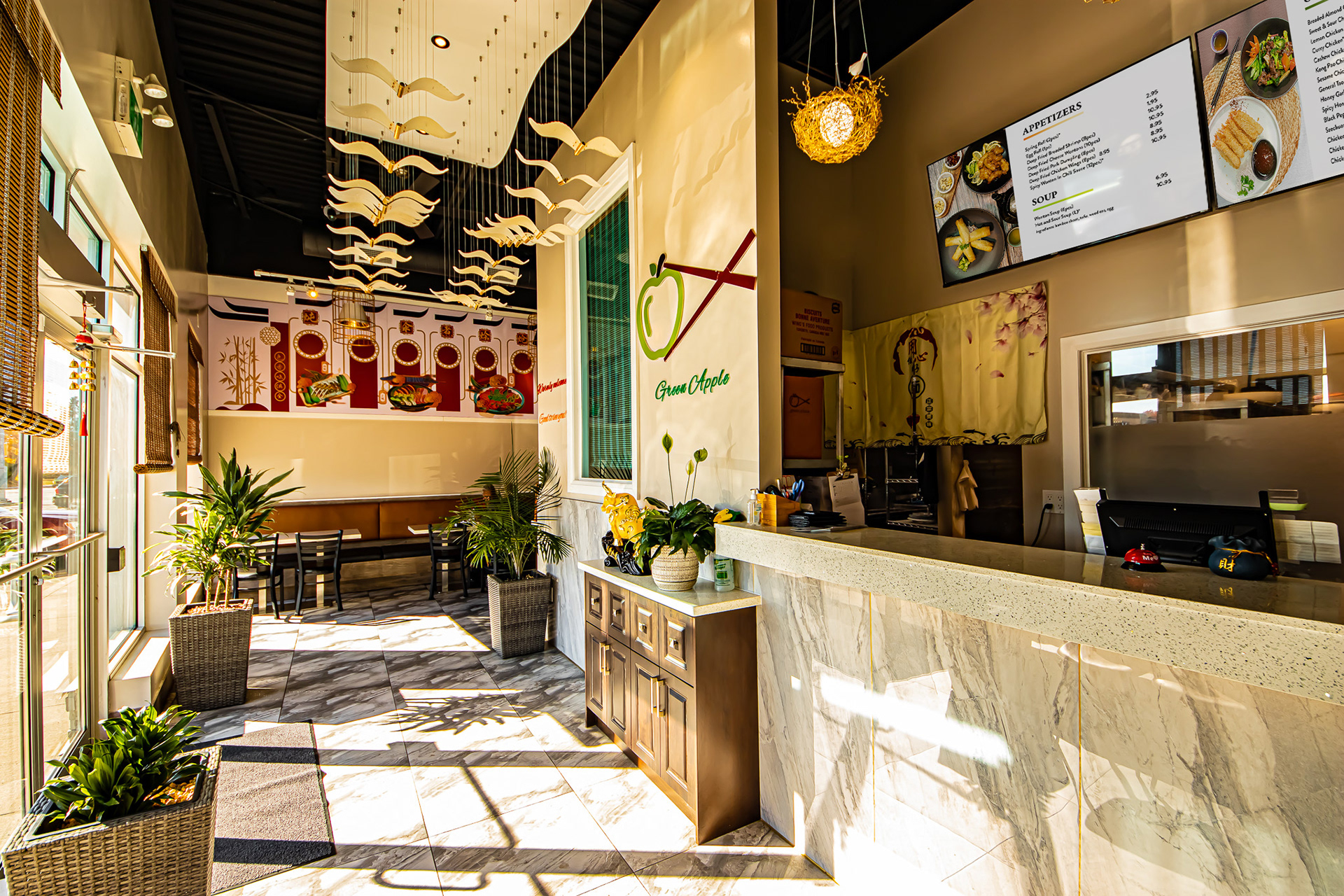
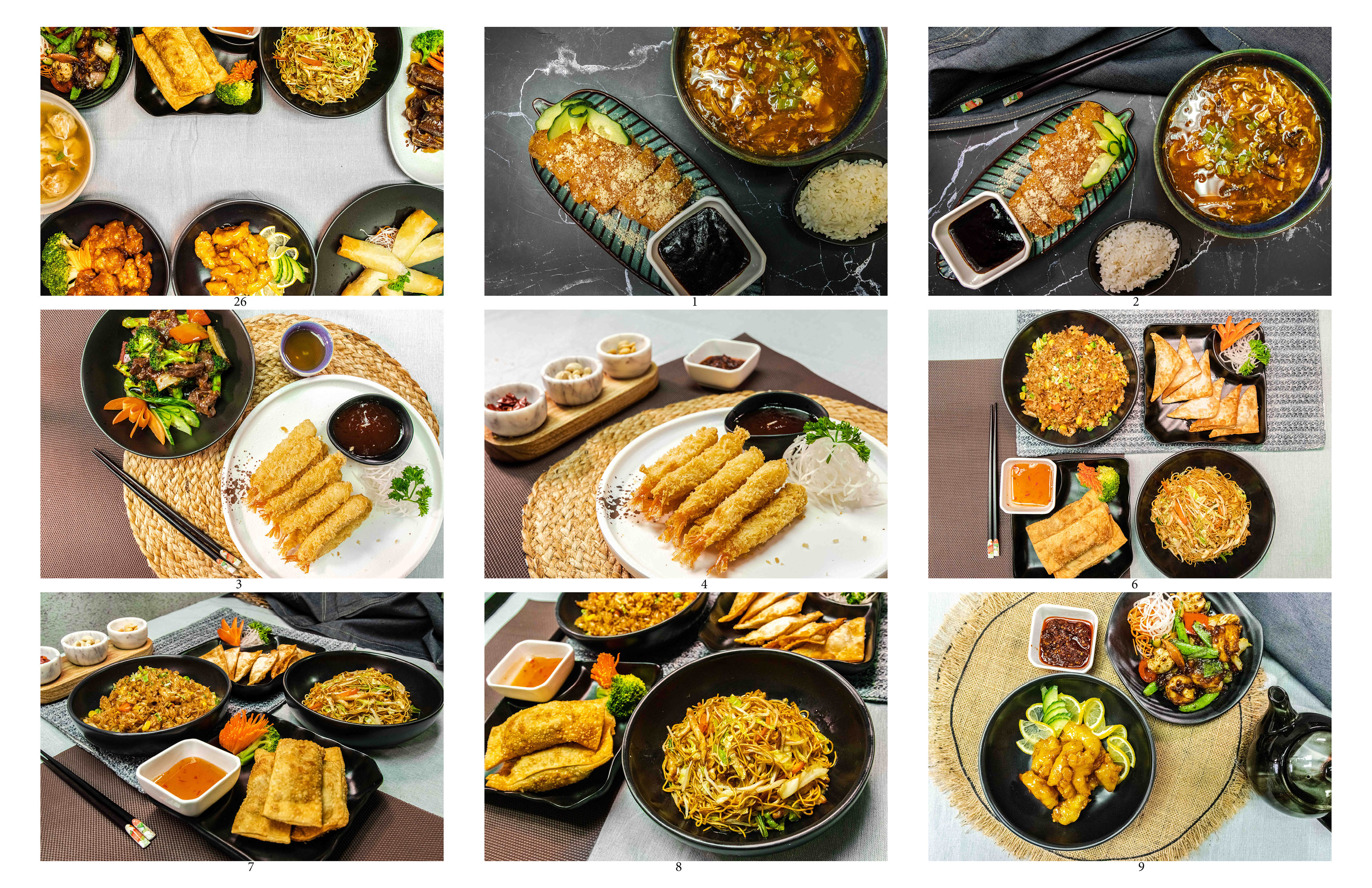
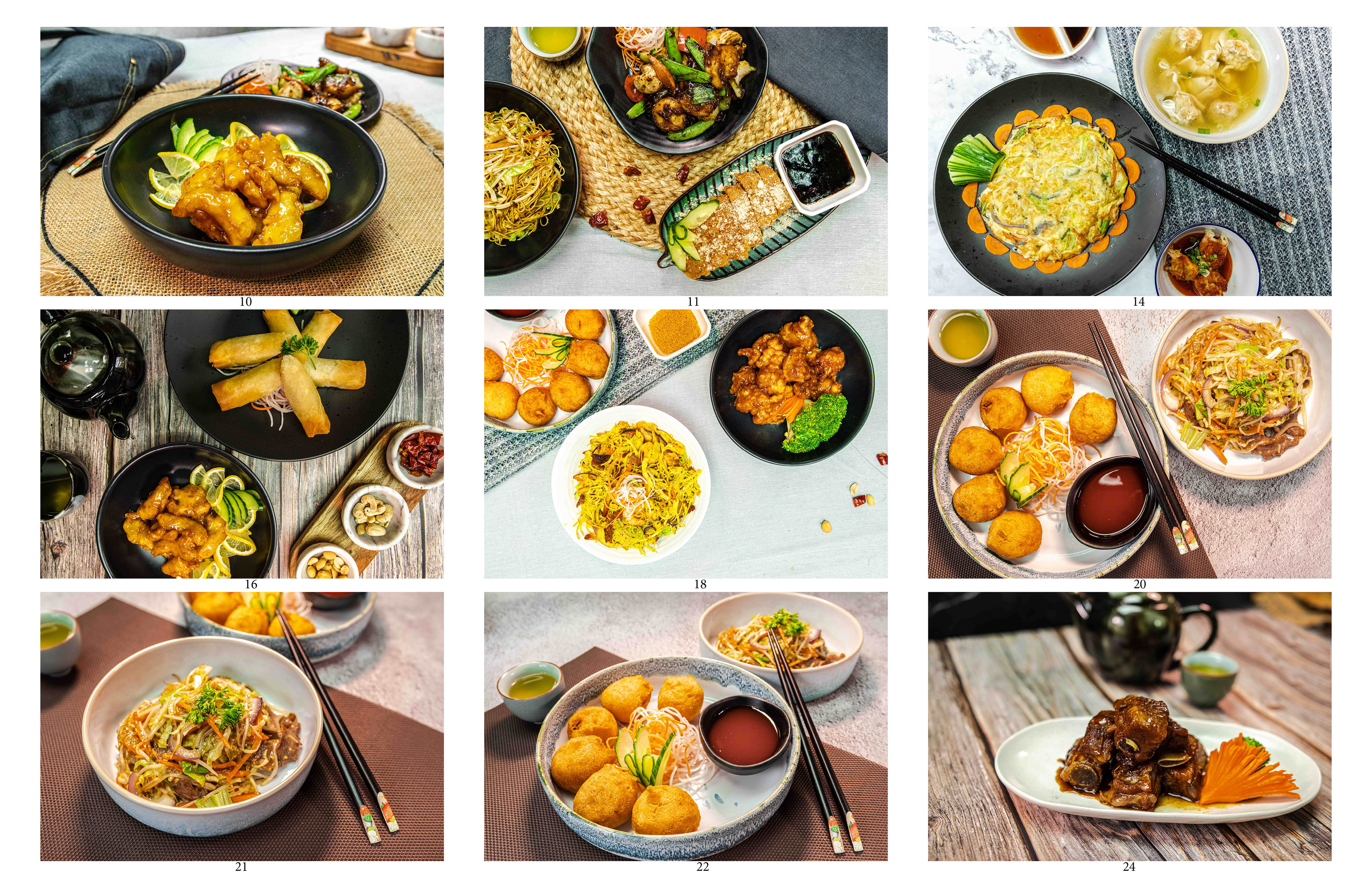
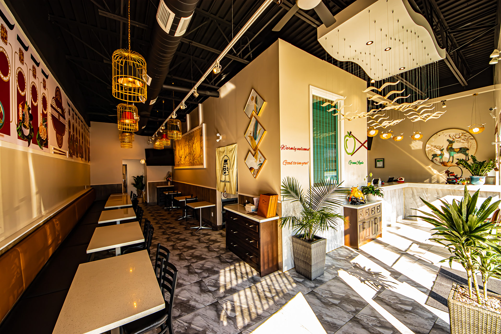
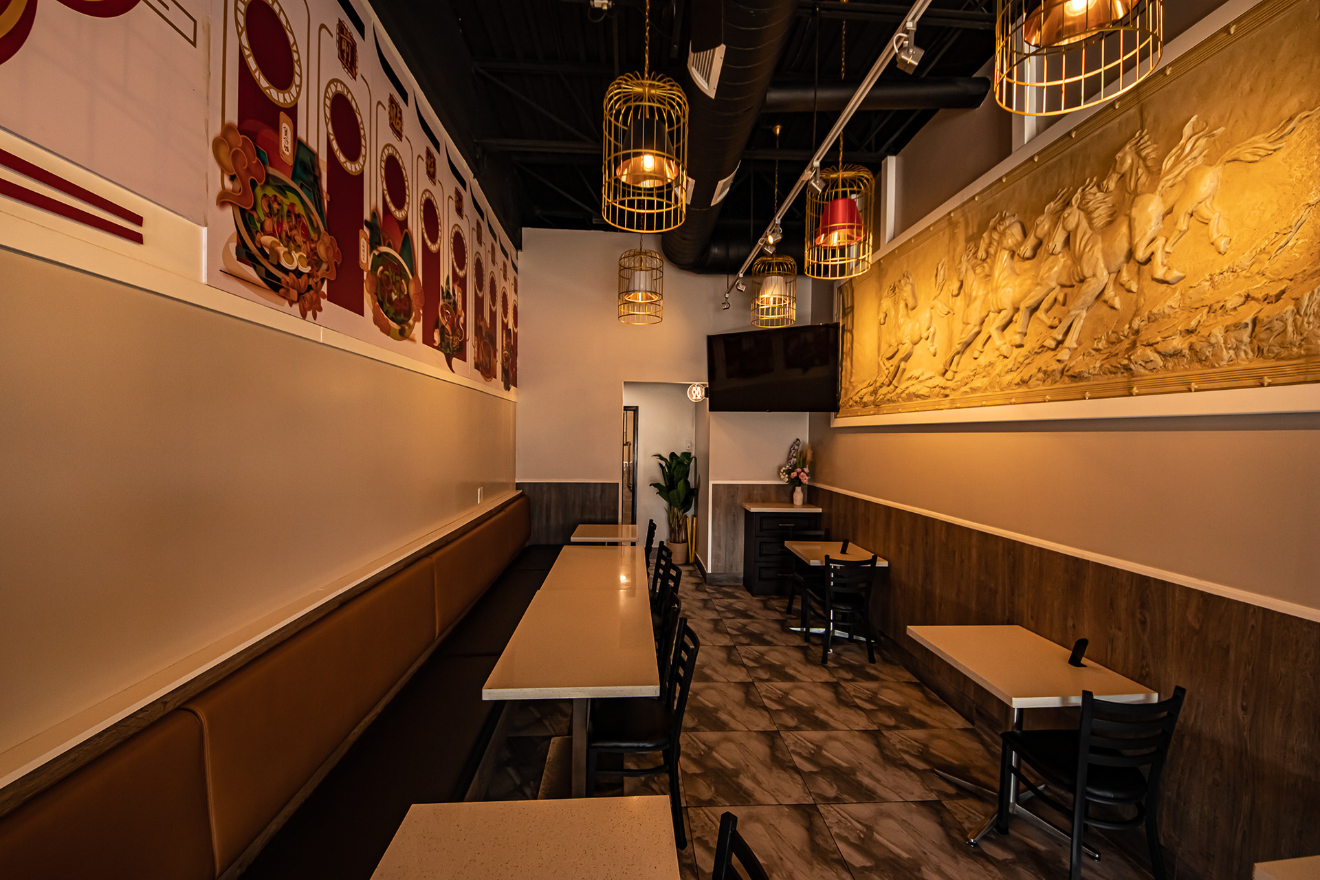
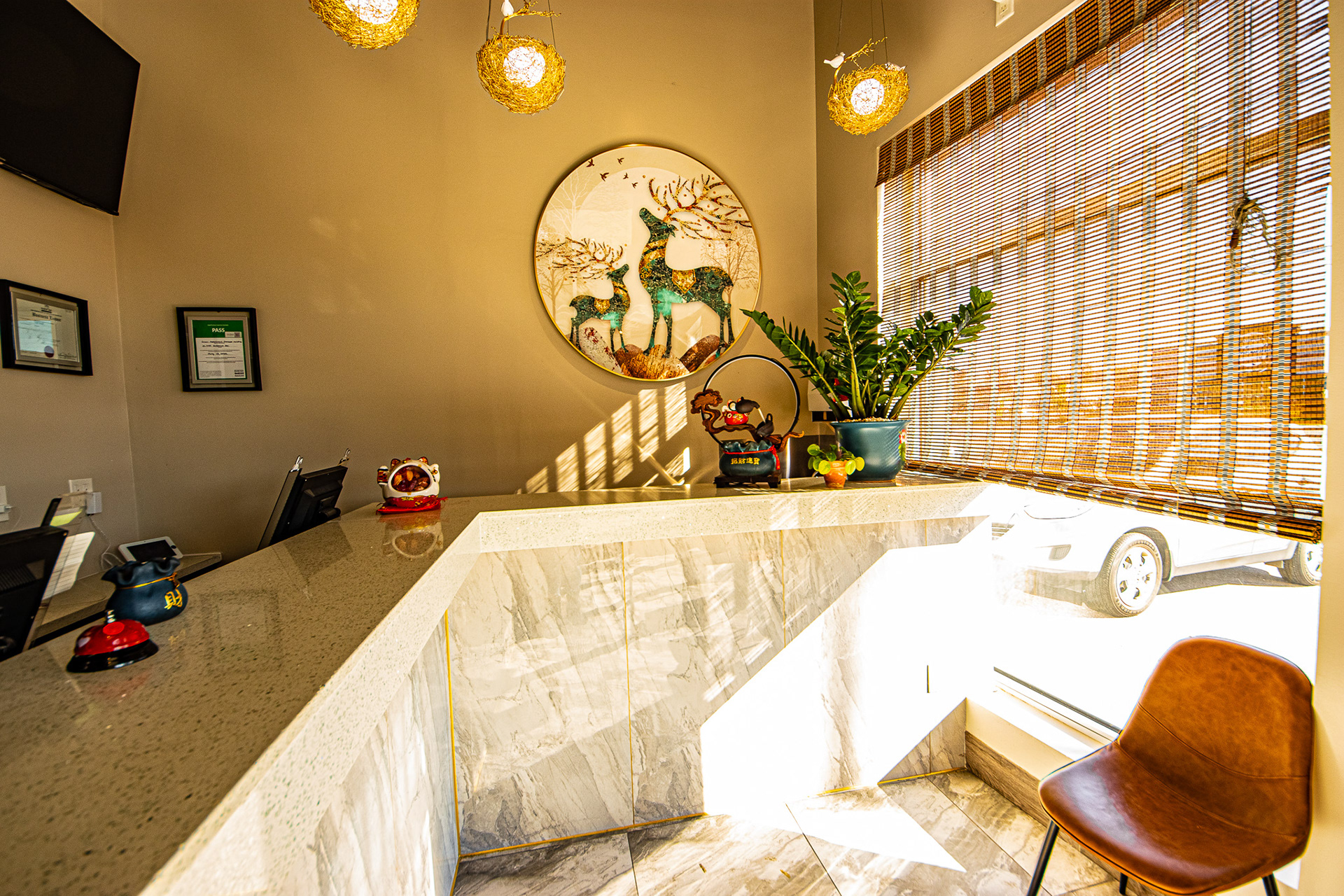
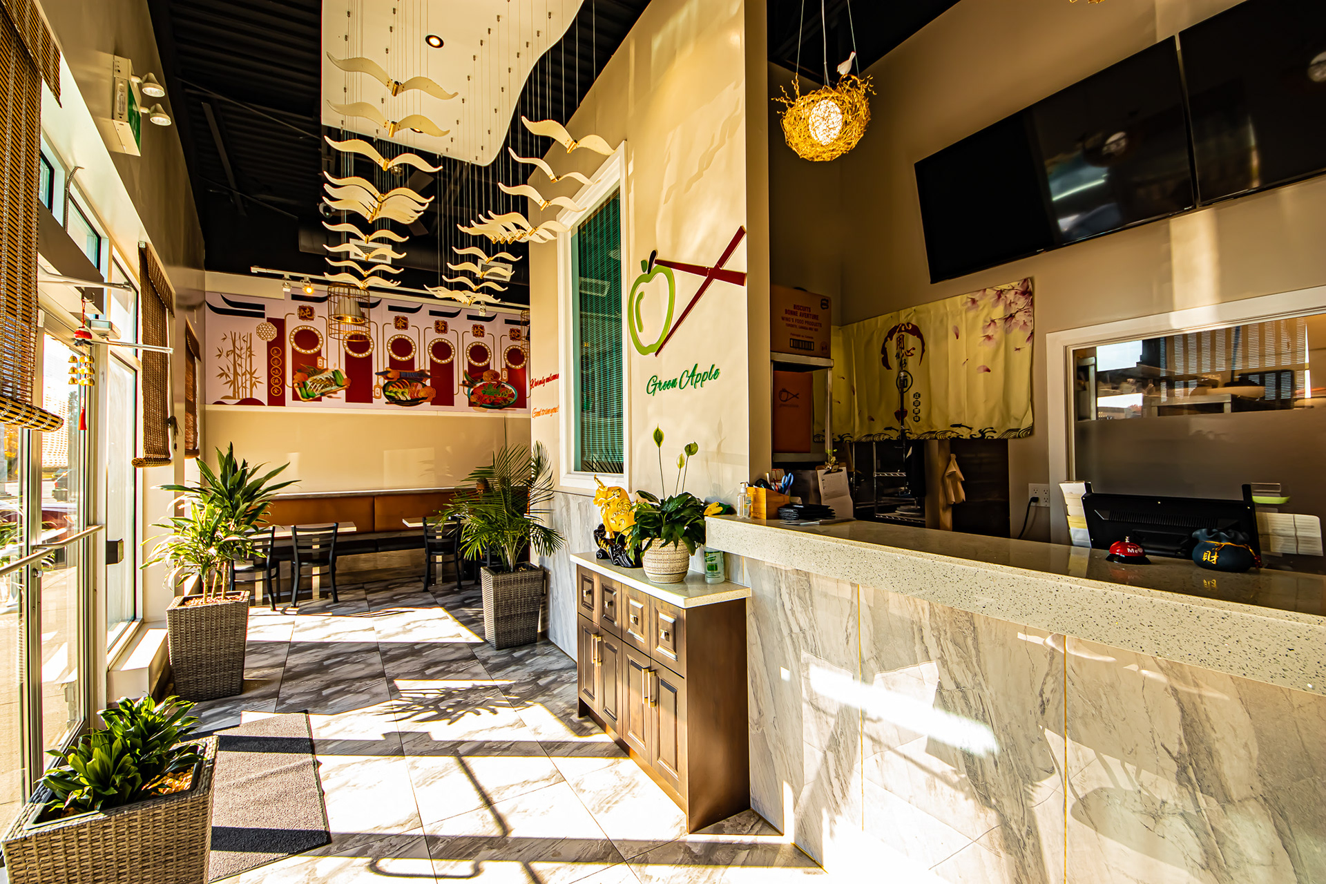
Green Applelicious is a restaurant that specializes in Asian cuisine. Founded in 2019 by Allen Zhu, the restaurant prides itself on creating dishes from scratch. Green Applelicious combines traditional Chinese wok-cooking techniques with Canadian influences to offer unique and innovative dishes to its guests. The chefs at Green Applelicious hand-roll dim sum, chop and slice all vegetables and meats, and scratch-cook every sauce to ensure the highest quality and freshest ingredients are used. The restaurant's interior is clean and comfortable and has an exotic ambience that makes for a pleasant dining experience. The kitchen is well-lit with natural and artificial light, which makes it perfect for food photography.
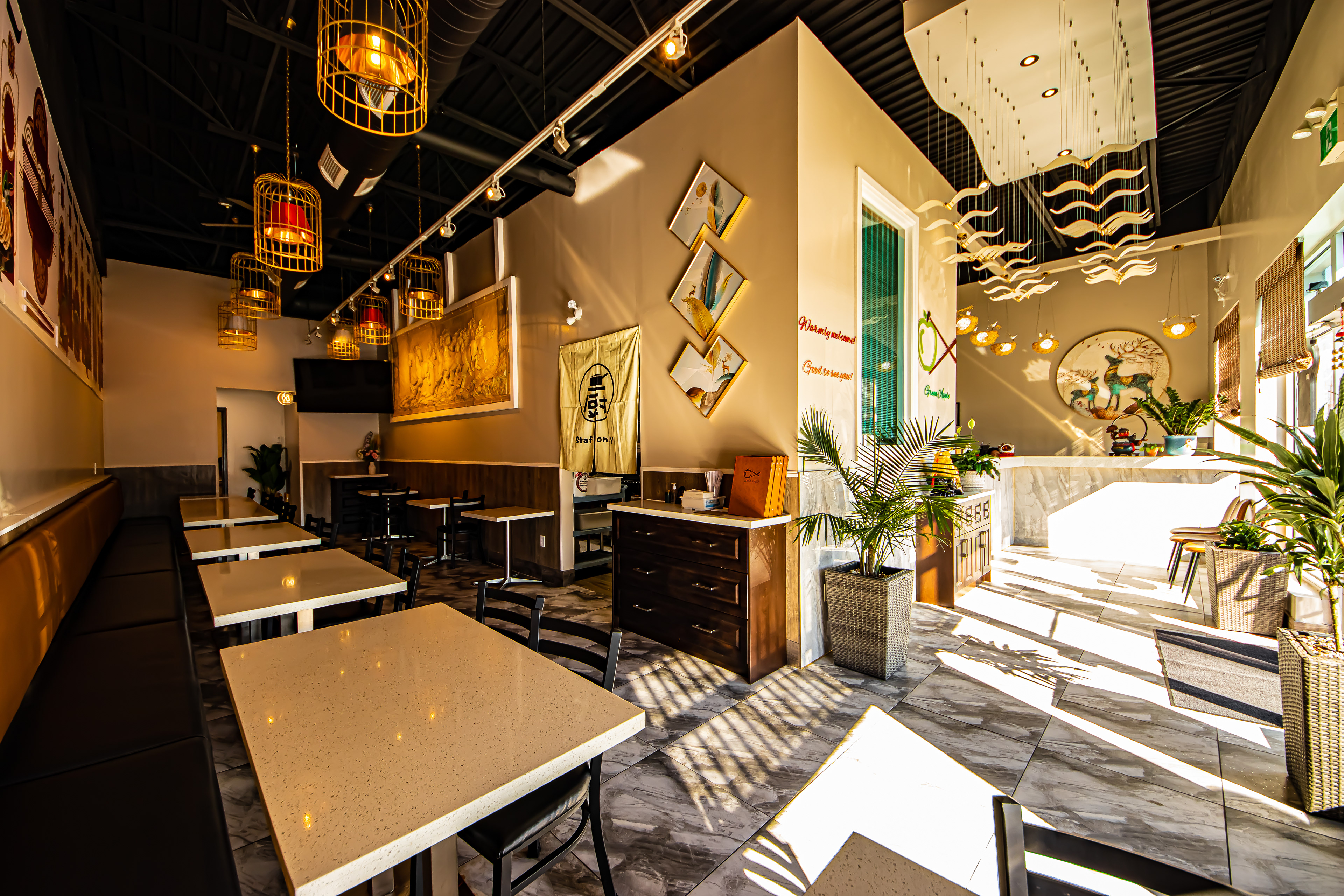
Interior Environment
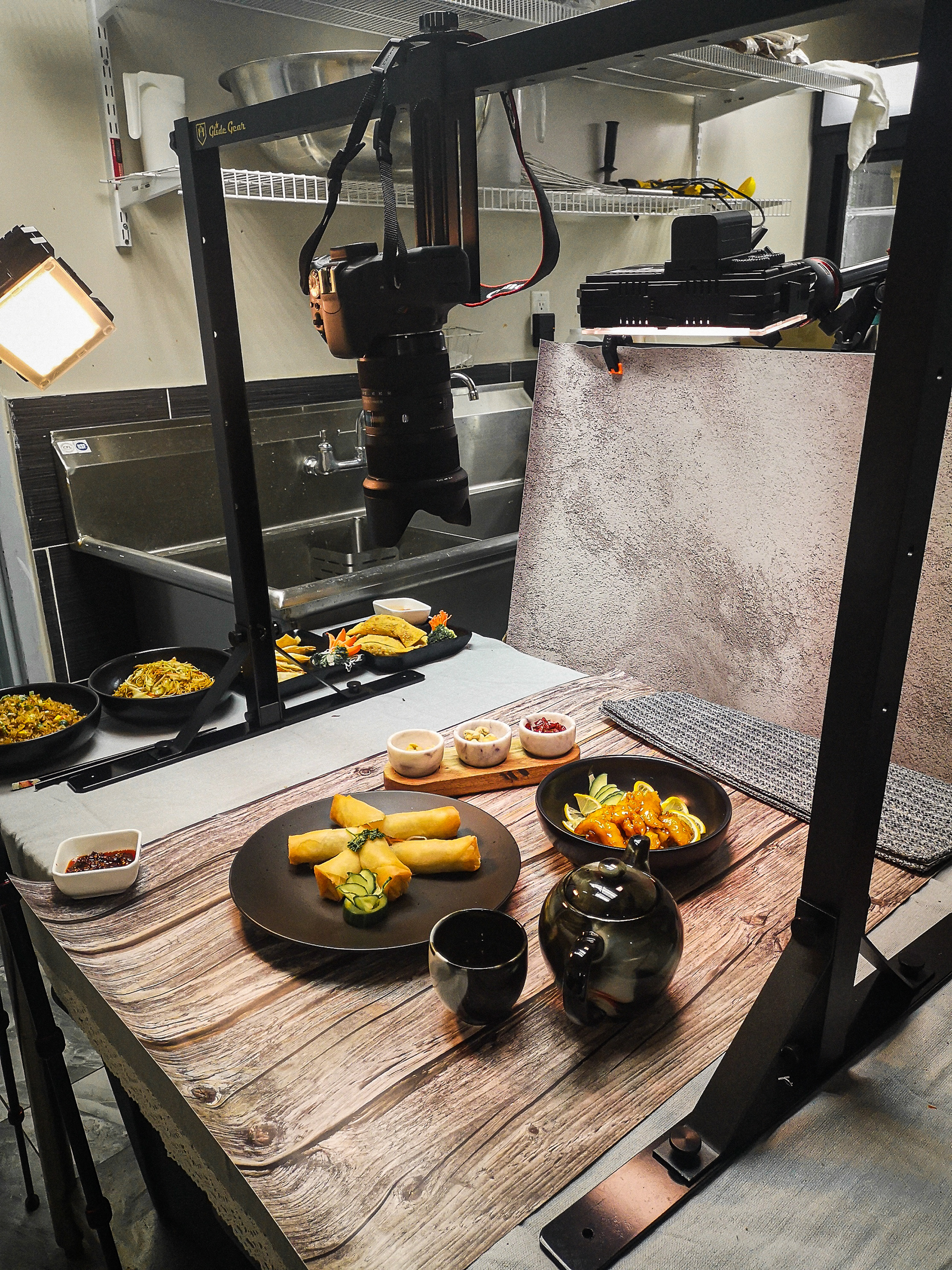
Behind The Scene
Inspiration/Research:
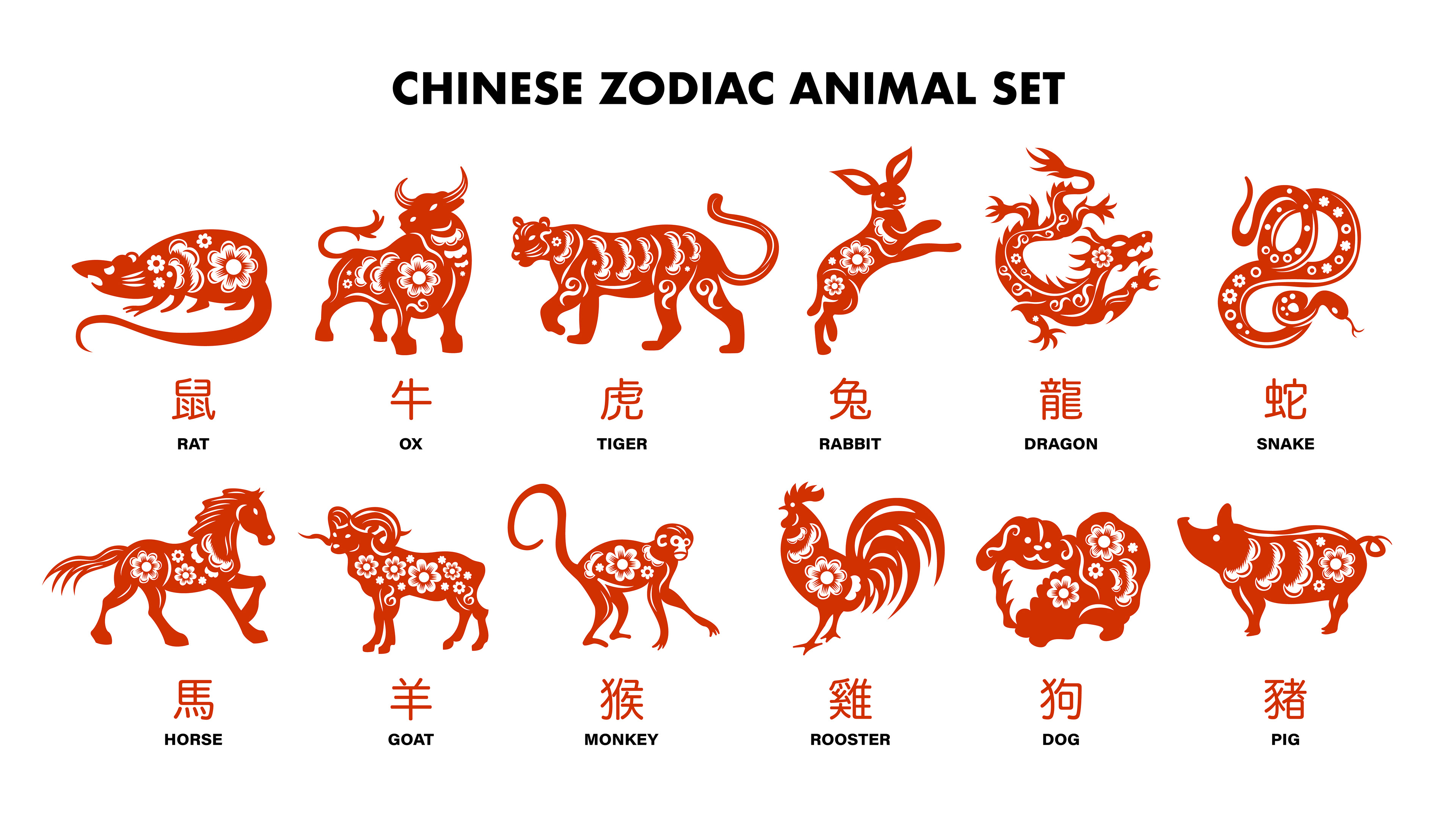
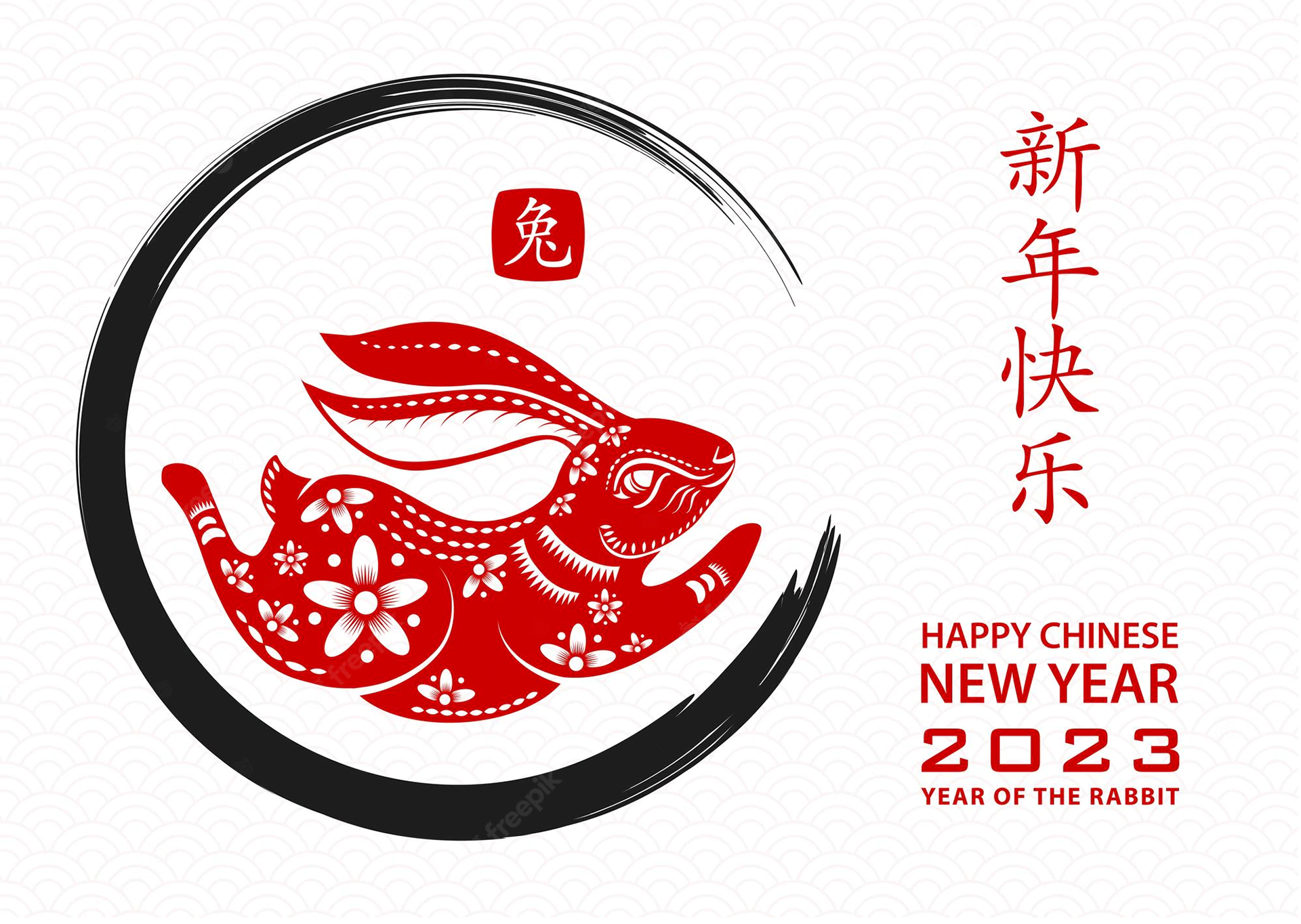
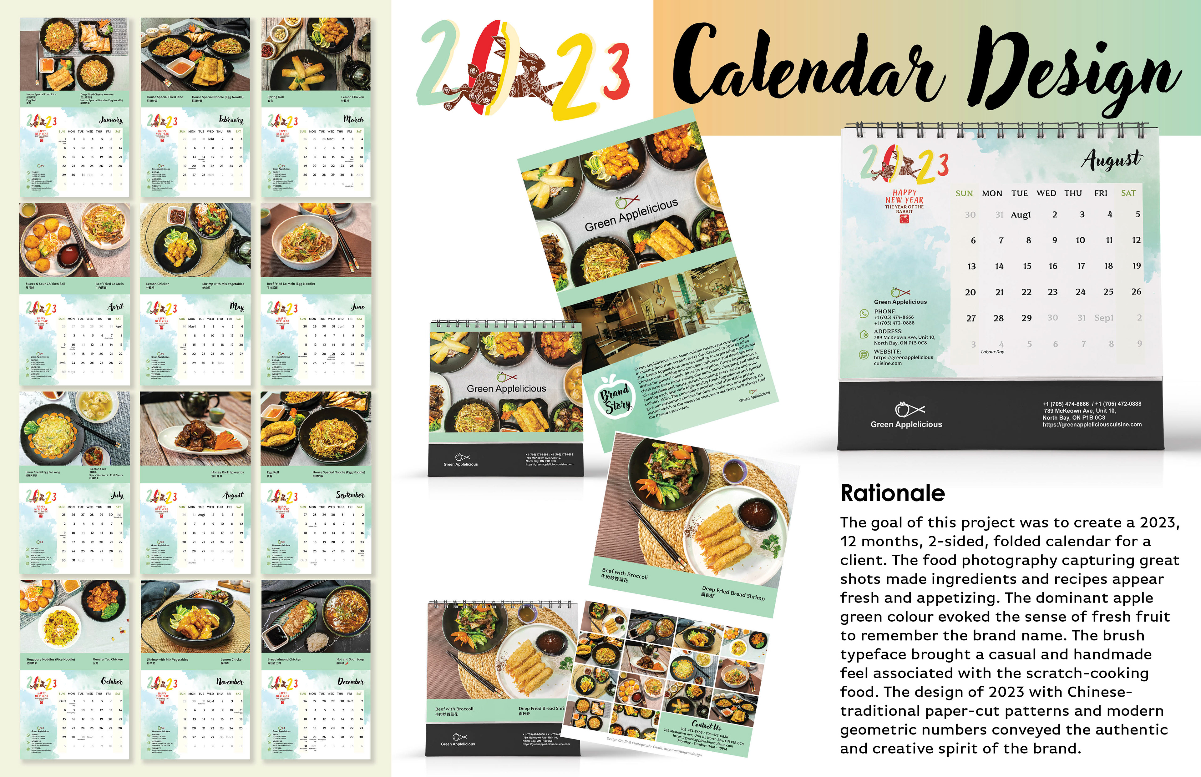
My inspiration for food photography came from Jimmy Design. The different compositions, moods, and lighting techniques used in his works helped me to convey different food styles. For my illustrations, I took inspiration from traditional Chinese paper-cut patterns (Freepik) and Chinese cuisine colour palettes (Adobe Colour). By incorporating traditional elements with a modern twist, I was able to create a unique style in my designs.
Colour Palette:

Font Choice:
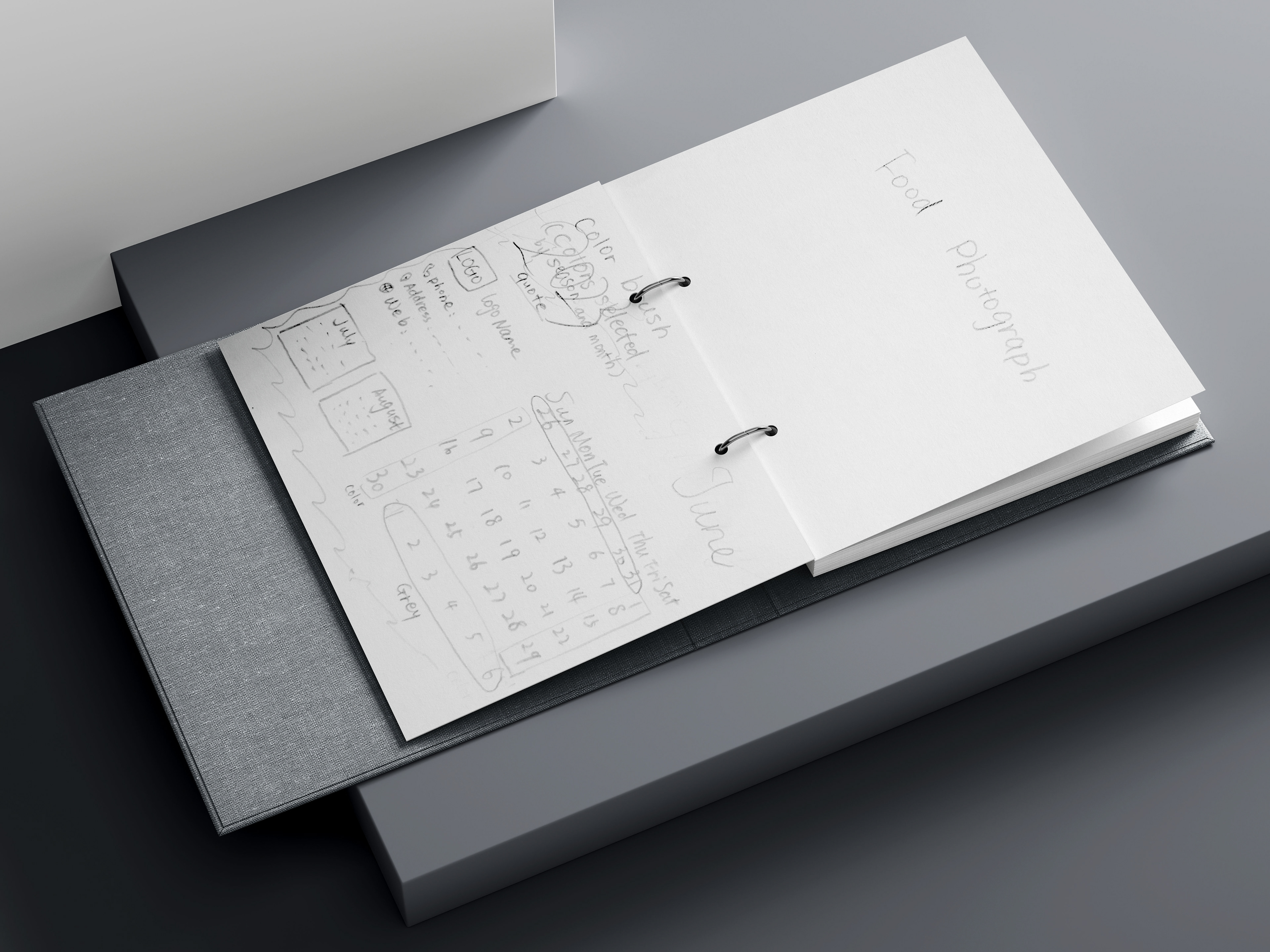
Process:
I folded seven legal-sized sheets of paper to create a mock-up and used it to design several drafts for a project.
I took pictures of the food in the restaurant kitchen and then edited the images using Adobe Lightroom and Photoshop.
I also designed illustrations and background elements using Adobe Illustrator. To bring everything together, I used Adobe InDesign to include the refined photos, food names, contact information, brand story, a 12-month calendar, and illustration components.
Throughout the project, I kept in constant communication with the client to receive feedback on the design, which helped me make prompt adjustments to improve the outcome. Once I finished the calendar design, I created a sample for proofing. The client reviewed the print sample, and I made the necessary adjustments to meet his requirements.
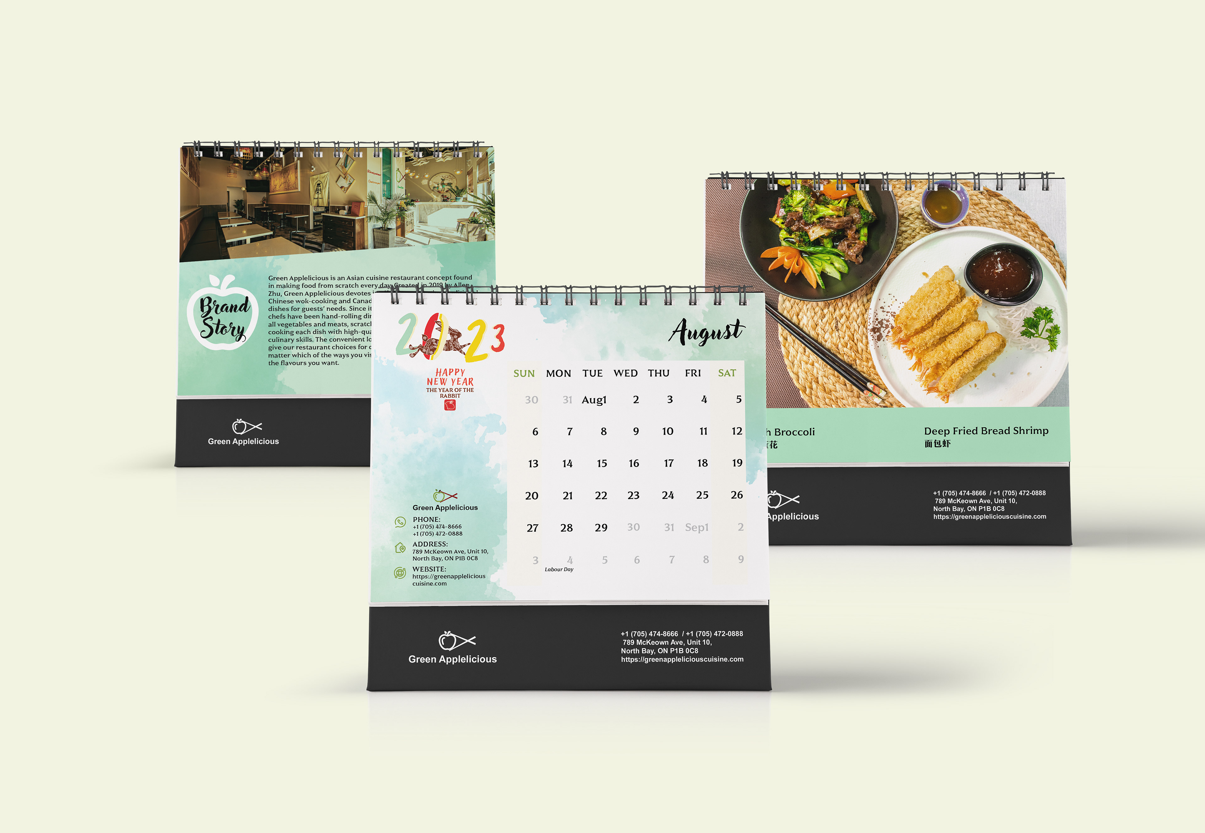
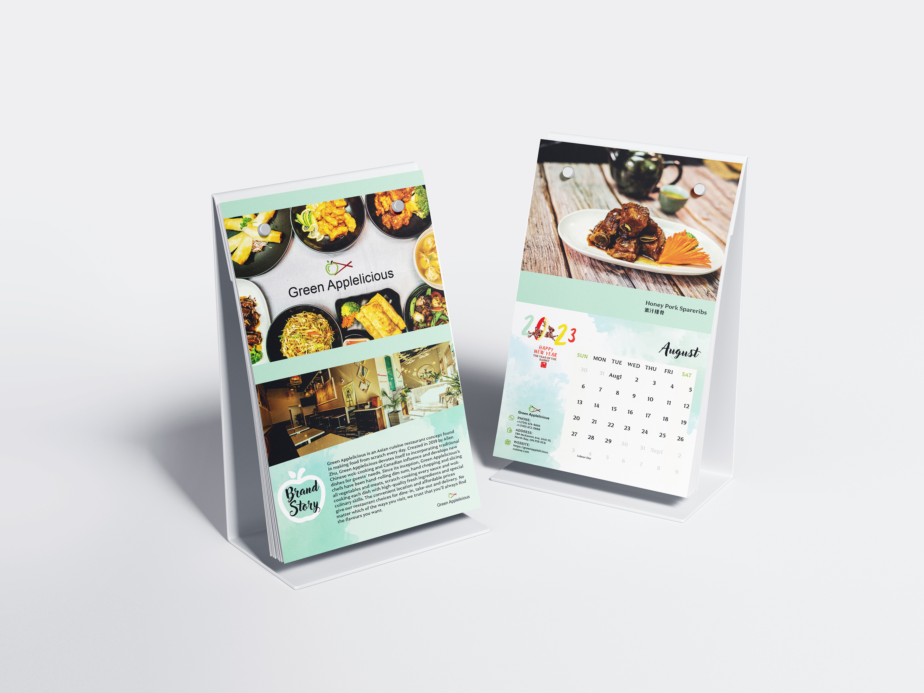
Final Result (Calendar):
The ultimate calendar turned out to be a highly effective tool in enhancing the brand identity and attracting greater attention to the quality of food and the brand's story. The calendar featured beautiful photographs of the food, showcasing the freshness and appeal of the ingredients and recipes. The clear and organized layout significantly improved the overall reading experience. Careful choices in font, colour theme, and illustrations effectively conveyed an authentic and creative spirit, leaving a positive and lasting impression of the brand.

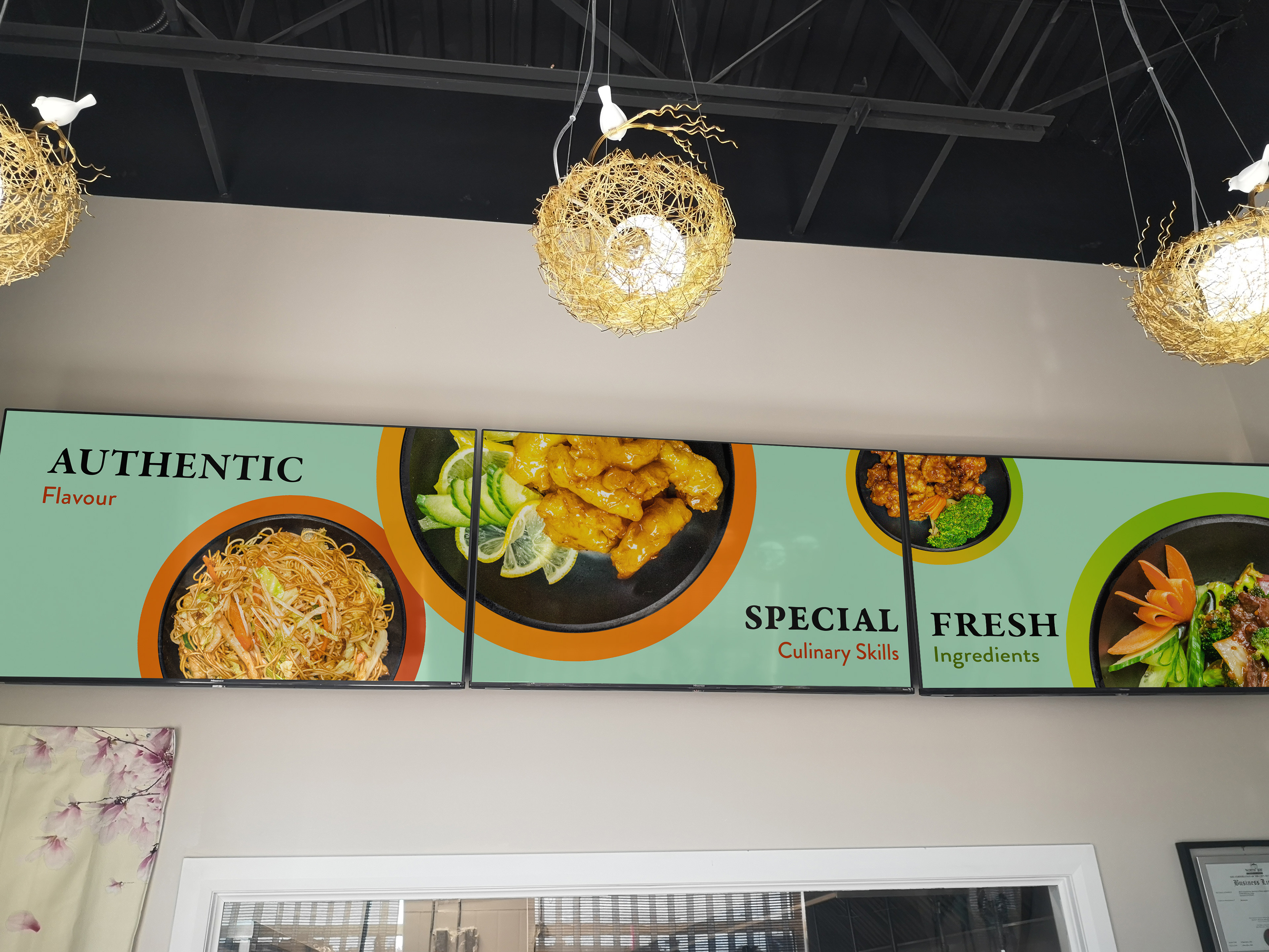
Final Result (Multiscreen Digital Menu Boards):
I created an impressive restaurant menu that was displayed on multiple screens, using digital signage with animated graphics and motion techniques. The menu was designed to show live updates, highlight featured items, and provide essential restaurant information. The visual promotion was displayed seamlessly across all the screens, allowing graphics to flow cohesively across the entire display. To ensure a well-executed video, I created a storyboard and mapped out the content display for optimal impact.