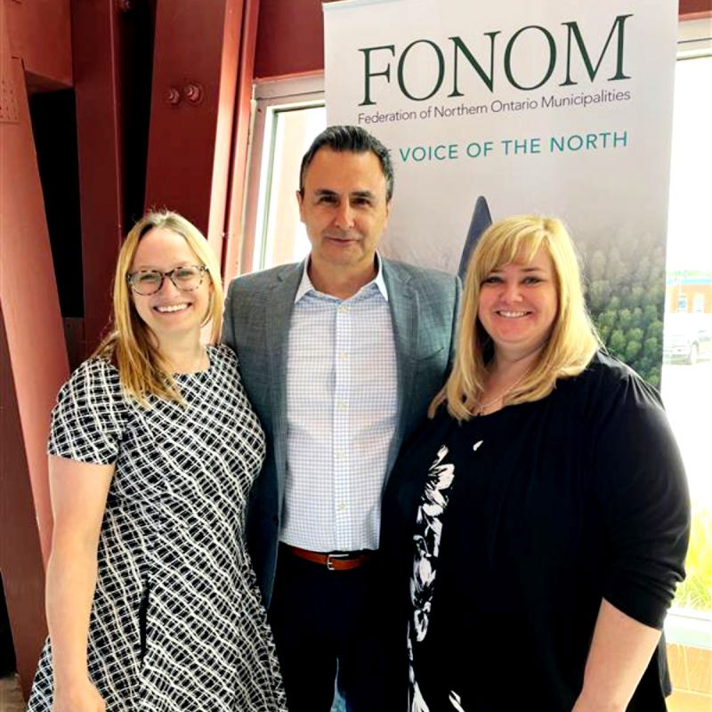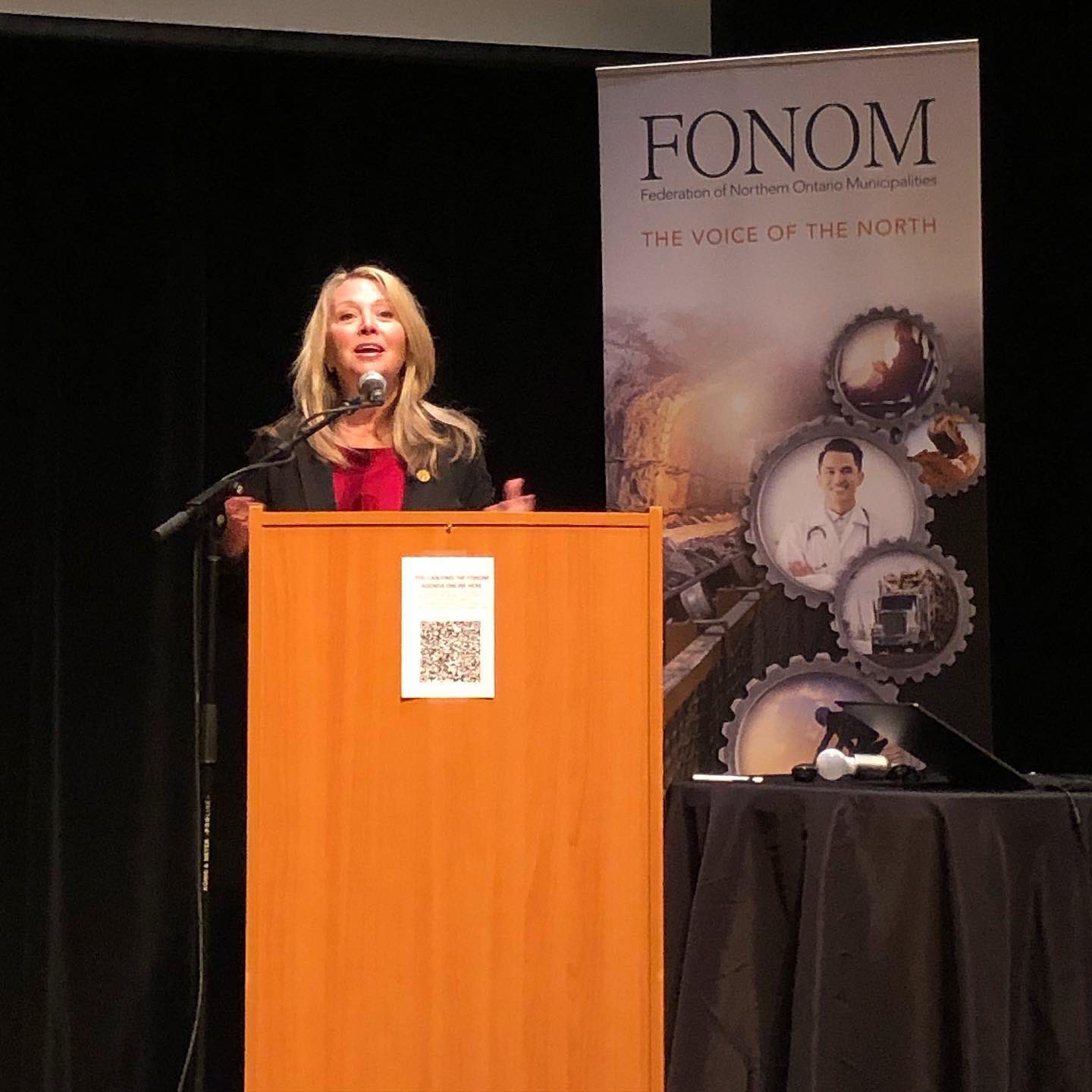

Introduction/Objective: The aim of the FONOM Bannerstand Redesign project was to create three new banners with a fresh logo design. The client required designs that would complement each other when displayed together and draw attention at a large conference attended by at least 700 people. Furthermore, the client emphasized the importance of conveying valuable content that FONOM represents numerous member districts and used the tagline "Voice of the North". I collaborated on this project with Clark Marketing Communications. Strategy/Methodology: To start the FONOM Bannerstand Redesign project, I adopted a new and modern approach to showcase FONOM's identity. Using image montage, I communicated a wide range of subject matter. The portrait photos effectively conveyed the essence of the "Voice of the North" tagline and reinforced the advocacy tonality. Additionally, I experimented with vibrant colors, impactful text, and prominent logos against a clean white background. This approach ensured that the crisp and light font remained easily legible even in the atmosphere of the large conference and varying lighting conditions, optimizing visibility and overall impact. Results/Impact: The client expressed satisfaction with the final designs, stating that the banner stands successfully represented FONOM's identity and messaging. These banners were placed in both the conference area and lobby.
